Exam dashboard
Everything on this page comes from the Week 10 lecture slides, which are the authoritative statement of exam format and scope. Administrative detail is kept short deliberately — the rest of this guide is content revision.
The paper
| Item | Confirmed detail |
|---|---|
| Reading time | 15 minutes |
| Writing time | 2 hours |
| Weight | 40% of the overall course mark |
| Total marks | Paper is marked out of 100 |
| Mode | Face-to-face, on-campus (Kensington), invigilated by the University Examination Unit |
| Platform | Inspera with Safe Exam Browser (SEB). Inspera closes automatically when the allocated time elapses. |
| Date / time | 1:45 pm – 4:00 pm, Saturday 15 August 2026 (Australian Eastern Time). Confirm venue and time in myUNSW. |
| Feedback | Summative assessment. No marking criteria released, no qualitative feedback, no numerical exam mark on Moodle. |
Question structure
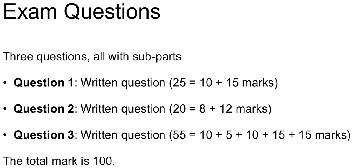
Three questions, all with sub-parts. The Week 10 slides give the mark split for each sub-part but do not state what form each sub-part takes. Drawing out artefacts is one of the four named formats — and in the Week 10 lecture the lecturer went further, saying that two sub-parts require a hand-drawn answer and that both sit inside Question 3. See the transcript panel below.
| Question | Total | Sub-parts | Guide-suggested time revision guidance |
|---|---|---|---|
| Question 1 | 25 marks | 10 + 15 | ≈ 30 min |
| Question 2 | 20 marks | 8 + 12 | ≈ 24 min |
| Question 3 | 55 marks | 10 + 5 + 10 + 15 + 15 | ≈ 66 min |
| Total | 100 marks across 9 sub-parts | 120 min writing | |
What the Week 10 recordings add about the shape of the paper transcript-derived
The slides publish the mark split and say nothing about the form of each sub-part. The Week 10 lecture recording and the Week 10 tutorial recording both go further. What follows is spoken clarification, not printed course content — but it comes from the lecturer and the tutor, and it is specific enough to plan around. Where the automatic transcription garbles a word, that is shown rather than tidied away.
| What was said | Wording in the recording | Source |
|---|---|---|
| Two sub-parts must be hand-drawn, and both sit inside Question 3 The location is stated flatly. The number of sheets is hedged — he says "I think" — so treat four sheets as what students were expected to receive, not as a confirmed fact. |
"We also have two questions that you might need to sketch something really quick um on a piece of paper. So you'll be given, I think each one of you will be given 4 pieces of paper…" and, later, "in regard to your drawing questions, um, it will be um within the question three. So one of these 21 of, so two out of these 12345 questions are drawing questions" ["21 of" and "12345" are the lecturer counting on screen; the recoverable claim is two of the five] | Lecture transcript clarificationlecture transcript\wk10.txt, SPEAKER 0 (lecturer)anchors: "two questions that you might need to sketch"; "in regard to your drawing questions" |
| You draw on paper, photograph it, and upload it — inside the two hours | "draw you can draw it. / Uh piece of paper. / Take photo, upload that." and "the format uh it's gonna be two hour by time is 15 minutes reading… but yeah two hours including answering the questions drawing and uploading that." | Tutor explanationWEEK10\tut transcript raw.txt, [29:51]–[29:55] and [22:55]–[23:09] |
| The drawing is a sub-question inside the case study, not a standalone question | "and usually again this is gonna be in the case study and it's gonna be part of a big question. It's gonna be a sub question that brought asked you to to draw." | Tutor explanationWEEK10\tut transcript raw.txt, [29:59]–[30:08] |
| Theoretical questions may be scenario-framed; the case study resembles a problem space | "So there is going to be a combination of theoretical questions. So imagine if you were something something or this business, um, use it as an example, and you would use framework, principles, um, we taught in this course, uh, to answer that question… we also have a case study. Um, basically, I'll give you a problem space looking thing." | Lecture transcript clarificationlecture transcript\wk10.txt, SPEAKER 0 (lecturer)anchor: "a combination of theoretical questions" |
Pen or pencil — the slide and the tutor differ transcript-derived
The Week 10 what-to-bring slide says a pen is preferred. In the tutorial the tutor read that line out and disagreed with it, because a drawing you cannot erase is a drawing you cannot fix: "See it says here that pen is referred to" … "I think a pencil would be safer when it comes to drawing uh because at least you can write erase and then you can change a bit of the the details but again make sure that it's clear". He then settled the question himself: "Pen or penciling doesn't really matter that much… make sure that you can make your drawing clear to us and that's the whole point." Bring both. The requirement neither source disputes is that the drawing must photograph legibly. Tutor explanation — WEEK10\tut transcript raw.txt, [27:53]–[29:40].
What could be examined
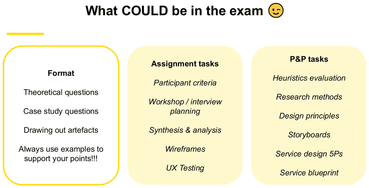
The lecturer's wording is "What COULD be in the exam". Treat the list as the boundary of possible scope, not a promise that every item appears.
Format
- Theoretical questions
- Case study questions
- Drawing out artefacts
- Always use examples to support your points!!!
Assignment tasks
- Participant criteria
- Workshop / interview planning
- Synthesis & analysis
- Wireframes
- UX Testing
P&P tasks
- Heuristics evaluation
- Research methods
- Design principles
- Storyboards
- Service design 5Ps
- Service blueprint
What will not be examined
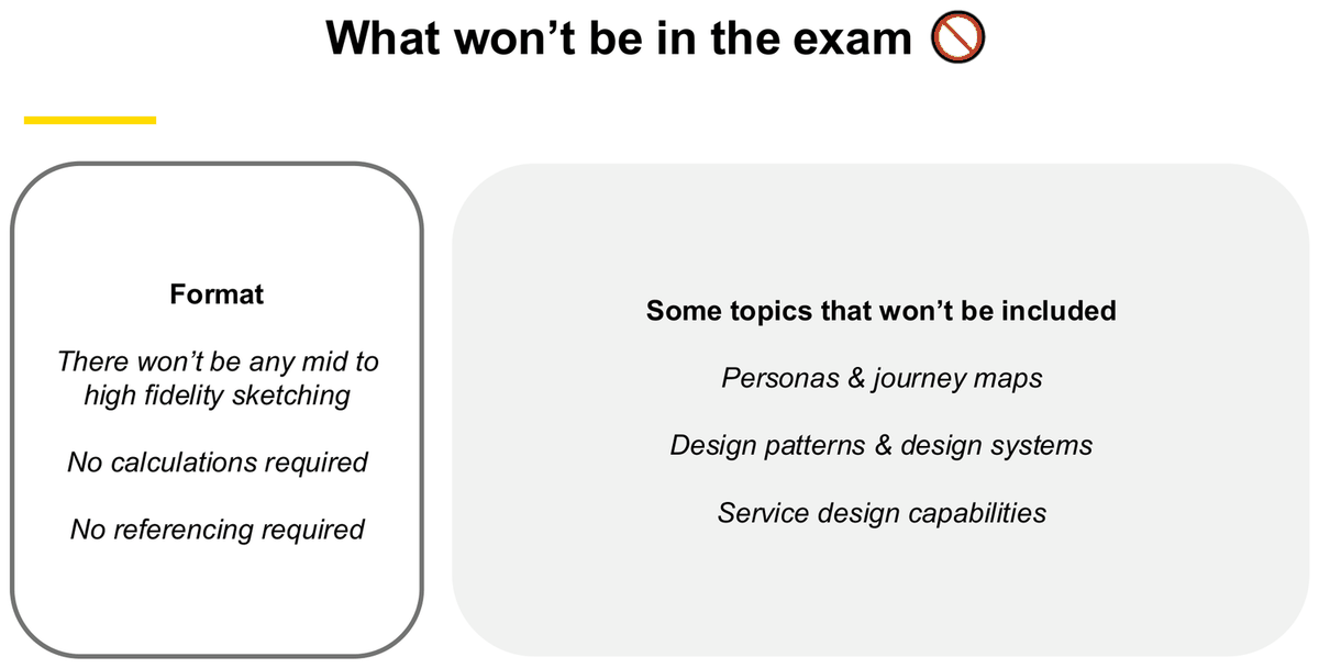
Format exclusions
- There won't be any mid to high fidelity sketching
- No calculations required
- No referencing required
Topics that won't be included
- Personas & journey maps
- Design patterns & design systems
- Service design capabilities
Reading the boundaries carefully
Three boundaries are easy to over-read. This guide resolves them as follows, and flags the reasoning wherever it matters:
- Journey maps are excluded, but the reasoning that used to sit on top of them is not. Pain points, joys, needs, opportunities and How Might We statements are all named under "Synthesis & analysis" (an included assignment task), and slide 27 of the Week 10 deck itself walks pain points through to HMW ideas. So the construction of a journey map is out; the evidence-to-opportunity reasoning chain is in. See Chapter 6.
- Wireframes are in, visual polish is out. "Wireframes" is listed as a possible topic and "drawing out artefacts" is a listed format, while mid- and high-fidelity sketching is explicitly excluded. Practise low-fidelity structure, flow, annotation and design reasoning. See Chapter 11.
- Service Design 5Ps and service blueprint are in; "service design capabilities" is out. They are different topics from different parts of the Week 8–9 material — this guide covers the first two fully and mentions capabilities only to keep the distinction clear. See Chapter 13 and Chapter 14.
Personas and journey maps do not get an examinable chapter in this guide. They appear only where they are needed to explain how earlier findings were captured.
Practice questions given in Week 10
The lecturer set three 10-mark practice questions in class (10 minutes to draft, 5 minutes peer critique, then share with the tutor). They are the closest thing available to a sample paper, and they are modelled in full in Chapter 17.
| Practice Q1 10 | Practice Q2 10 | Practice Q3 10 |
|---|---|---|
| Why is UX and SD design important for products and services? Define both roles and provide examples from your personal experiences. | What will you consider if you are conducting exploratory research? Give examples of 2 activities and 2 artefacts produced. | What are some examples of quantitative vs qualitative data? How would you go about collecting both types of data? |
What these three questions tell you about the whole paper
- Every one asks for definition + application + your own examples. An answer that stops at the definition has answered only part of what the question asks.
- Q2 asks for a specific count ("2 activities and 2 artefacts"). Count-based instructions appear in this course — answer exactly the number asked.
- Q3 asks "how would you go about collecting" — a method question, not a list question. Listing metrics without saying how you would gather them answers half the question.
Exam-day checklist
Mandatory
- Physical UNSW Student ID card (electronic IDs are not accepted; a physical driver licence or passport is also accepted). The card is scanned at the venue.
- A pen or pencil — there is an ID form to complete, and some Inspera exams require written answers.
- A laptop with SEB installed and correct version, plus charger (power is not guaranteed).
- Your smartphone — required for SSO/MFA login.
Advised, and before the day
- A mouse; laptop fully charged; laptop adaptor; pen preferred over pencil.
- Install the correct SEB version (Mac 3.5.4 / Windows 3.10.0 as stated in Week 10) and uninstall any other version on Windows.
- Complete the Inspera Student Practice Test, and re-run it on 14 August, the day before.
- Do not trigger OS updates or upgrades in the two days before the exam; if you do, re-run the practice test.
- Arrive at least 15 minutes early; connect to Uniwide; log in via the Inspera site, not SEB directly.
How to spend the 15 minutes of reading time revision guidance
During reading time, identify the mark value, command verb and relevant case evidence for each sub-part. Record or annotate anything only where the examination interface or invigilator explicitly permits it.
- Read Question 3 first — it is 55 marks across five sub-parts and will take the longest to plan.
- For every sub-part, register two things: its mark value and its command verb (define, explain, compare, evaluate, recommend, draw…). The verb decides the shape of the answer — see Chapter 18.
- For any case-study stem, note where the evidence sits in the case — user quotes, metrics, failures, staff actions. Those are the raw material for your "we found that… so what?" sentences.
- Decide which example from Chapter 16 you will attach to each sub-part. The same project can serve several sub-parts, provided each use makes a different point — see the note below.
- If a sub-part says "draw", settle the structure now: how many lanes or regions, and what each is called.
Guide inference — not stated by the lecturer. The order and the mechanics of this list are this guide's suggestion. What the Week 10 slides do state is the mark split (slide 23) and the reading-time allowance (slides 14–15). Whether you may write anything at all during reading time depends on the rules in force on the day — the venue's instructions, the invigilator and the Inspera interface. Do not assume you can annotate; check, and follow what you are told.
The Double Diamond and the end-to-end process
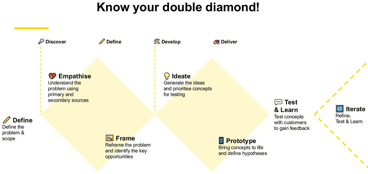
This is the spine of the whole course. The same diagram appears in the Week 2, 3, 4, 5, 7, 8 and 10 lecture decks, always with the same seven activity labels. If a case-study question asks "how would you approach this problem", this framework is the structure of your answer.
The shape
Two traps in this diagram
- "Define" is used twice. The phase Define is the converging half of the first diamond (where Frame sits). The activity Define — "Define the problem & scope" — happens before the first diamond opens. In an exam answer, say which one you mean.
- The Week 5 deck disagrees with itself. Week 5 slide 5 labels the phases Discover / Define / Develop / Deliver, but Week 5 slide 36 labels them Discover / Define / Design / Deliver. Use Develop — it is the version in six of the seven decks including Week 10. source conflict
Stage by stage: what each answers, what you do, what comes out
| Stage | Course definition (verbatim) | The question it answers | Methods the course teaches here | Likely output |
|---|---|---|---|---|
| Define (pre-diamond) |
"Define the problem & scope" | What are we even working on, and where does it stop? | Scoping; kick-off & scoping workshop; PEST; stakeholder map (core / involved / informed); the eight client questions; project brief | Project brief; funnel of scope; in-scope / out-of-scope list |
| Empathise Discover |
"Understand the problem using primary and secondary sources" | What is actually happening for users and for the business? | Primary research (interviews, surveys, focus groups); secondary research (desk research, data analytics, complaints data, social media); contextual inquiry; observation; workshops; current-state analysis; competitor analysis; the 5Ps | Research plan; discussion guide; participant recruitment brief; raw notes, quotes and observations |
| Frame Define |
"Reframe the problem and identify the key opportunities" | Of everything we heard, what is the problem worth solving? | Affinity mapping; triangulation; problem framing (five Ws, User Story / Job Story syntax); How Might We; prioritisation (Impact × Importance, Impact/Effort, MoSCoW) | Themes; insights; problem statements; HMW statements; a prioritised shortlist |
| Ideate Develop |
"Generate the ideas and prioritise concepts for testing" | What could we build, and which of those is worth building first? | Crazy 8s; Parallel worlds; How Might We's; group ideation rules (defer judgement, encourage wild ideas, build on ideas of others…); storyboards; Effort/Impact prioritisation | Idea pool; storyboard; shortlisted concepts |
| Prototype Develop → Deliver |
"Bring concepts to life and define hypotheses" | What exactly are we claiming will be better, and can we put it in front of someone? | Sketching; wireframes; wireflows; low-fi → hi-fi ladder; hypothesis recipe; test scenarios | Low-fidelity sketches; wireframe / wireflow; prototype; a written hypothesis |
| Test & Learn Deliver |
"Test concepts with customers to gain feedback" | Was the hypothesis right, and where did users actually struggle? | Concept testing; usability testing; moderated / unmoderated; think-aloud; task-based scenarios; quantitative + qualitative measures | Success rates, ratings, click paths; observed and inferred responses; a list of usability problems |
| Iterate | "Refine, Test & Learn" | Given what we learned, what changes and what gets re-tested? | Re-run the loop. Week 7 slide 7 calls the decision point a "Go / no go / refactor decision from test results". | Revised design; a second round of testing; an updated hypothesis |
How the evidence moves from one stage to the next
Naming the stages only names them. What shows you understand the process is that the output of one stage is the input of the next. This is the chain the course actually teaches:
Using the framework in a case-study answer
When a case stem gives you a messy business situation and asks how you would approach it, do not just list the four phases. Do this instead:
- Name the stage you would start at, and justify it from the case. "The brief already names the problem, so I would start at Empathise rather than re-scoping" answers the question; a generic walkthrough of all four phases does not.
- Pick one or two methods per stage and say why they fit this case — not every method you can remember. Week 2 slide 22 gives you the justification language: how clear is the problem, and how much risk is there?
- State the artefact each stage produces, because that is what makes the answer concrete and it is what the Week 10 practice question ("2 activities and 2 artefacts") is asking for.
- Close the loop. Say what you would measure at Test & Learn and what would make you iterate rather than ship.
Optional detail: the second framing — 4 Key Stages and 2 Mindsets (Week 2)
Week 2 introduces the Double Diamond twice: once as the seven-activity map above (slide 15), and once as a value-of-the-method argument (slides 7–8). The second version is worth knowing because it gives you the reason the shape is a diamond.
| Gateway | Outcome at that gateway (verbatim) |
|---|---|
| PROBLEM → RESEARCH | Insight into the Problem |
| RESEARCH → PROBLEM DEFINTION [typo is on the slide] | Scope down the Focus |
| DESIGN | Potential Solutions |
| → SOLUTION | Solutions that Work & Receive Feedback |
Two Mindsets (Week 2 slide 8): Divergent Thinking — "thought process used to generate creative ideas by exploring many possible solutions" (DIVERGE / CREATE CHOICES); Convergent Thinking — "thought honing in on one well-defined solution to a problem" (CONVERGE / MAKE CHOICES). Each diamond opens with divergence and closes with convergence — that is literally why it is drawn as a diamond, and saying so shows you understand the shape rather than just its labels.
The design squiggle (Week 2 slide 6, Week 8 slide 23) is the same idea drawn as a mess: "Starts messy and uncertain, but moves to a single point of focus over time. We navigate this with Mindsets, Stages, Activities." Week 8's version labels the squiggle RESEARCH → INSIGHTS → DESIGN & TEST → SOLVE & VALIDATE → EXECUTE, running from "UNCERTAINTY | ABSTRACT" to "CLARITY | FOCUS".
Optional detail: the UX Research Process — the five-step model that sits inside Discover
Weeks 2 and 3 share a five-step research process that is more operational than the Double Diamond and is a better answer when a question asks specifically about running research.
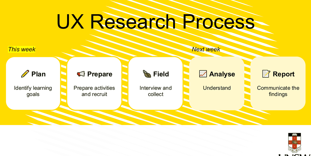
Week 7 has its own four-step version for testing specifically — Plan → Prepare → Moderate → Outcomes (Week 7 slide 17). Do not mix the two: the five-step model is for discovery research, the four-step model is for a usability test.
Common mistakes with this framework
- Listing Discover / Define / Develop / Deliver and stopping. The phases are only the container. The substance of an answer is the activities, methods and artefacts inside them.
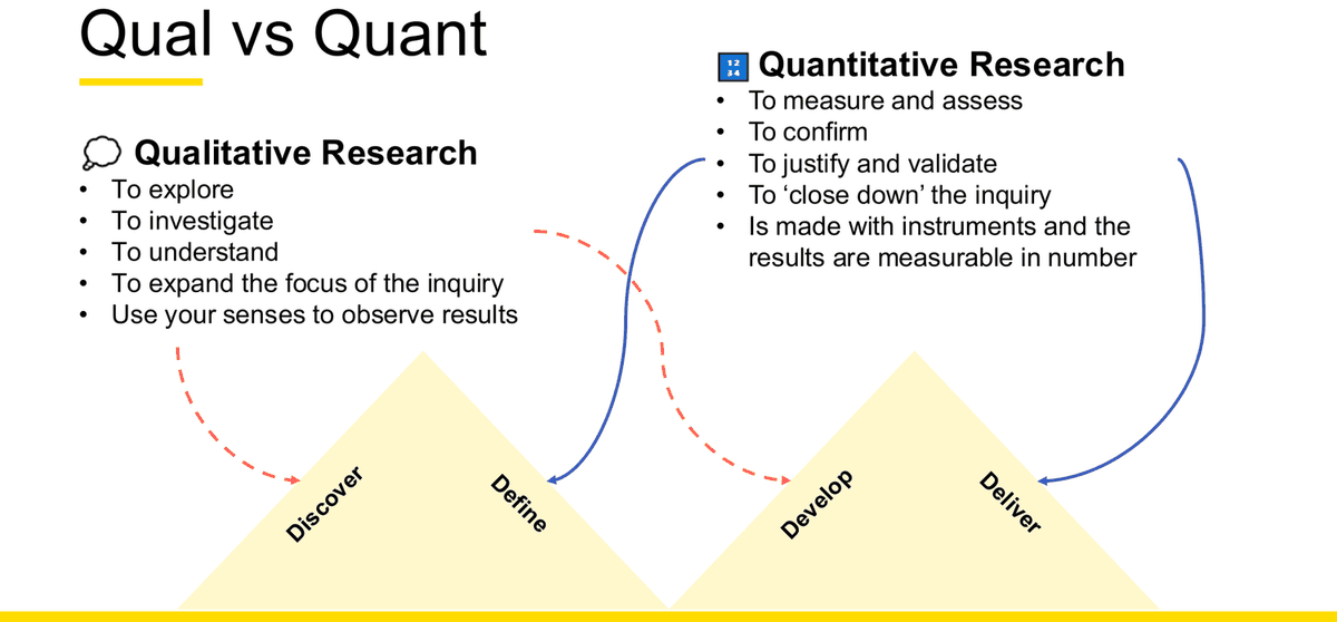
- Putting research only in the first diamond. Week 2 slide 20 explicitly puts qualitative research into Discover and Develop and quantitative into Define and Deliver — research runs across all four phases.
- Treating the process as linear. Iterate loops back; Week 3 slide 30 even tells you how to know when to stop discovering ("No new insights — this is the surest sign discovery has come to an end for now").
- Naming stages that are not in this course's version. There is no "Deliver the solution to market" stage and no "Implement" stage. Seven activities, four phases — that is the whole model.
UX and Service Design — what each is, and how they relate
Week 10 practice Question 1 is exactly this: "Why is UX and SD design important for products and services? Define both roles and provide examples from your personal experiences." The Week 8 P&P task asked the same thing. That makes this a strongly supported revision priority — it appears in both the Week 8 P&P task and Week 10 Practice Question 1.
The three levels: UX, SD, CX
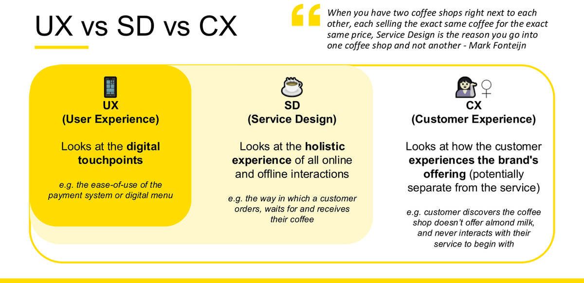
The course does not treat UX and Service Design as rivals. It nests them, and adds a third ring — Customer Experience — on the outside.
| Term | Course definition (verbatim) | Scope word used on the slide | The coffee-shop example (verbatim) |
|---|---|---|---|
| UX User Experience |
"The process of understanding and solving specific problems, often being discrete, digital interface solutions." | "Various shapes (not limited to 1)" — looks at the digital touchpoints | "the ease-of-use of the payment system or digital menu" |
| SD Service Design |
"The understanding of how services are created, delivered and experienced by your customers, noting specific problems in an experience journey that need to be improved." | "Inner ring" — looks at the holistic experience of all online and offline interactions | "the way in which a customer orders, waits for and receives their coffee" |
| CX Customer Experience |
"How your customers perceive their interactions with your company." | "Outer ring" — looks at how the customer experiences the brand's offering, potentially separate from the service | "customer discovers the coffee shop doesn't offer almond milk, and never interacts with their service to begin with" |
Why each one matters
Why good UX matters — four reasons
- Increase usability — "creates systems that easy to understand and use" [sic]
- Reduce errors — "generates fewer errors as they are considered early and solved for"
- Generate revenue — "helps businesses meet their goals"
- Meet needs — "it helps us solve real customer problems"
Why Service Design matters — six benefits
- Greater understanding of the service user and their experiences
- Retain the service users' perspective in the delivery of complex services
- Drive all business decisions from the service users' perspective
- Visualization, customer journey mapping, and scenario-making provides a richer understanding of the organization
- Co-create with service users to test, learn and to improve the service experience
- The service experience becomes an organization-wide responsibility
The business case, in the lecturer's own numbers
- Tempkin Group: "Loyal customers are 5x as likely to repurchase, 5x as likely to forgive, 7x as likely to try a new offering, and 4x as likely to refer." (Week 8 slide 19)
- Harris Interactive: "86% would pay more for a better service experience." (Week 8 slide 19)
- The four organisational challenges service design answers: Lack of Differentiation; Relying on old systems, processes & models; Disconnect between customer & business; Inability to Innovate — illustrated with Uber against the taxi industry. (Week 8 slide 18)
What Service Design is not
Not aesthetics
"Service Design goes beyond the visible to reshape everything from operations to the business model."
Not customer service
"Not only about solving customer problems but about also designing value propositions, processes and business models."
Not service recovery
"Service Design addresses the entire customer journey (even when things go wrong). It's about proactively creating moments of delight, not just about repairing mistakes."
Products vs services — the distinction the definitions rest on
| A product is… | Course wording |
|---|---|
| Tangible | Products are tangible and increasingly digital (e.g. boarding pass, mobile app) |
| Channels | Could be distributed to different platforms: mobile, tablet, desktop, connected TV, etc. |
| Physical | Often physical parameters to work within: boundaries, dimensions, etc. |
| Owned | Products can be processed, owned, and transferred in ways that services can't |
| Feature driven | Best interpreted in terms of features and functionality |
Three definitions of Service Design worth memorising
Week 8 slide 13 gives three practitioner quotes. One of them, used well, makes a definition answer look authoritative:
- "Service design choreographs processes, technologies and interactions within complex systems in order to co-create value for relevant stakeholders." — Birgit Mager, President of the Service Design Network
- "Service Design is a collaborative process for researching, envisaging and then orchestrating experiences that happen over time and multiple touch points." — Oliver King, Co-founder of Engine Service Design
- "The biggest influences on our lives are not products… they're services, and they scale faster than any product on earth." — Lou Downe, Director of School of Good Service
Weak vs strong answer
✗ Weak
"UX is about the user experience of a product. Service design is about designing services. Both are important because they make things better for customers, which is good for the business."
Why this answer is incomplete: circular definitions, no course terminology, no example, no explanation of the relationship — which is half the question.
✓ Improved
UX is the process of understanding and solving specific problems, usually discrete digital interface solutions — it looks at the digital touchpoints. Service Design is the understanding of how services are created, delivered and experienced by customers, and it looks at the holistic experience of all online and offline interactions. The relationship is one of scope: several UX problems sit inside a single service, which is why the course draws UX as shapes inside the SD ring.
Both matter because a good interface cannot rescue a broken service. In my own group project on university group-assignment coordination, designing a clear scheduling screen was a UX concern; making sure a confirmed meeting actually flowed through to notifications, task ownership and how the team then worked together was a Service Design concern. Fixing only the screen would have left the coordination failure in place.
This matters commercially: Harris Interactive found 86% would pay more for a better service experience, and the course's own coffee-shop example makes the point that when two shops sell identical coffee at an identical price, service design is the reason a customer picks one.
What makes this the stronger answer: both definitions in course wording, the relationship stated explicitly, a personal example that shows the boundary between the two, and a "so what" that connects to business value.
Exploratory research: how a project actually starts
Week 10 practice Question 2 is: "What will you consider if you are conducting exploratory research? Give examples of 2 activities and 2 artefacts produced." Week 10 slides 6–9 answer that question directly — they are effectively the lecturer's own model answer.
Where a project comes from
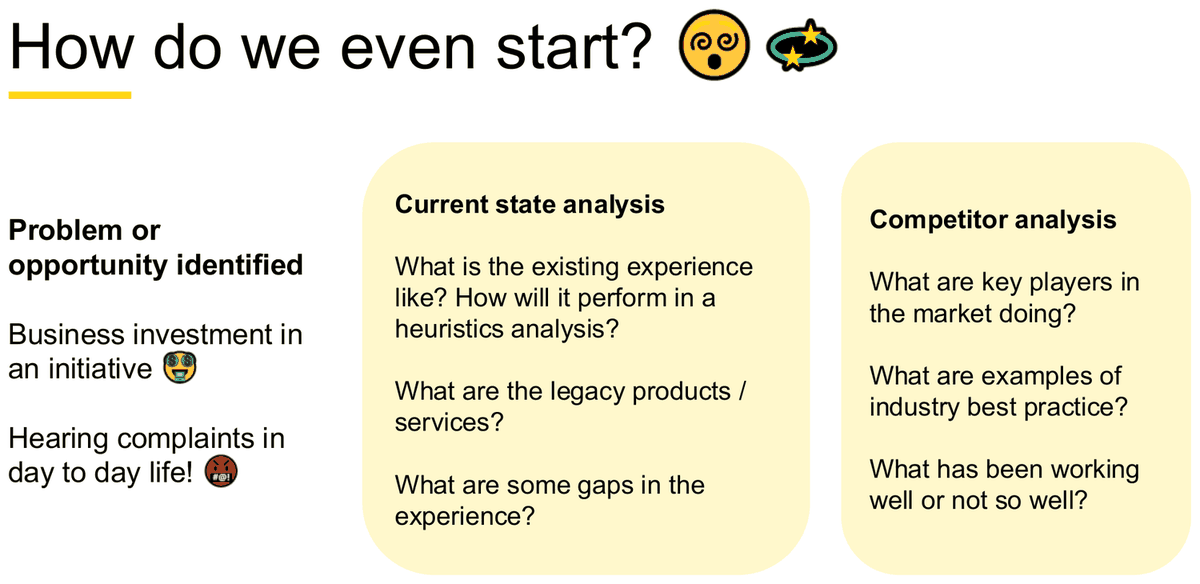
Week 10 slide 6 is titled "How do we even start?" and gives three starting points. It is the most compact framing in the deck for an exploratory-research question, which makes it easy to recall under time pressure.
Problem or opportunity identified
- Business investment in an initiative
- Hearing complaints in day to day life!
Current state analysis
- What is the existing experience like? How will it perform in a heuristics analysis?
- What are the legacy products / services?
- What are some gaps in the experience?
Competitor analysis
- What are key players in the market doing?
- What are examples of industry best practice?
- What has been working well or not so well?
What sources can we rely on?
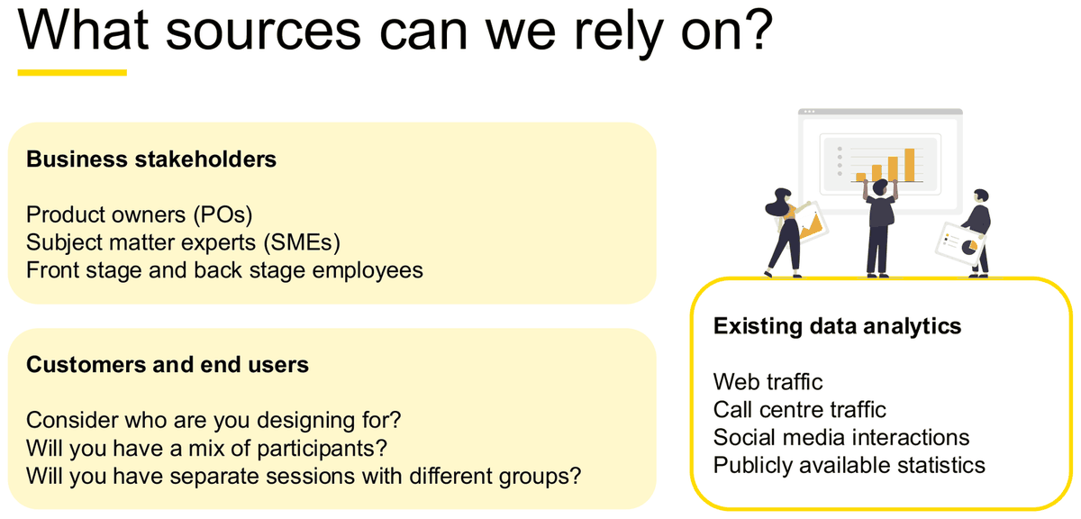
This slide is the answer to "who and what will you draw on?" — and it is the only place the course lists the stakeholder types by name.
Business stakeholders
- Product owners (POs)
- Subject matter experts (SMEs)
- Front stage and back stage employees
Customers and end users
- Consider who are you designing for?
- Will you have a mix of participants?
- Will you have separate sessions with different groups?
Existing data analytics
Web traffic · Call centre traffic · Social media interactions · Publicly available statistics
Primary vs secondary research
Primary Research
Interviews, surveys, focus groups.
Data you collect yourself, from people, for this project.
Secondary Research
Desk Research, Semiotic Analysis, Data Analytics, Complaints Data, Social Media.
Data that already exists, which you interpret.
The definitions to quote
- Research
- "creative and systematic work undertaken to increase the stock of knowledge. It involves the collection, organization and analysis of information to increase understanding of a topic or issue." (W2 s17)
- UX research
- "Applied research methods that allow us to better understand our users, their needs, pain points and behaviours. It is essential to developing empathy and evaluating design concepts. Includes both quant & qual techniques." (W2 s19)
- Why we do it
- "We conduct user research to understand the behaviours, needs and characteristics of our customers. It prevents us from designing for ourselves (or purely from a business perspective!)" (W2 s19)
Getting out of the building
GooB — Get Out Of the Building: "A good sentiment from Lean UX (2008) which promotes designers and researchers to get out of the office and observe their products and users in their natural environment." (Week 2 slide 21)
Ethics — three principles
Consent
"capture and record participants consent in participating prior to research"
Privacy
"ensure notes and personally identifiable information is stored securely"
Upfront & Transparent
"be clear how research insights and results will be used"
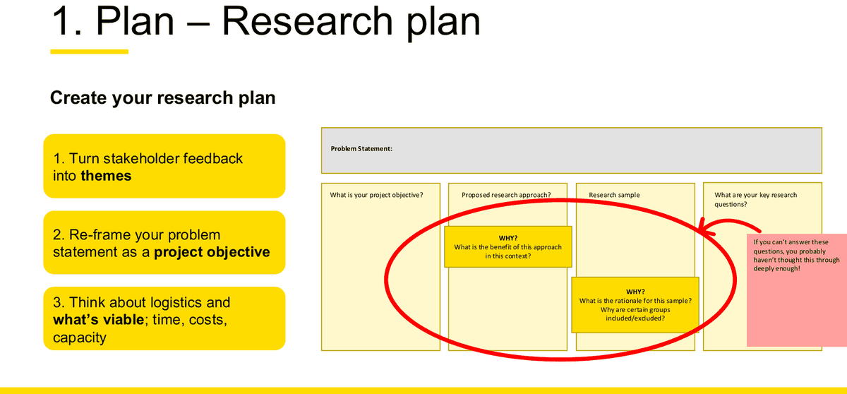
The research plan
If a question asks what you would produce before doing any research, this is the artefact. Week 2 slide 62 gives both the three preparation steps and the canvas fields.
Three steps to build it
- Turn stakeholder feedback into themes
- Re-frame your problem statement as a project objective
- Think about logistics and what's viable; time, costs, capacity
Canvas fields
- Problem Statement
- What is your project objective?
- Proposed research approach? WHY? What is the benefit of this approach in this context?
- Research sample WHY? What is the rationale for this sample? Why are certain groups included/excluded?
- What are your key research questions?
The lecturer's warning, printed on the slide: "If you can't answer these questions, you probably haven't thought this through deeply enough!" — and note that two of the five fields carry a "WHY?" prompt. Justification is built into the artefact. An exam answer that names a method without justifying it is failing the course's own template.
Four preparation tasks
| Task | What it involves |
|---|---|
| Recruitment | recruiting participants |
| Activity | preparing discussion guide |
| Operations | organizing materials / logistics for the interview |
| Ethics | organizing consent forms and sign off |
Stakeholder and SME interviews — four purposes
| Purpose | Course wording |
|---|---|
| Shared understanding | Building consensus around the problem space |
| Context | Understand the business problem clear from the individuals who are experiencing them |
| Success | Understand what 'success looks' like to the business – if this is 'solved' how will it impact the business? |
| Customer | Gain some second hand knowledge of customer behaviours and attitudes |
Optional detail: scoping before research (Week 8) — for a service-design case
Week 8 puts a formal scoping step before Discover. Use this if the case is a service-design brief rather than a product one.
Definition (W8 s29): "Scoping involves exploring the business problem at hand - the driver behind the project, with the client or external stakeholders in a kick-off workshop. Co-creating and co-designing the proposal together… It's important to define what's in scope and what's not – this information ultimately shapes the Project Brief."
Scoping workshops help in… (W8 s30)
- Understanding your client's goals
- Mapping the current environment and some PEST (political, economic, social, technological) factors
- Surfacing research to date that will help the project team
- Calling out key assumptions and risks underpinning the project
- Defining the funnel of scope
Areas of focus — six prompts (W8 s31)
- What do we think is the problem or opportunity?
- What is the context?
- Consider constraints
- Who is the target audience?
- Consider stakeholder alignment, landscape & motivations
- What is the vision & ambition of the project?
Eight questions to set the scope (W8 s32): Who is the client and what do they need? · Who is their audience or target market? · Who are their competition? · What are they trying to achieve? · What is their budget? · How would they like to engage? · Who are the other relevant stakeholders? · What is the scope of the project?
Stakeholder map — three rings (W8 s33): CORE TEAM → INVOLVED STAKEHOLDERS → INFORMED STAKEHOLDERS. Used "to understand who we should engage in a project to report to, collaborate with, keep informed and possibly avoid."
The project brief (W8 s34–35). "A one-page summary that clarifies; business intent, aspiration, goals/objectives, obstacles, practical approach and identifies potential project team." Its five headed question sets are Purpose / Performance / People / Place / Problems.
Exam trap. The project brief's five headings are also five P-words, and three of them (People, Place, Performance) overlap with the 5Ps of Service Design (People, Processes, Places, Products, Performance). They are different frameworks on different slides. The project-brief slide never calls its list "the 5Ps". See Chapter 13.
Model answer skeleton for Week 10 practice Q2 10 marks
"What will you consider if you are conducting exploratory research? Give examples of 2 activities and 2 artefacts produced."
What I would consider — take these straight from Week 10 slides 6–9: where the problem came from (business initiative, or complaints heard in day-to-day life); the current state (what the existing experience is like, how it performs in a heuristics analysis, what the legacy products are, where the gaps are); the competitors (what key players do, industry best practice, what is and isn't working); which sources I can rely on (business stakeholders — POs, SMEs, front stage and back stage employees; customers and end users; existing analytics such as web traffic, call centre traffic, social media and public statistics); the participant mix (who am I designing for, do I need separate sessions for different groups); preparation (physical and digital set-up, a practice run, tech tested); roles (meeting organizer, facilitator, note taker, time keeper, tech set up); and ethics (consent, privacy, upfront and transparent).
2 activities + 2 artefacts — pick a matched pair so they connect: activity 1 a 1-hour semi-structured user interview → artefact 1 a discussion guide (5 sections, 60 minutes, from Week 2 slide 66); activity 2 a co-design workshop → artefact 2 a participant recruitment brief / screener with quotas and exclusions (Week 2 slide 67). Say what each artefact is for, not just what it is called.
Research methods and how to choose one
"Research methods" is named on the Week 10 possible-topic list, and the Week 2 P&P task was literally "Select ONE quantitative research method — justify why this is appropriate; what insights are you aiming to gather? Select ONE qualitative research method — [same]." Choosing and justifying is the skill being tested, not listing.
Qualitative vs quantitative — the course's own split
Qualitative Research — purposes
- To explore
- To investigate
- To understand
- To expand the focus of the inquiry
- Use your senses to observe results
Quantitative Research — purposes
- To measure and assess
- To confirm
- To justify and validate
- To 'close down' the inquiry
- Is made with instruments and the results are measurable in number
The decision tool: Risk × Problem Clarity
Week 2 slide 22 is the course's named tool for deciding how much research to do. Quoting the axis definitions is what makes a justification sound like this course rather than generic UX.
How to use it in an exam. Read the case for two things: how much evidence already exists about the problem, and what happens if the design is wrong. Then say, in one sentence, which quadrant the case sits in and therefore how heavy your research should be. That single sentence converts "I would do interviews" into a justified choice.
Method-selection matrix
Only methods actually taught in this course are listed. Purpose and description columns use the lecturer's wording; the strengths, limitations and exam-application columns are compiled from the same slides and marked where they go beyond them.
| Method | Type | Purpose / course description | Stage | Participant type | Likely output | Strengths | Limitations | Example exam application |
|---|---|---|---|---|---|---|---|---|
| User interviews (1:1) | Qual | "form the backbone of research… help uncover a customer's thoughts, behaviours, motivations, and opinions" | Discover / Empathise | Customers, end users; also POs and SMEs | Discussion guide; transcripts; quotes; participant snapshots | "Personal; Easier for customer; Follow-up" | "Time; Training" | Any "explain why users behave this way" question. Pair with a survey to get scale. |
| Contextual inquiry | Qual | "combines classic research methods of workshops and interviews, and places them together within a customer's real context… focus is on observation with as little interference from the designer as possible" | Discover | Users in their real environment | Field notes; observed workarounds | Reveals the gap between what people say and what they do; the course's own "GooB" argument | Slow; access to the real setting is often impossible | When the case involves a physical or workplace setting (a clinic, a warehouse, a campus). |
| Observation | Qual | "Identify non-verbal cues such as tone of voice, facial expressions, behaviours etc." | Discover / Test | Users performing a real task | Observed and inferred responses | Catches behaviour participants can't articulate | Inference is not fact — Week 7 s43 keeps "observed" and "inferred" as separate columns for this reason | Use with think-aloud in a usability test; cite the observed/inferred split. |
| Focus group / online communities | Qual | "Collecting user sentiments in a group setting or on social platforms" | Discover | Groups of users | Group sentiment; debate points | Fast breadth of opinion; cheap | Group bias — W2 s56 warns of "biases in the group and loud/outspoken members" | Only propose it if you also say how you would control for dominant voices. |
| Workshops | Qual | "opportunities for researchers, designers, business stakeholders, and even customers to come together to either understand the current state or ideate a future state (or both)" | Discover / Frame / Ideate | Mixed: stakeholders, staff, customers | Workshop plan; FigJam board; clustered outputs; prioritised list | Produces analysis and buy-in in one session; four 4Cs stages in one hour | Facilitation-heavy; participant mix drives quality; you get what the loudest person says unless you design against it | The course's own assignment vehicle — see Chapter 5. |
| Online survey | Quant | "a structured questionnaire that your potential users/customers complete over the internet generally through a filling out a form" [sic] | Define / Deliver | Large samples of the target market | Counts; ratings; Likert distributions | Measures scale and frequency; cheap at volume | Cannot explain why; wording bias; W2 s29 requires the "Right number of questions / Ease of questions / A clear path" | Pair with interviews. The course's own line: "Survey data can show what problems are common, but interviews can explain why." |
| Card sorting | Quant (as classified by this course) |
"a well-established research technique used to discover how people understand and categorize information… group and label website information in a way that makes the most sense to your audience" | Define | Target users | Grouping and labelling evidence for information architecture | "Simple, Quick, Quantifiable"; "Provides quantitative evidence (closed)" | Tells you how people group things, not why they need them; the slide advises 30–60 cards maximum | Any navigation or IA question. Open sort = respondents create their own groups and labels; closed sort = respondents place items into existing groups only. |
| A/B testing | Quant | Named as a quantitative method example (W2 s26) and as an "Other Method" for testing (W7 s24) | Deliver | Live or test users | Preference counts; paired ratings | Direct comparison of two options with a number attached | Needs two real options and enough participants; tells you which, not why — W7 s51 therefore adds "Why do you like your chosen version more? / Why didn't you like the other version?" | Use the W7 s51 structure: preference count + out-of-5 clarity rating per version + two "why" questions. |
| Web analytics | Quant | Named as a quantitative method example (W2 s26) and as an existing data source (W10 s7: web traffic, call centre traffic, social media interactions, publicly available statistics) | Discover (secondary) / Deliver | None — existing behavioural data | Traffic patterns; drop-off points | No recruitment needed; real behaviour at full scale | Shows where people drop out, never why | Perfect opener for a current-state analysis: "analytics tell me where the funnel leaks; interviews tell me why." |
| Hotspots / eye tracking | Quant | Named as a quantitative method example (W2 s26); heat maps reappear as a usability measure (W5 s47) | Deliver | Test participants | Heat maps; click maps | Objective evidence of attention and first clicks | Equipment or tooling required; attention ≠ comprehension | Cite as a quantitative validator alongside completion rate and click paths. |
| Desk / secondary research | Both | "Desk Research, Semiotic Analysis, Data Analytics, Complaints Data, Social Media" | Discover | None | Current-state and competitor analysis | Free, fast, done before you recruit anyone | Not specific to your users; may be out of date | Always mention it first in an exploratory-research answer — it is what makes the primary research targeted. |
| Heuristics analysis | Qual (expert) |
Week 10 s6 places it inside current-state analysis: "How will it perform in a heuristics analysis?" | Discover | None — evaluator-led | Findings + recommendations against the five heuristics | No participants needed; fast; standardises comparison of new and existing sites/apps | Expert judgement, not user evidence — it predicts problems rather than observing them supplementary | See Chapter 7. Strong opener when a case gives you an existing product to critique. |
| Concept testing | Both | "happens at earlier stages of the design and aims to refine and remove ideas quickly to focus on key ideas only" | Develop | Target customers | Go / no-go on concepts | Kills bad ideas cheaply; "UNSW approved" | Concepts are not yet usable, so results are directional | See Chapter 10. |
| Usability testing | Both | "a more rigorous form of evaluative testing that happens closer to the final completion of development, and before the product is released to the market" | Deliver | "Realistic user of the product or service being studied" | Success rates, times, ratings, usability problems | Allows experiences to be "measured and compared across industries or over time" | Needs something to test; 5 users finds ~85% of problems, not all | See Chapter 10. |
Triangulation — why you use more than one method
Week 3 gives you the vocabulary to justify combining methods, which is exactly what the Week 2 P&P task asks for.
Definition (W3 s32): "Data triangulation is the use of a variety of data sources, including time, space and persons, in a study. Findings can be corroborated and any weaknesses in the data can be compensated for by the strengths of other data, thereby increasing the validity and reliability of the results." The slide adds: "it is a form of cross-checking", and the analogy: "Think about how cell-towers can pinpoint the location of your phone with the information it receives from three or more sources."
Four types (W3 s33, attributed on the slide to Denzin (1978) and Patton (1999)): 1. Data triangulation · 2. Methodological triangulation · 3. Investigator triangulation · 4. Theory triangulation. The worked example converges Analytics, Survey, User Testing and Benchmarking on "Patterns".
Survey craft — the details that separate answers
Four scripting rules (W2 s30)
- Ask more general questions first
- 'Chunk' and section questions in a logical manner
- Write simple succinct questions using specific language familiar to your audience
- Only ask one question at a time; don't combine 2 or more questions into one
Three question types (W2 s32)
- Open ended — "start with 'Why?' 'How?' and 'What?' They encourage a full answer"
- Close ended — "Provides a set of responses for the respondent and is easier to complete and analyze later"
- Likert scale — "Respondents specify their level of agreement or disagreement with a series of statements on a scale"
✗ Bad survey questions (verbatim, W2 s31)
- "How great is our hard-working customer service team?" — leading
- "How awesome is the product?" — leading
- "The product helped me meet my OKRs." — jargon
- "Was the product easy to find and did you buy it?" — double-barrelled
✓ Improved versions (verbatim, W2 s31)
- "How would you describe your experience with the customer service team?"
- "How would you rate this product?"
- "The product helped me meet my goals."
- Split in two: "The store made it easy for me to find the product." / "Did you buy a product from our company during your last visit?"
The sentence that answers every "justify your method" prompt
Name the method → name the stage it belongs to and the quadrant of Risk × Problem Clarity the case sits in → say what insight it produces that the other type cannot → name the artefact it leaves behind. Four clauses, one sentence each. The student's own Week 2 forum answer does this in two lines: "Survey data can show what problems are common, but interviews can explain why those problems happen… The survey would help measure the scale of the problem, while the interviews would help uncover the context and emotions behind the problem." student example
Participants, workshop planning and interview planning
Three separate items on the Week 10 possible-topic list live in this chapter: participant criteria, workshop planning and interview planning. All three were also assessed in the group assignment, so the exam can legitimately ask you to produce any of them for a new case.
Part A — Participant criteria
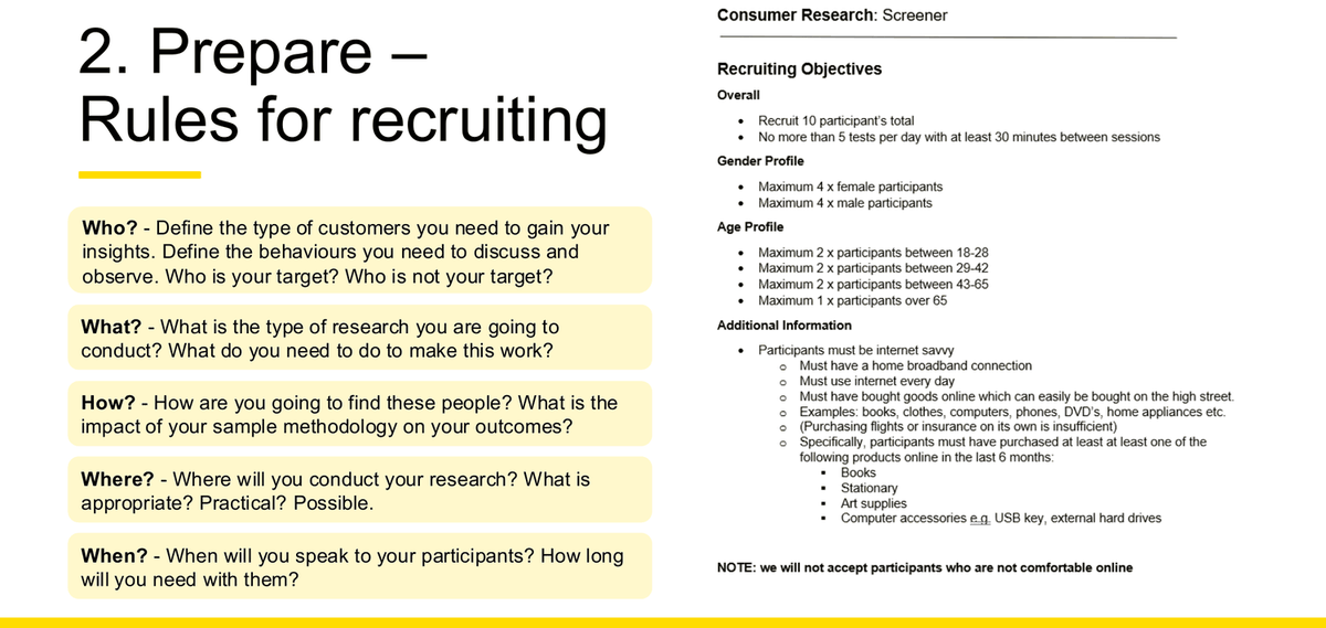
The five recruiting questions
| Question | Course wording (verbatim, Week 2 slide 67) |
|---|---|
| Who? | "Define the type of customers you need to gain your insights. Define the behaviours you need to discuss and observe. Who is your target? Who is not your target?" |
| What? | "What is the type of research you are going to conduct? What do you need to do to make this work?" |
| How? | "How are you going to find these people? What is the impact of your sample methodology on your outcomes?" |
| Where? | "Where will you conduct your research? What is appropriate? Practical? Possible." |
| When? | "When will you speak to your participants? How long will you need with them?" |
A real screener — what "criteria" looks like when written properly
The same slide carries a full worked screener. Reproduce this structure and you have answered any "define your participant criteria" question completely.
| Criterion type | Worked example (verbatim, Week 2 slide 67) |
|---|---|
| Overall quota | "Recruit 10 participant's total; No more than 5 tests per day with at least 30 minutes between sessions" |
| Gender profile | "Maximum 4 x female participants; Maximum 4 x male participants" |
| Age profile | "Maximum 2 x participants between 18-28; Maximum 2 x between 29-42; Maximum 2 x between 43-65; Maximum 1 x over 65" |
| Behavioural must-haves | "Participants must be internet savvy (must have a home broadband connection; must use internet every day; must have bought goods online which can easily be bought on the high street…)" |
| Recency qualifier | "must have purchased at least at least one of Books / Stationary / Art supplies / Computer accessories… online in the last 6 months" [sic — "at least at least", "Stationary"] |
| Explicit exclusion | "NOTE: we will not accept participants who are not comfortable online" |
✗ Unsuitable participant criteria
- "University students." — no behaviour, no quota, no exclusion.
- "People who would use the app." — circular; you cannot screen for it.
- "My friends, because they're available." — convenience alone, with no stated limitation.
- "Anyone aged 18–65." — a range this wide is not a criterion.
✓ Suitable participant criteria
- Who: current university students who have completed at least one group assignment in the past 12 months, and who have taken a coordinating role at least once.
- Mix: at least one postgraduate; span STEM, business and arts, because group work looks different across fields; span year levels, because experience with group work varies.
- Exclusion: not students who have only worked solo — they cannot speak to the coordination pain point.
- Limitation stated: recruited through personal networks, so this is a convenience sample and findings are directional, not generalisable.
Where the course says to find participants
Week 3, slide 5
Family and friends · Student societies and social media · Companies & organizations. Plus the course's own rule: "You can focus on 1 main user group… However, groups who put in effort and demonstrate the ability to clearly identify more distinct sub groups will perform better."
Week 7, slide 27
Colleagues · Friends & family · Online survey · Professional recruiters. Rule: "Always collect consent – industry standard practice."
Group Assignment, p5
"Use your networks – family and friends are fine, student societies, connections in relevant industries etc." Plus mock-participants: "get your participants to play the role of a stakeholder that you assign to them, and provide them with a brief of mindsets and attitudes." And: "Have back up participants."
Sample size — the numbers the course actually gives
| Context | Number | Source and reasoning |
|---|---|---|
| Group workshop (assignment) | 6–8 participants | Group Assignment p3; repeated on Week 4 lecture s3 and Week 4 tutorial prep p2, both highlighted in yellow |
| Project team size | 4–5 students | Group Assignment p3 — from the same tutorial |
| Usability testing | 5 users ≈ 85% of problems | Week 7 s35 "Magic of 5 users". 3 → 65%, 4 → 75%, 5 → 85%, 6 → 90%, 8 → 95%, 12 → 99%. Underlying figure: 31% probability of a user encountering an error. Attributed on the slide to Jeff Sauro of MeasuringU and to "binomial probability, or what may be better known as the Poisson Distribution" |
| Qualitative prototype test (industry example) | 7 participants | Week 5 s44 — NRMA/SGIx study, "even spread across gender, age, SGIx vs non-SGIx customers" |
| Unmoderated quantitative test (industry example) | 30 + 30 | Week 5 s47 — 30 NRMA customers and 30 non-customers, aged 20–65, located in Australia, recruited through Askable |
| Consumer research screener (industry example) | 10 total | Week 2 s67, with max 5 tests per day |
Part B — Workshop planning
What a workshop is, and the four types
Definition (W2 s52): "Workshops are opportunities for researchers, designers, business stakeholders, and even customers to come together to either understand the current state or ideate a future state (or both). Workshops are an essential tool in the designers toolkit, and facilitation is an important skill for any design professional, or future leader."
| Type | Purpose (verbatim, W2 s53) | Detail |
|---|---|---|
| 1. Kick off & scoping | "to provide clarity as a project commences" | Activities/tools: Stakeholder Mapping (e.g. RACI); In-scope/out of scope; What we know & what we don't; Risk and Territory Mapping (e.g. PESTLE). Identify: Challenge definition · Project team values · Team schedules/availability · Team roles · Cadence and ways of working · Team bonding (W2 s54) |
| 2. Co-design | "to create something with a diverse group of skills/mindsets" | "focused on finalizing data and insights around the current state… also help shape the outputs together (to generate a sense of ownership and buy-in)" (W2 s55) |
| 3. Customer | "to co-create something with real customers of the product" | "An evolution of focus groups… Be mindful that customers are not designers. It is the facilitator and assistants role to help translate raw ideas provided by customers." (W2 s56) |
| 4. Learning | "to help others learn a new tool or activity" | "focused on helping teammates or clients uplift in a specific design skill or framework… useful when trying to build internal capability" (W2 s57) |
The workshop agenda skeleton
This is the reusable structure. If an exam asks you to plan a workshop, build your answer on these three bands and fill them with 4Cs activities.
Where the 4Cs sit on the Double Diamond transcript-derived
This is the one integration question about the 4Cs that the slides do not answer, and the lecturer answered it twice — once in Week 2 in reply to a student, and once in Week 4 while marking a past student submission wrong in front of the class.
All four Cs sit inside the first diamond only. Collect and Choose fall under Discover; Create and Commit fall under Define. Develop and Deliver carry no 4Cs activity.
Week 4: "with the 4C framework collect, choose, create, commit, they are sitting literally only within this double diamond, the first diamond, not mentioning any of the, the second half… but the way they present it is sort of like, oh, we do collect during the phase of discover and we do choose activity during the phase of define. And do the cre during phase of development, so on and so forth, and that's not accurate. So, collect, choose is sitting under discover and create and commit sitting under define." Lecture transcript clarification — lecture transcript\wk4.txt, SPEAKER 0 (lecturer), anchor "they are sitting literally only within this double diamond".
Week 2, the reason behind it: "They are not designer. You are the designer, don't ask them to do your job. So everything we do is at the the first stage which is the um research a huge state" — the workshop is research, not design, which is why none of it lands in the design diamond. Lecture transcript clarification — lecture transcript\wk2.txt; the file carries no speaker labels, so the speaker is inferred from context as the lecturer answering a student.
The 4Cs framework
The 4Cs is the course's own named workshop framework, drawn from The Workshopper Playbook and the Ultimate Workshop Exercise Encyclopedia. You must know the four stage names and their purposes; you do not need all forty activities.
| Stage | Purpose (verbatim) | Activities (numbered as on the slide) |
|---|---|---|
| Collect | Understand current state | 1. Expert Interviews · 2. Lightning Demos · 3. Sailboat · 4. Product Map · 4. Business Model Canvas [sic — the slide numbers two items "4" and has no 5] · 6. Setting the Scene · 7. Retrospective · 8. Parking Lot · 9. User Observations · 10. Empathy Map |
| Choose | Identify common problems | 11. Dot Voting · 12. Sticky Notes Tree · 13. Map Target · 14. Heat Map · 15. Straw Poll · 16. Decider Vote · 17. Pick your Top 3 · 18. Focus Question · 19. Categories · 20. Ranking |
| Create | Ideas to solve problems | 21. Note Taking · 22. Doodling · 23. Crazy Eights · 24. Three Step Concept · 25. Quick Ideas · 26. Business Strategy Concept · 27. User Test Flow · 28. Idea Storm · 29. Elevator Pitches · 30. SCAMPER |
| Commit | Prioritize the best ideas | 31. 2-Year Goal · 32. Can We Questions · 33. Define the Purpose · 34. Storyboarding · 35. Breadboarding · 36. Effort Impact Scale · 37. Roadmap · 38. Divide and Conquer · 39. Turn Ideas into Actions · 40. Presentation of Outcomes |
The tutor's three rules for planning a 4Cs workshop tutor feedback, context clear
- One activity per C, then go deeper. "settling on one activity per C and then going deeper on each one. Think through (1) the instructions, (2) the questions you'll ask, and (3) how much time you'll allocate."
- Map every question to where it sits. Do not put your questions in a separate section — fold each one into the C activity that will actually ask it, because a separate list "breaks the sequence of the 4Cs (Collect ⇒ Choose ⇒ Create ⇒ Commit)".
- Sequence has a shape. "your first two Cs should be digging into the problem, and the last two should be steering toward solutions."
Preparing and facilitating — Week 10's own checklist
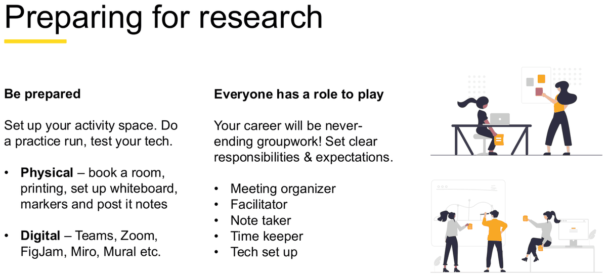
Be prepared (W10 s8)
"Set up your activity space. Do a practice run, test your tech."
- Physical — book a room, printing, set up whiteboard, markers and post it notes
- Digital — Teams, Zoom, FigJam, Miro, Mural etc.
Everyone has a role to play (W10 s8)
"Your career will be never-ending groupwork! Set clear responsibilities & expectations."
- Meeting organizer
- Facilitator
- Note taker
- Time keeper
- Tech set up
Set the scene (W10 s9)
- What are we trying to find out today?
- Get to know each other, who's who in the zoo?
- Clear agenda and instructions for activities
- Make everyone comfortable with sharing
Choose activities that can help you… (W10 s9)
Understand stakeholders — Business goals and metrics · Customer goals and attitudes
Understand the current experience — Current joys · Current pain points · What's on their wish list / crazy ideas?
Optional detail: five workshop facilitation tips and customer-workshop techniques
Five workshop tips (W2 s52): Design for the energy of the room · Set the pace · Create a safe space · Manage your energy levels, share the load · Have fun!
Techniques for Customers (W2 s56): Use warm-ups and icebreakers · Use a mix of individual work and discussion — "This helps avoid biases in the group and loud/outspoken members)" [sic] · Capture things on post it notes – and post them on the walls as you go · Promote standing · Use workshop templates · Avoid using business jargon.
An industry example (W2 s56): "Customer workshops have been used to help design credit card reward programs, pairing each customer with a designer for 2-3 workshop and visualizing initial ideas."
✗ Poor workshop instructions
"Activity 2: Dot voting. Participants vote on the problems. Output: the top problems."
Why it's poor: no instructions a participant could follow, no questions, no time allocation, no stated output format — the three things the tutor explicitly asked for are all missing.
✓ Improved workshop instructions
Activity 2 — Dot Voting (CHOOSE, #11) · 10 minutes
Instructions: "You each have three dots. Place them on the pain points that cost you the most time in a group assignment. You may put more than one dot on the same note."
Questions the facilitator asks: "Why did that one get your dots?" · "Is there a pain point here you expected to see and can't find?"
Time: 3 min silent voting, 7 min discussion of the top two clusters.
Expected output: a tally per cluster, plus one quote explaining each of the top two clusters.
Part C — Interview planning
Why 1:1 interviews
W2 s41: "1:1 interviews form the backbone of research and gathering customer insights. They help uncover a customer's (or potential customer's) thoughts, behaviours, motivations, and opinions." Advantages (s42): Personal; Easier for customer; Follow-up. Limitations (s42): Time; Training.
Question types — avoid and try
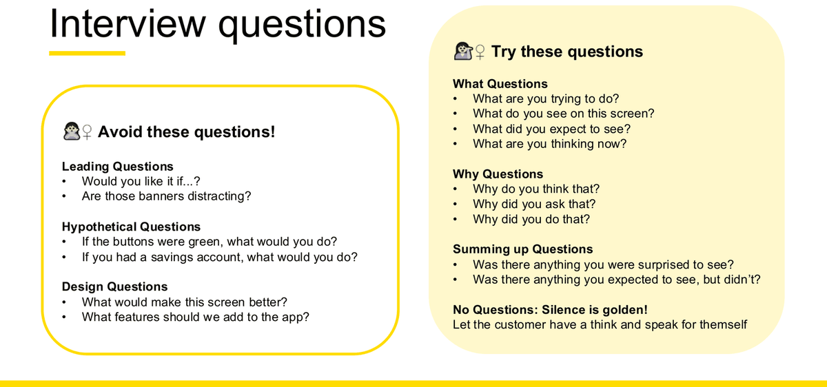
✗ Avoid these questions!
- Leading Questions — "Would you like it if...?" / "Are those banners distracting?"
- Hypothetical Questions — "If the buttons were green, what would you do?" / "If you had a savings account, what would you do?"
- Design Questions — "What would make this screen better?" / "What features should we add to the app?"
✓ Try these questions
- What Questions — "What are you trying to do?" / "What do you see on this screen?" / "What did you expect to see?" / "What are you thinking now?"
- Why Questions — "Why do you think that?" / "Why did you ask that?" / "Why did you do that?"
- Summing up Questions — "Was there anything you were surprised to see?" / "Was there anything you expected to see, but didn't?"
- No Questions: Silence is golden! — "Let the customer have a think and speak for themself"
The interview protocol — what the document must contain
W2 s47, "What Should An Interview Protocol Contain?"
- A heading
- Instructions to the interviewer (opening statements)
- The key research questions to be asked
- Probes to follow key questions
- Transition messages for the interviewer
- Space for recording the interviewer's comments
- Space in which the researcher records reflective notes
The discussion guide
Three principles (W2 s66, W7 s36)
- Make it clear
- Ensure inclusivity
- Keep it relaxed
Five writing tips (W2 s65): ensure a natural flow by visualising the discussion · start broad, move gradually to the specific · avoid repetition · tailor to your audience · treat it as a working document.
A real 60-minute guide (W2 s66, W7 s36)
- INTRODUCTION & WARM UP — 4 mins
- PARTICIPANT CONTEXT & BACKGROUND — 10 mins
- CURRENT STATE — 25 mins
- EXPLORING THE IDEAL EXPERIENCE — 20 mins
- THANK YOU & CLOSE — 1 min
Total 60 mins. Notice the shape: most time on the current state, then the ideal.
Running the session: Beginning / Middle / End
| Band | Step | What it is for |
|---|---|---|
| Beginning | Set the Ground Rules | Purpose, privacy, recording |
| Start Broad & Gather Context | Warm the participant up before the specifics | |
| Middle | Deep Dive into Areas of Interest | The core research questions |
| Exercises & Activities | Do something, not just talk | |
| End | Wind Down | Summing-up questions |
| Thank & Close | Close cleanly; confirm how data will be used |
Why the written guide never survives contact with a real interview
Week 2 slide 64 shows "What you'll write" as four neat sticky notes in a line, beside "What actually happens" as ten sticky notes in a tangle of arrows — and pairs it with Forming / Storming / Norming / Performing: "1. Forming – introductions, reassurance · 2. Storming – testing the boundaries, getting to know each other · 3. Norming – settling down, understanding the dynamic, becoming comfortable to share · 4. Performing – task orientated stage, cooperative." This is why the course calls a discussion guide "a working document".
Common mistakes in this chapter
- Giving participant criteria with no exclusion and no statement of sampling limitation. Both are prompted for on the course's own slide.
- Listing 4Cs activity names without saying what the facilitator would say, ask and how long it takes.
- Mixing the interview question taxonomy (Leading / Hypothetical / Design / What / Why / Summing up) with the survey taxonomy (Open / Closed / Likert).
- Mixing the workshop Beginning-Middle-End (s55) with the interview Beginning-Middle-End (s69).
- Naming a workshop type without matching it to the case — a kick-off workshop and a customer workshop answer completely different questions.
Synthesis, analysis and opportunity framing
"Synthesis & analysis" is on the Week 10 possible-topic list. This chapter is about one skill only: turning a pile of raw research into a defensible design direction. It is the difference between "users complained about X" and "therefore we should do Y".
Scope note — journey maps are excluded, this reasoning is not
Week 10 slide 13 excludes personas and journey maps from the exam. This chapter therefore does not teach how to construct either. But Week 10 slide 27 itself walks pain points → How Might We, and the Group Assignment brief names affinity mapping and How Might We statements as the synthesis techniques. Pain points, joys, needs, insights, opportunities and HMW are all in scope; the artefact that used to hold them is not. Where a definition of "pain points" comes from a journey-mapping slide, that is flagged below.
The three sensemaking steps
Everything in this chapter sits inside one of three named steps. Getting these three right, with their definitions, gives any synthesis answer a correct spine to hang the detail on.
| Step | Course definition (verbatim, Week 3 slide 18) | Methods that sit here (Week 3 slide 19) |
|---|---|---|
| Analyse | "Analysis is a process of inspecting, cleansing, transforming, and modelling data with the goal of discovering useful information, informing conclusions, and supporting decision-making." | Affinity mapping · Triangulate |
| Synthesize | "Synthesis is the process where we bring our research ideas together to form a fundamental understanding. In our context, this will help us to understand the problems our users are facing so we know why we're building a specific product." | Personas · Journey mapping both excluded from the exam |
| Frame & Focus | "Framing is the process of structuring insights or problems details in a digestible and collaborative way. By looking at it differently, we can then begin to ideate and solve for the correct problem." | Problem framing · Prioritization |
Note the scope consequence: the two methods the course places under Synthesize are both excluded from the exam. In an exam answer, take the Analyse step (affinity mapping, triangulation) straight through to Frame & Focus (problem statements, HMW, prioritisation).
What to look for when you start
Week 3 slide 15: "Look for themes and trends that will help you make decisions and inform design direction:"
The IRA test — what makes an observation an insight
Definitions
Data insights (s16): "knowledge that a company gains from analyzing sets of information pertaining to a given topic, situation or phenomenon. Analysis of data provides insights that help businesses make informed decisions, reducing risks."
Insight (s16): "Insights are groupings of observations that bubble up into a clear theme that is IRA: Interesting, Relevant, Actionable."
The three tests (s17)
- Interesting — "What about your observation is interesting; how did the users perspective change yours?"
- Relevant — "Though your observation may be interesting, is it useful in answering your research questions or explaining something further"
- Actionable — "How is this observation going to be used to change a behaviour? Does it provide some new thinking or certainty in our knowledge of an area?"
Affinity mapping
The most detailed method in Week 3, and the one the Group Assignment brief names explicitly.
The three moves (s21)
Why it matters (s21): "Distil - Used to distil patterns and useful insights from many individual quotes and data points you gather through interviews and observations"; "Visualize - useful visual reference or tool for communicating your research with a larger team"; "Evolution - Based on the KJ Method – Jiro Kawakita".
Why it's important (s21): Sort & organize design research · Identify themes and pain points · Communicate observations to broader audience
The four steps (s22)
- Create one insight per Post-it note (an observation, a quote or a behaviour)
- Organize the insights into categories related to the problem (not by solutions)
- Group and title each category based on the theme they represent
- Map the themes and discuss findings as a group
Step 2's parenthetical is the most commonly-missed nuance in the whole method. You group by problem, never by the solution you already have in mind.
Best practices (s25)
- Silence — "Do your initial groupings as a team but in silence"
- Team — "Any grouping that the entire team can't abide by should be reorganized"
- Timebox — "Set a time for participants to complete the exercise"
Grouping size rules (s27)
- < 3 Data Points — Too Small → "Consider folding into other groupings."
- > 10 Data Points — Too Big → "Consider breaking into other, smaller groupings."
- 1 Data Point — Too Few → "Groupings should have data from at least 2 users."
Quotable numbers. A cluster built from one person is one person's opinion, not a theme.
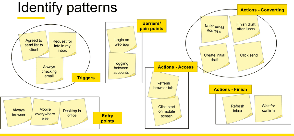
A worked cluster title, from the lecturer's own exercise (s26–27)
Raw data points: "Eats junk food every day" (User 1) · "Often eats at fast food restaurants" (User 3) · "Prefers work over social life" (User 3)
Theme title: "My priority is work over my health right now" — a first-person statement of the user's stance, not a category noun. Two other themes from the same exercise: "I am a multi-tasker" and "Payment preferences".
When to stop
Four signals (s30)
- Increasingly granular insights
- Feeling anxious about elaborating the design concept
- Impatience to flesh out details
- No new insights — "This is the surest sign discovery has come to an end for now."
Why this is worth citing
Most students can say "do research". Very few can say when research should stop. Quoting "no new insights" as the surest sign is a concise, distinctive sign of understanding in any question about the discovery process.
Problem framing
Definition (s56): "Problem statements tell your team what needs to be fixed – for example, highlighted the pain points, obstacle, or tension that prevents people from accomplishing their goals. They also provide a framework for evaluating ideas, allowing you to ask the question 'Does my concept solve the problem?'"
The slide also notes: "Crafting the right level of statement can take time. It's a matter of going Too Broad, then Too Narrow – and finally finding a statement that feels just right!"
The five Ws
| W | Course wording (verbatim, Week 3 slide 56) |
|---|---|
| What | "Begin with a clear, brief statement of the problem. In 1-3 sentences, explain exactly what the issue is and how it affects the company." |
| Where | "Explain what sector of your business the problem is affecting and whether it has triggered related problems." |
| Who | "Name the stakeholders whose goals are impeded by the specific issue at hand." |
| When | "Lay out the timeframe during which the problem has existed." |
| Why | "Articulate why this problem matters, and why it prevents the company from moving forward toward its goals." |
Two problem-statement syntaxes
User Story Based
Stanford D's School Design Thinking Format [the slide prints "Desian"]
I am a … / Trying to… / But… / Because … / Which makes me feel …
Worked example (s58): "I am… a tired mum of 3 who is / Trying to… prepare the kids for school tomorrow / But… I have run low on milk and cereal / Because… I forgot to pick it up in store (in a rush!) / Which makes me feel… like a failure as a mum!"
Job Story Based
Alan Klement's Job Story
When … / I want to … / So I can … / But …
"By adding a single word, 'But,' to the end of the Job Story format, the problem space can be introduced."
Worked example (s58): "When… I realise I need milk for morning breakfast / I want to… get this delivered to my kitchen table by 6.30am / So I can… get start with the most important meal of the day, like a boss / But… stores closed, too far to walk in rain, too expensive, don't have time, etc"
Six problem-framing traps
| Trap | Description (verbatim) | Healthcare example (verbatim) |
|---|---|---|
| Anchoring | Positions the problem in terms of an existing idea for a solution | "Healthcare providers need a guide to new regulations so they know how it affects their jobs" |
| Wish Listing | Describes the problem as a set of desired features | "Healthcare provides need a guide to regulations, reminders to check in with patients, suggestions on how to deal with particular conditions." [sic] |
| Frankenstein | Smushes two or more existing products together to imply a novel solution | "Healthcare providers need a Facebook Group & Salesforce" |
| Boiling the ocean | Suggests that a single problem is really the amalgam of many, many different problems | "Healthcare providers need a shared calendar, to do list, contact list and medical encyclopedia." |
| Amplifying feedback | Focusing on a specific message from a non-representative group of users | "Healthcare providers need a guide to Obamacare, because some mentioned they're confused by how it affects their job" |
| Being presumptuous | Makes assumptions about how people will behave, especially with respect to the product | "Nurses will use the software to record every check-in with patients immediately following the check-in" |
How Might We statements
Definition (s60): "How Might We statements are a specific way to reframe a problem and 'turns challenges into opportunities for design'. We use the How Might We format because it suggests that a solution is possible and because they offer you the chance to answer them in a variety of ways. It doesn't suggest a particular solution."
The four-step how-to (verbatim, Week 3 slide 60)
- "Start by looking at the insight statements that you've created. Try rephrasing them as questions by adding 'How might we' at the beginning."
- "The goal is to find opportunities for design, so if your insights suggest several HMW questions that's great."
- "Take a look at your HMW question and ask yourself if it allows for a variety of solutions. If it doesn't, broaden it."
- "Make sure that your HMWs aren't too broad… a good HMW should give you both a narrow enough frame to let you know where to start your brainstorm, but also enough breadth to give you room to explore wild ideas."
Weak and strong HMW statements — the course's own examples
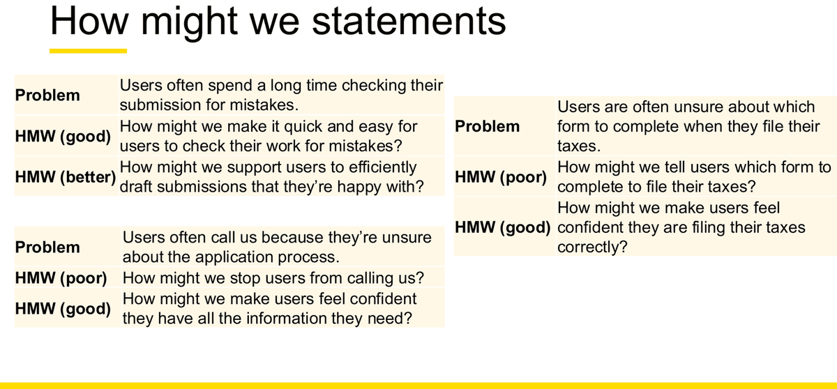
| Problem | Weaker HMW | Stronger HMW |
|---|---|---|
| "Users often call us because they're unsure about the application process." | Poor: "How might we stop users from calling us?" Frames the business's annoyance as the problem. |
Good: "How might we make users feel confident they have all the information they need?" Frames the user's desired state. |
| "Users are often unsure about which form to complete when they file their taxes." | Poor: "How might we tell users which form to complete to file their taxes?" "Tell users" is the solution — it forecloses every other answer. |
Good: "How might we make users feel confident they are filing their taxes correctly?" |
| "Users often spend a long time checking their submission for mistakes." | Good: "How might we make it quick and easy for users to check their work for mistakes?" Fine, but still locked to the checking mechanic. |
Better: "How might we support users to efficiently draft submissions that they're happy with?" Widens the frame past the immediate mechanic — the change from checking to drafting opens a whole new solution space. |
The three tests you can apply to any HMW in an exam
- Whose problem is it? If the statement describes something that annoys the business, rewrite it as the user's desired state.
- Is the solution already inside the sentence? Verbs like "tell", "notify", "add a dashboard" are solutions. Replace them with the outcome the user wants.
- Could this be answered five different ways? If only one design answers it, it is too narrow. If it could be answered by anything at all, it is too broad.
Tests derived directly from Week 3 slides 60–61. A useful sentence pattern that satisfies all three: "How might we help [who] [achieve outcome] without [the burden we must not create]?"
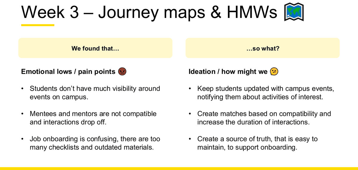
The Week 10 pain-point → HMW worked examples
| We found that… (emotional lows / pain points) | …so what? (ideation / how might we) |
|---|---|
| Students don't have much visibility around events on campus. | Keep students updated with campus events, notifying them about activities of interest. |
| Mentees and mentors are not compatible and interactions drop off. | Create matches based on compatibility and increase the duration of interactions. |
| Job onboarding is confusing, there are too many checklists and outdated materials. | Create a source of truth, that is easy to maintain, to support onboarding. |
Prioritisation
Definition (s63): "Prioritizing gives you another way to look at your data: elevating the important ones. Prioritization activities need criteria. Prioritization is not an exact science."
Worked criteria (s63): given the framing question "Given our budget and timeline, what features can we build before the end of the calendar year?" — Strong demand by users identified by user research · Close alignment with project goal · Low cost to build and deploy · Supports organizations ability to deliver to strategic goal. The slide notes these can prioritise problem spaces, solution or feature ideas, or early concepts.
Two prioritisation matrices, taught back to back with different axes — do not conflate them
Matrix 1 — Impact × Importance (s64)
Impact = benefit to the customer. Importance = benefit to the business. Score each 1–5.
Four steps: draw the axes → assign Impact and Importance 1–5 → plot and "hone in-on features landing in top-right quadrant" → discuss as a group, "Focus on 1-2 and get ready to frame your next step."
Zone labels: IGNORE THIS STUFF COMPLETELY / STRONGLY CONSIDER ACCOMMODATING THIS STUFF / INCLUDE OR DIE.
Matrix 2 — Impact × Effort (s65)
Factors: Effort – how difficult it is to build; Customer Value – how satisfied will our customers be; Business Value – how much will it help meet our project or strategic needs.
Quadrants: High Impact + Low Effort = Start Here · High Impact + High Effort = Do Next · Low Impact + Low Effort = Proceed Carefully · Low Impact + High Effort = Avoid. The slide prompts: "Remind you of DVF?"
Named alternatives (s66–67)
- MoSCoW Method — Must / Should / Could / Won't. "Each feature is assigned a priority label based on its relative importance."
- Measuring Level of Effort — T-Shirt Sizing (XS, S, M, L, XL) · Pebble, Rock, Boulder
- Drafting dots and M&Ms — "Prioritising ideas during design studio - eat after best ideas are selected!"
- Feasibility scoring (s67) — score each feature on Technical Feasibility, Design/UX Feasibility, Impact on User, Impact on Business, against a capped budget. Technical feasibility = "the formal process of assessing whether it is technically possible to manufacture a product or service"; Design feasibility = "a validation process that looks at how well a design delivers to requirements, objectives and goals". no calculations in the exam — describe the criteria and the trade-off, do not compute scores.
Assumptions and hypotheses in synthesis
Synthesis is where assumptions become explicit. Week 7 slide 21 lists the three assumptions to write down before designing anything: User understanding of design concepts · Relevance / appeal of features and functions · Types of users who may find this valuable etc. Week 7 slide 39 makes it a bias-control step: "Note down your assumptions beforehand." The hypothesis that follows from an assumption is covered in Chapter 10.
Common mistakes in synthesis answers
- Listing findings without the "so what?" The course's own answer format is a two-column table: "We found that… / …so what?" Never write only the left column.
- Grouping by solution instead of by problem. Step 2 of affinity mapping says "(not by solutions)" for a reason: clusters named "Notifications" or "Dashboard" have already decided the answer.
- Naming a cluster after a feature rather than after a user experience or stance.
- Treating one participant's comment as a theme. The course's rule is data from at least 2 users per grouping.
- Writing a HMW that contains its own solution. The commonest single error, and the one the course explicitly contrasts on slide 61.
- Prioritising without stating criteria. "Prioritization activities need criteria" is on the slide.
- Confusing the two matrices. Impact/Importance is customer vs business; Impact/Effort is value vs cost. Getting Impact and Importance the wrong way round is an easy, avoidable error.
Heuristics evaluation
Named on the Week 10 possible-topic list under "P&P tasks", and Week 10 devotes two whole slides (25–26) to it. It was also the Week 1 preparation task. Of all the possible topics, this is the one with the strongest evidence of being examined.
Read this before anything else: these are not Nielsen's heuristics
The course uses its own set of five, assembled from three different authors. Week 1 slide 35 is titled "Combining 5 heuristics for INFS3700" and colour-codes each heuristic to its source:
- Alan Cooper — "Software should be polite" → heuristics 01 and 02
- Jakob Nielsen — Usability Heuristics → heuristics 03 and 04
- Steve Krug → heuristic 05
Writing "Nielsen's five heuristics" would be factually wrong against the slide. Nielsen's own ten are taught separately (Week 1 slide 31) and only two of them feed this set.
The five INFS3700 heuristics
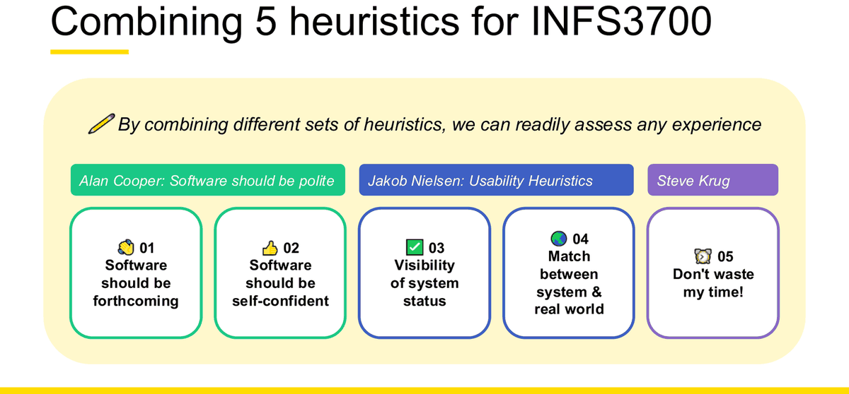
| # | Name (Week 1 s35) | Positive framing (Week 10 s25 / Week 5 s51) | Negative framing (Week 10 s26 / Week 5 s52) | Definition and course example |
|---|---|---|---|---|
| 01 Cooper |
Software should be forthcoming | Software is forthcoming → "It is proactive with helping users" |
Software is not forthcoming | W1 s36: "A good example of software that is forthcoming is Google Maps. When you're navigating to your destination, Maps automatically informs about road congestion up ahead and even suggests an alternative route, if one is available!" |
| 02 Cooper |
Software should be self-confident | Software is self confident → "It speaks for itself and doesn't need further explaining" |
Software is not self confident | W1 s37: "You can assign work to them and expect that they will complete it without bothering you again and again asking for unnecessary details. Applications should follow Gmail's lead, skipping confirmations and offering a quick undo option." |
| 03 Nielsen |
Visibility of system status | Software has visibility of status → "Keeps users informed and sets expectations" |
Software lacks visibility of status | W1 s38: "Systems should constantly keep users informed about the system's state by giving clear, appropriate, and timely feedback. Some examples: Progress bars; Success and error states." Slide shows 'Syncing 5 of 21', 'Processing uploaded file…', 'Uploading: 77%'. |
| 04 Nielsen |
Match between system & real world [s39 spells "and"] |
Software is matched to real world → "It is based on every day objects and language" |
Software is not matched to real world | W1 s39: "The system should speak the users' language, with words, phrases and concepts familiar to them, rather than system-oriented terms. Some examples: Icons based on everyday objects; Using everyday language over jargon." Slide shows the recycle-bin icon beside a photo of a real bin, plus floppy-disk Save, printer Print, magnifier Search, house Home. |
| 05 Krug |
Don't waste my time! [s40 drops the "!"] |
Software doesn't waste your time → "Provides key information to help make decisions" |
Software wastes your time | W1 s40: "Help a user make their decision! Don't overwhelm them with options and don't mislead them. Give them the key information that they need and help them complete their task with ease." Slide shows a three-tier pricing page with one call-to-action per tier. |
The two framings — and why both matter
Week 10 gives you the same five heuristics twice: once as a positive finding with a "so what?", and once flipped negative with the instruction "Have a go at the flip side and give recommendations". That is the exam task.
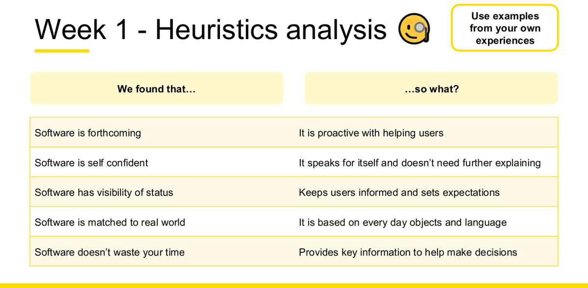
Working each heuristic in an exam
For each heuristic below: what to look for, why it matters, a positive example, a negative example, the recommendation, and a short case-study answer you could write under time pressure.
01 · Software should be forthcoming
| Definition | The system is proactive with helping users — it volunteers what you need before you have to ask. |
| Evidence to look for | Does the product warn you about something ahead? Does it suggest the next step? Does it surface relevant information without being asked? Or does it wait silently for you to discover a problem yourself? |
| Why it matters | Users cannot act on information they do not have. A system that only answers direct questions pushes the whole cognitive load onto the user. |
| Positive example | Google Maps warning about congestion ahead and offering an alternative route (course example, W1 s36) |
| Negative example | A booking site that only reveals a booking fee at the final payment screen, having said nothing on any earlier step. |
| Recommendation | Surface the constraint at the moment the user makes the relevant choice, not at the end — e.g. show the total including fees on the results list, not only at checkout. |
Model sentence: "The site is not forthcoming: the booking fee is disclosed only on the final payment screen, so users choose a flight on a price that changes at the end. This wastes the effort of comparing options and damages trust at the moment of payment. I would display the fee-inclusive total on the results list so the comparison is honest at the point the decision is actually made."
02 · Software should be self-confident
| Definition | The system speaks for itself and doesn't need further explaining. It gets on with the job instead of asking for reassurance. |
| Evidence to look for | Confirmation dialogs on low-risk actions. Tooltips and help text propping up unclear labels. Onboarding tours explaining an interface that should be self-evident. Repeated "Are you sure?" prompts. |
| Why it matters | Every confirmation is an interruption. The course's own remedy is structural: act immediately, and offer undo instead of asking permission. |
| Positive example | Gmail sending immediately and offering "Message sent — Undo" (course example, W1 s37) |
| Negative example | A form that asks "Are you sure you want to save?" every single time you save. |
| Recommendation | Remove the confirmation on reversible actions and replace it with an undo affordance; keep confirmations only where the action is genuinely destructive and irreversible. |
Model sentence: "The interface is not self-confident: it interrupts a reversible save with a confirmation dialog, so a routine action costs two clicks and a decision. Following Gmail's pattern, I would save immediately and offer an undo, reserving confirmation for genuinely destructive actions."
03 · Visibility of system status
| Definition | The system keeps users informed and sets expectations through clear, appropriate and timely feedback. |
| Evidence to look for | Progress bars, spinners with a stated stage, "5 of 21" counters, success and error states, saved/unsaved indicators, queue positions, estimated times. |
| Why it matters | Without status the user cannot tell "working" from "broken" and will re-click, refresh, or abandon. |
| Positive example | "Syncing 5 of 21", "Uploading: 77% — Example Data.csv" (course example, W1 s38) |
| Negative example | A payment screen that greys out for 20 seconds after "Pay" with no spinner and no message. |
| Recommendation | Show an immediate state change on submit, a determinate indicator with the current step, and an explicit success or failure state at the end. |
Model sentence: "The checkout lacks visibility of status: after pressing Pay the screen is inert for roughly twenty seconds with no indicator, so users cannot distinguish processing from failure and some press Pay again, risking a double charge. I would show an immediate disabled-with-spinner state naming the step ('Confirming payment…') and a clear success or failure screen."
04 · Match between system & real world
| Definition | The system speaks the users' language and is based on every day objects and language, not system-oriented terms. |
| Evidence to look for | Internal jargon or database terms in the UI ("entity", "record ID", "SKU"), error codes shown to end users, icons that only make sense to the development team, menu labels that mirror the org chart rather than the task. |
| Why it matters | Users navigate by recognising concepts they already own. Jargon forces translation, and translation causes errors. |
| Positive example | The recycle-bin icon; floppy disk for Save; magnifier for Search (course example, W1 s39) |
| Negative example | A university portal labelling a class list "Enrolment Entity Extract" and reporting failures as "Error 0x80070005". |
| Recommendation | Rename against the words users actually use — the course's own method for finding those words is a card sort (open, then a second closed round). Replace codes with plain-language messages that say what happened. |
Model sentence: "The portal is not matched to the real world: 'Enrolment Entity Extract' is a database term, not a student's term, so users cannot find their class list without help. I would relabel using students' own vocabulary, validated through an open card sort followed by a closed round."
05 · Don't waste my time!
| Definition | "Help a user make their decision! Don't overwhelm them with options and don't mislead them. Give them the key information that they need and help them complete their task with ease." |
| Evidence to look for | Too many choices at once; information the user needs to decide with hidden behind another click; repeated data entry; steps that exist for the business rather than the user. |
| Why it matters | The course pairs this with Hicks Law: "the more choices you present your users with, the longer it will take them to reach a decision" (W4 s32). |
| Positive example | A three-tier pricing page with a clear feature list and one call-to-action per tier (course example, W1 s40) |
| Negative example | A signup flow that asks for address and payment details before the user has seen what the product costs. |
| Recommendation | Cut the decision down to the information that actually differentiates the options, and defer any data collection until after the user has committed. |
Model sentence: "The signup flow wastes the user's time: it collects address and payment details before showing the price, so users invest effort in a decision they have not yet been able to make. I would show the tiered comparison first with one call to action per tier, and collect details only after a plan is chosen."
How to structure a heuristic evaluation answer
✗ Weak heuristic finding
"The site has bad visibility of system status. It should be improved so users know what is happening."
Why this answer is incomplete: no evidence, no user consequence, and the "recommendation" just restates the heuristic. Any product could be described this way.
✓ Strong heuristic finding
Finding: the checkout lacks visibility of system status. Evidence: after pressing "Pay", the screen is inert for roughly twenty seconds with no spinner, message or step indicator. User impact: users cannot tell processing from failure, so several press Pay a second time. Business impact: duplicate submissions and avoidable support contacts at the highest-value moment in the funnel. Recommendation: disable the button on submit and show a determinate indicator naming the current step ("Confirming payment…"), followed by an explicit success or failure state.
Optional detail: the other heuristic and principle sets taught in Week 1
Week 1 teaches three external sets before combining them into the course's five. You will not be asked to reproduce all of them, but knowing where the five come from is exactly the kind of precision that separates answers.
What a heuristic is (W1 s30) — four descriptors: "Characteristics of best practice · Criteria to measure against · Rules of thumb · Principles to follow". Why heuristic evaluation matters (W1 s30): quickly perform an evaluation; standardise evaluations of new and existing websites/apps; refine UX skills.
Jakob Nielsen – 10 Principles (W1 s31)
- Visibility of System Status
- Match Between System & Real World
- User Control And Freedom
- Consistency And Standards
- Error Prevention
- Recognition Rather Than Recall
- Flexibility And Efficiency of Use
- Aesthetic And Minimalististic Design [sic]
- Help Users With Errors
- Help And Documentation
The lecturer uses shortened names for #2 and #9. Reproduce the slide's wording; do not substitute Nielsen's longer canonical phrasings.
Steve Krug – 8 Principles (W1 s33)
- First law of usability - don't make people think
- Design for scanning, not reading
- Make clicks mindless
- Less is more
- Help users to easily navigate
- Don't argue but test
- Usability testing - do it regularly
- Increase your Reservoir of Goodwill
Framing on the slide: "Don't make things difficult for a user." Principles 6 and 7 are directly quotable justifications for Chapter 10.
Donald Normans – 7 Stages of Action (W1 s32). Careful: the course presents these as seven questions, not as Norman's canonical named stages. Reproduce the questions: 1. What do I want to accomplish? 2. What are the alternative action sequences? 3. What action can I do now? 4. How do I do it? 5. What happened? 6. What does it mean? 7. Is this okay? Have I accomplished my goal? The slide maps them onto deleting emails in a mobile email app.
Natural Mapping and Perceived Affordances (W1 s34) — two definitions worth memorising because they bridge into Chapter 8:
Natural Mapping = "A natural arrangement of controls and their outcomes to the real world." Example: cooktop knobs — "Smaller hobs for smaller pots, but also each knob relates to the position of each hob, going from Bottom-Left to Bottom Right."
Perceived Affordances = "The actions the user perceives as being possible based on how an object is presented." Example: "In a normal room, a chair affords 'sitting on'. However in a burning room, a chair could be used to smash the window for you to get out."
Where heuristics evaluation fits in the process
Week 10 slide 6 places it inside current-state analysis, at the very start of a project: "What is the existing experience like? How will it perform in a heuristics analysis?" That makes it a Discover-stage method requiring no participants — a genuine advantage worth stating whenever a case gives you an existing product and limited time. Week 1 slide 19 also lists "Heuristic Evaluation" under the Usability competency.
Common mistakes
- Calling the five "Nielsen's heuristics". Only 03 and 04 are Nielsen's; 01 and 02 are Cooper's and 05 is Krug's.
- Listing the five names and stopping. The Week 10 slide gives a "so what?" for every one — that column is the half most answers leave out.
- Giving a generic example ("a website I once used") instead of a specific observable behaviour.
- Recommending "improve the design" instead of naming a concrete change.
- Evaluating against principles from Chapter 8 and calling them heuristics. They are two separate sets taught in two different weeks — see the comparison at the top of Chapter 8.
Design principles
Named on the Week 10 possible-topic list, given two whole Week 10 slides (28–29), and the subject of the Week 4 P&P task: "Provide examples of the 5 Design Principles in the real world using everyday objects." Like the heuristics, this is a five-item list you must be able to reproduce exactly.
Heuristics vs design principles — two different five-item lists
Both are five items. Both get a "We found that… / so what?" slide in Week 10. They are not the same thing, and swapping them answers a different question from the one asked.
| Heuristics (Week 1) | Design principles (Week 4) | |
|---|---|---|
| Purpose | Criteria you evaluate an existing experience against | Rules you design by |
| Subject of the sentence | "Software is forthcoming…" | "Design is perceivable and predictable…" |
| Source | Combined from Cooper, Nielsen and Krug | The course's own list, unattributed on the slide |
| The five | forthcoming · self-confident · visibility of system status · match between system & real world · don't waste my time | perceivable and predictable · consistent and conventional · use natural affordances · provide feedback · provide constraints |
| Where used | Current-state analysis, Discover | Designing and critiquing a solution, Develop |
The five design principles
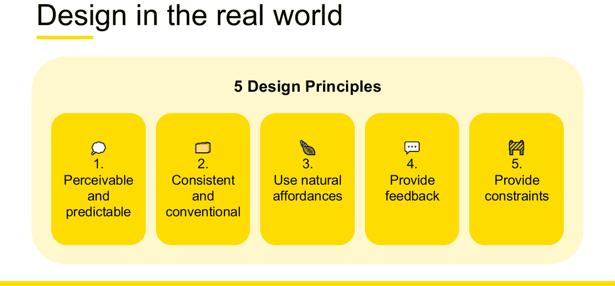
| # | Principle | "…so what?" — the user consequence (Week 10 s28) | Meaning, in the course's own words |
|---|---|---|---|
| 1 | Perceivable and predictable | "Information is grouped well and actions are clear" | Components listed on W4 s9: Chunking (input groups) · Field labels · Alignment · Call to action · Visual hierarchy. Each of these is then taught in its own right in section 04.2. |
| 2 | Consistent and conventional | "Users understand that things behave in the same way" | W4 s10: "Design consistency is about making elements uniform — having them look and behave the same way." / "Design conventions are models that govern the look and feel." Three types (s16): Visual consistency (elements, fonts, colours, experience) · Functional consistency (similar controls and predictability, e.g. all buttons greyed when hovered) · Following platform conventions (e.g. sliders for volume, switches for on/off). Slide tagline: "Consistency breeds familiarity & trust". |
| 3 | Use natural affordances | "Users don't have to guess how to interact with it" | W4 s11: "Affordance is a property or feature of an object which presents a prompt on what can be done with the object." Illustrated with "Push or Pull?" doors, captioned Norman's Doors, beside the cover of The Design of Everyday Things. |
| 4 | Provide feedback | "Users are aware of the status and any actions required" | W4 s12: "Good interaction design and good UX will always require some feedback: Obvious · Visible · Understandable reactions from the UI or the device." |
| 5 | Provide constraints | "Users know what they have to choose from" | W4 s13: "Constraints limit the number of choices a user can choose to act upon." |
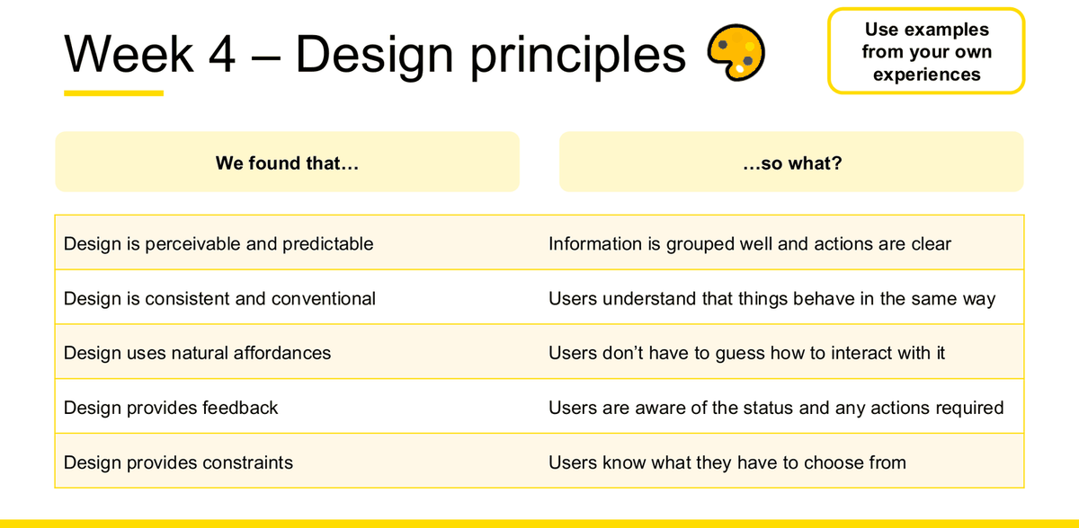
Each principle, worked for the exam
| Principle | Evidence of compliance | Evidence of violation | Everyday-object example (the P&P task format) | Recommendation pattern |
|---|---|---|---|---|
| Perceivable and predictable | Related fields grouped under headings; labels above inputs; a single obvious primary action; clear size/weight hierarchy so the eye lands on the most important thing first. | One undifferentiated column of fields in no logical order; no headings; two equally-weighted buttons; body text the same size as headings. | A measuring cup with printed volume markings. "The printed lines let you see the exact amount of liquid while you pour. As the level rises you can predict when to stop, so you are not guessing. The key info stays visible at the same moment you are doing the action." student example | Chunk the fields into named groups that match the user's mental model, and give the screen one visually dominant primary action. |
| Consistent and conventional | The same control looks and behaves identically everywhere; the platform's own patterns are followed (iOS vs Android navigation); one visual language across screens. | Primary buttons in three different colours; a back gesture that works on one screen and not another; a custom control replacing a standard one for no reason. | A volume knob that turns clockwise to increase volume. "Most speakers and amps use the same pattern… Because the convention is familiar you do not need instructions on a new device." student example | Adopt the platform convention rather than inventing a control, and unify the button/label system across all screens. |
| Use natural affordances | The shape of the control tells you what to do with it — a raised button looks pressable, a handle looks pullable, a slider looks draggable. | Flat text that is actually a link; a card that looks tappable but isn't; a door with a handle you must push. | Scissors with finger holes and cutting blades. "The two holes show where your thumb and fingers are meant to go. The blades point out the cutting direction without any label. The shape alone tells you how to hold it and how to use it." student example | Give interactive elements a visual form that matches their behaviour, and remove that form from anything non-interactive. |
| Provide feedback | An immediate reaction to every action; state changes that are obvious, visible and understandable; success and error states with a next step. | A button that looks identical before and after being pressed; a silent save; a failure that produces nothing at all. | An electric kettle's indicator light and click-off. "The indicator light comes on to show it has started heating. The click sound when it switches off tells you the water has boiled. So you get clear confirmation of both the start and the end of the action." student example | Confirm the action at both ends — an immediate acknowledgement on press and an explicit completion state — using more than one channel where the environment is noisy. |
| Provide constraints | Choices limited to what is valid; a date picker instead of a free-text date; inline validation before submit; the wrong option physically impossible. | Free-text where only four values are valid; validation only on submit, after the whole form is filled; destructive and safe actions side by side and identical. | An AA battery compartment. "The spring end lines up with the flat negative side of the battery. The raised positive terminal matches the bump on the other end. These shapes make it hard to put the battery in the wrong way." student example | Replace free entry with a constrained control, and validate at the field rather than at the end of the form so the error is fixable in place. |
WEEK4\pic\). Each has been checked against the Week 4 slide definitions and is consistent with them — the battery example in particular is a textbook physical constraint, matching the lecturer's own elevator-keypad and multi-select-dropdown examples on W4 s13. The compliance / violation / recommendation columns are compiled from W4 slides 9–16, 27–31.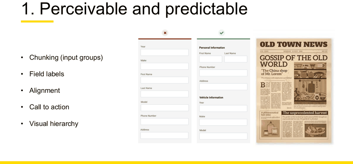
Applying the "We found that… so what?" logic
Week 10 slides 28–29 model the exact sentence shape the exam wants. Build every principle-based critique as a three-part move:
✗ Weak
"The form doesn't follow the design principles. It is confusing and should be made more consistent and easier to use."
Why this answer is incomplete: no named principle, no observed evidence, no user consequence, and a recommendation that is a wish rather than a change.
✓ Improved
We found that the design is not perceivable and predictable: the quote form lists Year, Make, First Name, Last Name, Model, Phone Number and Address in one unlabelled column, so personal and vehicle details are interleaved.
So what? Users have to re-read the whole column to work out where they are, and switching between two mental contexts mid-form is where they abandon it.
It also fails to provide constraints: Year is a free-text field, so "2O21" is accepted and only rejected after submit.
Recommendation: chunk the fields under "Personal Information" and "Vehicle Information", place labels above their inputs, and replace the free-text Year with a constrained picker validated inline.
The second layer: digital UX design principles
Week 4 section 04.2 expands principles 1 and 2 into a set of named digital concepts. These are all fair game — the Week 4 P&P and tutorial both drew on them.
| Concept | Slide tagline | Course definition (abbreviated where marked …) |
|---|---|---|
| Page elements (s15) | "The Lego blocks of the interface" | Textbox (empty boxes for strings of text; field validation can be applied) · Checkbox (yes/no Boolean response capture, multi selection) · Radio buttons (yes/no Boolean, single selection) · Dropdown (select items(s) from a predefined list) · Buttons (primary or secondary calls to action) · Headings (provides label and hierarchy for the different sections on a page) |
| Sensory appeal (s20) | "What is beautiful, is usable." | "if we design for a multi sensory experience, then we can increase the effectiveness of the overall experience. This means using sound, colour, imagery and touch… There is also some research to suggest that things that 'look good' are often perceived to perform better." |
| Anchoring (s22) | "Reduce cognitive load by creating a focus" | "A psychological principle which can impact how people perceive value and make decisions… People tend to focus on a single, initial piece of information, which influences how they estimate value and make subsequent decisions." Example: a Mailchimp pricing page anchored by a $299/month Premium tier beside $14.99, $9.99 and Free. |
| Chunking (s23) | "Grouping like elements" | What: "originates from the field of cognitive psychology… break their text and multimedia content into smaller chunks to help users process, understand, and remember it better." Why: "Our brain can hold and process approximately 7 (+- 2) pieces of information at a time." How: "breaking up and presenting content into small, distinct units of information (or 'chunks'), as opposed to presenting an undifferentiated mess of atomic information items." Cited on the slide: "How Chunking Helps Content Processing, NNG (2018)". |
| Visual hierarchy (s24) | "Flow, with importance" | "how UX designers transmit to users the importance of elements within the product. Having a good hierarchy helps users' eyes move across the interface and immediately understand the bits that are most important as well as how those relate to the others. Closely linked to layout design…" |
| Two Viewing Patterns (s26) | "Flow, with importance" | The slide shows two unnamed scan-path overlays on a news site and a streaming landing page. The slide itself does not name either pattern. transcript-derived But the lecturer does name the first one out loud: "there are two different distinct, uh, viewing patterns. Um, so one is F pattern and one is that, uh, pattern… Not literally FF but uh the shape looks going down from top to to bottom… in the F pattern, user first read horizontally, usually across the top of the content… before moving down slightly again." So F pattern is safe to use. The second pattern's name is lost in the automatic transcription and is not confirmed as "Z pattern" by any source in this folder — describe it instead. Lecture transcript clarification — lecture transcript\wk4.txt, SPEAKER 0 (lecturer), anchor "one is F pattern and one is that". |
| Label alignment (s27) | "Make it scannable" | Rules: "Usually left-aligned, but… · Sometimes inline · Keep it short · Be consistent". Do = labels above inputs, left-aligned; Don't = labels beside inputs on the same line. Cited: "UX Movement - Form Scanning (2000)". |
| Error handling (s28–30) | "Supporting users when things go wrong" | See the annotated pair below. |
| Call to Action (CTA) (s31) | "Bringing to attention the user's next step" | "an interactive UI element both web and mobile. Its major aim is to induce people to take certain actions that present a conversion…" Checklist: CTA affords clicking · Be large enough to click (Fitts Law) · Use proper contrast, colour & size for emphasis · Clear, verb orientated label – few words only · Provide alt text (or additional instruction) · Test and iterate |
Error handling — the annotated good/bad pair
✗ Four anti-patterns (W4 s29)
"Whoops! Something went wrong / The third-party you're trying to connect to isn't responding, so we can't fetch your data. Try again later. [Close]"
- Inappropriate tone
- Passing the blame
- Technical jargon
- Generic
✓ Five best practices (W4 s30)
"Unable to connect your account / Your changes were saved, but we could not connect your account due to a technical issue on our end. Please try connecting again. If the issue keeps happening, contact Customer Care. [Cancel] [Try Again]"
- Say what happened
- Say why it happened
- Provide reassurance
- Give them a way out
- Help them fix it
Help users with Errors (W4 s28): Clear next steps — "Short, but detailed error messages" · Offer alternative path — "Instructs the user exactly how to resolve issue" · Polite Tone — "Error codes are not user friendly".
Design should also prevent issues from occurring (W4 s28): "White space between cancel and save buttons · Delete and save buttons should be easily distinguishable and far apart · Including validations before submitting a form." — note this is error prevention through constraints, i.e. principle 5 doing the work of principle 4.
Three named laws
Hicks Law
"A simple idea that says that the more choices you present your users with, the longer it will take them to reach a decision."
Jakob's Law of the Internet User Experience
"Users spend most of their time on other sites. This means that users prefer your site to work the same way as all the other sites they already know."
Fitts Law
"The time to acquire a target is a function of the distance to and the size of the target."
Optional detail: information architecture and navigation (Week 4, section 04.3)
Information architecture (s34): "the way we arrange the parts of something to make it understandable." Qualities of good IA: Findable · Usable · Clear. How-to, seven steps: Follow conventions · Look at your traffic data · Look at your search data · Benchmark your peers · Define a hypothesis · Card sort with real people · Keep refining.
Navigation (s35): "how we move around a website or physical space. It is information architecture made tangible." — a quotable one-liner for any IA question.
| Type (s38) | Definition |
|---|---|
| Global | Primary navigation such as Home, or Settings. Usually appear at the top of the page. |
| Local | Navigation that exists on 2nd level navigation |
| Contextual | Allows the user to explore the site and jump around various parts of a website when the need arises. E.g. recommendations |
| Faceted | Search filters on search results pages |
| Supplementary | Site maps and indexes |
Search best practices (s39): Don't make search just to have search · Use autofill and autocorrect · Provide filter and sort options on the results page · Help your users choose the most useful search results · No results? Show a clear, friendly error message and suggest possible alternatives. Framing (s39): "Beyond a certain volume of content, wayfinding gets too complex to manage exclusively through hierarchical navigation. That's why we need search functionality!"
Optional detail: ideation (Week 4, section 04.6) — three named techniques
Definition (s41): "Ideation is the name given to the process of generating new and creative solutions and ideas. It is iterative process and looks to build and combine ideas." [sic]
| Technique | What | Goal |
|---|---|---|
| Crazy 8s | "An individual activity which aims to generate as many high-level ideas as possible. Typically 1-2 mins per idea, then move on." | "to generate as many ideas as possible – then build on these with others" |
| Parallel worlds | "A 'what if' technique to help you think outside of the box. Example – What might this look like if Apple were to do it?" | "to remove constraints from ideation and promote more expansive ideas" |
| How Might We's | "A reframing technique that allows you 'unlock' potential solutions, by restating the problem in another way." | "to see the problem in a new way – and generate more insightful/impactful ideas" |
Designing with others — group ideation rules (s41): Defer judgement · Encourage wild ideas · Build on ideas of others · Stay focused on the topic – 'relevant' · Be Visual · Go for as many ideas as possible. Designing on your own (s41): Freedom and time to think · 'Space' for brainstorming · Crazy 8s · Parallel worlds · Fun, snacks & playlist. Plus "Set up the space - Setting a physical and/or digital pace is important for creativity." [sic — almost certainly "space"]
Excluded, and why it does not hurt you
Week 10 excludes design patterns and design systems. Conveniently, the Week 4 deck's own agenda lists sections "04.4 Design patterns" and "04.5 Design systems" but contains no slides for either — it jumps straight from Search (s39) to the Ideation divider (s40). There is nothing to revise, and nothing you can be examined on. explicitly excluded
Common mistakes
- Reciting the five names without the "so what?" — the user consequence is half of every Week 10 slide on this topic.
- Mixing the design principles with the heuristics. Use the table at the top of this chapter to keep them apart.
- Calling the Week 4 slide-26 patterns "F-pattern and Z-pattern" as though both names were course terminology. The slide says only "Two Viewing Patterns"; the lecturer names the F pattern out loud but the second name is not recoverable from the recording. Use "F pattern", and describe the other rather than naming it.
- Writing "affordance" when you mean a visual hint the designer added. The course's definition is a property of the object that prompts what can be done with it — the word "signifier" never appears in the Week 4 deck, so do not introduce it.
- Giving a digital example when the P&P-style question asks for an everyday object, or vice versa. Read what is being asked for.
Quantitative and qualitative research data
Week 10 practice Question 3: "What are some examples of quantitative vs qualitative data? How would you go about collecting both types of data?" Week 10 slide 30 is the lecturer's own answer sheet — it names the metrics and the interpretation structure.
Where each term actually comes from — read this before revising the vocabulary
The metric vocabulary is split across two decks and they use different words for overlapping ideas. The table below states, term by term, which deck each word actually comes from — so that you can attribute what you write instead of blending the two vocabularies into one that neither deck uses.
| Term | Where it appears | Where it does not |
|---|---|---|
| Direct success · Indirect success · Failure · Confidence rating | Week 5 slide 48 (NRMA industry example) and Week 10 slide 30 (summary) | Not in the Week 7 UX Testing deck at all. Week 7 says "Success rate" and "X/X customers completed task successfully". |
| Success rate · Time spent before completing · Number of clicks · Ease of use · User satisfaction | Week 7 slide 42 | Week 7 never uses the phrases "task completion rate" or "time to complete" — those are paraphrases. |
| Completion rate · Click paths · Heat maps | Week 5 slide 47 | — |
Safe approach in the exam: use the Week 10 slide-30 vocabulary (direct/indirect success, ratings/scales, time to complete, confidence rating) because Week 10 is the revision deck the lecturer put in front of you — and mention that Week 7 calls the same idea "success rate". Both are defensible; inventing a third term is not.
Two mistakes the tutor corrected live, on this exact question transcript-derived
The Week 10 tutorial ran Practice Question 3 as a live exercise and the tutor critiqued the answers students posted. Two corrections came up, and both are about precision rather than knowledge.
| The mistake | What the tutor said | Why it matters |
|---|---|---|
| Naming a collection method as though it were a data type — answering "interview transcripts" to "give examples of qualitative data" | "Um interview transcripts for example this is the example for qualitative um i know interview is a method for qualitative research but it doesn't mean that I mean in the interview you might ask questions about their incomes, for example… And some of them can be measurable and counted. So they might not always so so let's be more specific about what what type of information, what type of data… it's not a type data." | An interview is a source. The same interview yields quotes (qualitative) and income figures or counts (quantitative). Name the data, not the instrument. |
| Assuming open-ended means qualitative | "uh but yeah, open ended, even with open ended. Open ended means only that they can add master [answer], right? So don't provide closed ended answer. But but sometimes even close ended also can be polymers, like quantities. I mean they can be both. That's why they have to be more specific." | Question format is not data type. "How old are you?" asked open-ended still returns a number. A rating scale is closed-ended and quantitative; a closed-ended "which of these frustrated you?" is categorical. |
Tutor explanation — WEEK10\tut transcript raw.txt, [53:01]–[53:36] and [54:45]–[55:00]. The speaker is not labelled in the file; he is identified as the tutor from context (he is running the class and marking posted answers). "add master" and "polymers" are automatic-transcription errors; the surrounding argument is unambiguous, but neither word should be treated as course terminology.
The definitions
Quantitative data
W7 s42: "Anything that can be represented as a number."
W2 s25: "UX Quantitative research activities allow us to build confidence, measure success, evaluate a problem or customer group… the presence of numeric data is a clear sign of a quantitative method."
W2 s39 summary: "Measurable, patterns, ratings, success rate, numeric data."
Qualitative data
W7 s42: "Anything that can't be represented as a number."
W2 s36: "relies on data obtained by the researcher from first-hand observation or observations made in a natural setting… more descriptive than quantitative methods… incredibly useful in understanding customer behaviours."
W2 s39 summary: "Descriptive, observations, understanding user behaviour."
Examples of each — straight from the slides
| Source | Quantitative examples | Qualitative examples |
|---|---|---|
| Week 10 s30 the revision slide |
Direct / indirect success · Ratings / scales · Time to complete | What did you like? · What did you not like? · What would you suggest? |
| Week 7 s42 testing metrics |
Number of clicks needed to complete a task · Time spent before completing · Success rate · Ease of use · User satisfaction | Overall impressions · What they like or dislike · Observed and inferred responses |
| Week 5 s47 industry validators |
Completion rate · Click paths · Heat maps | Open ended feedback |
| Week 2 s26 / s37 methods, not metrics |
Hotspots / Eye Tracking · Card Sorting · A/B Testing · Web Analytics | User interviews · Contextual Inquiry · Observation · Focus Group / Online Communities |
Behavioural vs attitudinal evidence
Week 7 slide 43 gives the course's four-way split for capturing feedback, and it is the sharpest tool available for distinguishing what someone did from what someone said.
| Type | Course example | Evidence class | What it is good for, and its risk |
|---|---|---|---|
| Context | "Overall impressions" | Attitudinal | Frames the session. Cannot stand alone as a finding. |
| Stated response | "It's clear that…" | Attitudinal | What the participant claims. Subject to social desirability bias — people are polite about your design. |
| Observed response | *User pauses on screen* | Behavioural | What actually happened. The strongest evidence you have, because it is not filtered through self-report. |
| Inferred response | *User appears confused* | Interpretation | Your reading of the behaviour. Must be labelled as inference — it is the researcher's claim, not the participant's. |
Which metric answers which research question
Listing metrics is not enough. This table is the "so what" of measurement: each metric exists because it answers a particular kind of question.
| Metric | Type | The research question it answers | What a poor result implies | Source |
|---|---|---|---|---|
| Direct success | Quant | Can users complete the task by the route we designed? | The intended path is not discoverable. | W5 s48 · W10 s30 |
| Indirect success | Quant | Can users complete the task at all, even by a route we did not design? | The goal is achievable but the design is not steering people — the flow works by accident. | W5 s48 · W10 s30 |
| Failure | Quant | What proportion cannot complete it at all? | A blocking usability problem, not a polish issue. | W5 s48 |
| Success rate / "X/X customers completed task successfully" | Quant | Is the design effective? | Effectiveness problem — the most serious class. | W7 s42, s50 |
| Time spent before completing / time to complete | Quant | Is the design efficient? | The task is achievable but costly — usually a hierarchy or navigation problem. | W7 s42 · W10 s30 |
| Number of clicks needed | Quant | How much work does the design demand? | The path is longer than the task requires. | W7 s42 |
| Ratings / scales, e.g. "Average rating X/5 for ease of use" | Quant | How hard did it feel? | Perceived difficulty — may diverge from actual success, which is itself a finding. | W7 s42, s50 · W10 s30 |
| Confidence rating (x/5) | Quant | Did users believe they had done it correctly? | Users completed the task but do not trust the outcome — a feedback or status problem. | W5 s45, s48 · W10 s30 |
| User satisfaction | Quant | Would they want to use it again? | Desirability problem rather than usability. | W7 s42 |
| Click paths · Heat maps | Quant | Where did attention and action actually go? | Salience problem — the important element is not where users look. | W5 s47, s48 |
| Likes / dislikes / suggestions | Qual | Why did it feel that way, and what would they change? | Supplies the explanation for every number above. | W10 s30 · W7 s42 |
| Observed responses | Qual | Where exactly did the difficulty occur? | Localises the problem to a screen or element. | W7 s43 |
| Open ended feedback | Qual | What did we fail to ask about? | Surfaces problems outside the test design. | W5 s47 |
Interpreting results — the Week 10 structure
Slide 30 gives a two-outcome structure. Learn the shape; it is a ready-made answer skeleton for any "interpret these results" question.
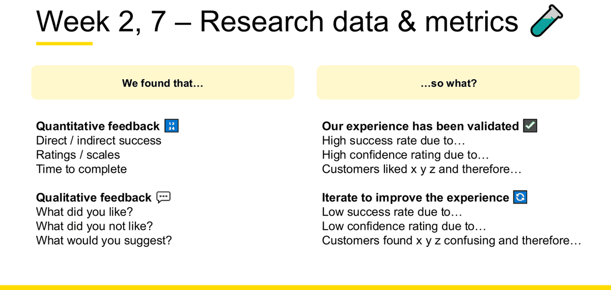
Our experience has been validated ✅
- High success rate due to…
- High confidence rating due to…
- Customers liked x y z and therefore…
Iterate to improve the experience 🔁
- Low success rate due to…
- Low confidence rating due to…
- Customers found x y z confusing and therefore…
A fully worked interpretation, from the course's own industry example
The data (Week 5, slides 47–49 — NRMA insurance renewal study)
Method: "Remote unmoderated testing with clickable prototype using Maze" · 30 NRMA customers + 30 Non-NRMA customers · 3 key scenarios · confidence ratings · open ended feedback · "Age between of 20-65" · located in Australia · recruited through Askable.
Testing objectives: "Can customers renew their policy with ease?" — Comprehension of renewal summary page · Clarity of key CTAs · Intuitiveness of information grouping & hierarchy.
Scenario 2 wording: "Your car insurance policy for your Mazda 3 needs to be renewed soon. Last year you paid off your policy for the entire year but this year you want to switch to paying monthly for your policy. How would you do this?"
Results: 86.7% Direct success · 11.7% Indirect success · 1.7% Failure · 4.8/5 Confidence rating · heat map showing most participants clicked the button in the policy card, some clicked the link in the policy-card notification.
✓ Validated — how the course reads it
Scenarios 1–3 returned 96.7% / 98.3% / 98.3% combined direct and indirect success, tagged on the slide "😀 No action required". Written out: "We found a high success rate due to the renewal action being surfaced on the policy card itself, and a high confidence rating of 4.8/5 due to the payment-frequency change confirming immediately. Therefore the renewal flow is validated and does not require iteration in this release."
↻ Iterate — how the course reads it
Key finding 3: "What renew your policy automatically entails was not perceived as intended." 45% believed automatic renewal meant payment would happen automatically on their current card. Tagged "💡 Iterate experience and copy to accurately communicate". Written out: "We found a comprehension failure in 45% of participants — a majority-adjacent misreading of a financial commitment. Therefore we iterate the copy and the surrounding experience so the scope of 'automatic' is unambiguous, then re-test the same scenario."
The interpretive move that completes the answer
Model answer skeleton for Week 10 practice Q3 10 marks
"What are some examples of quantitative vs qualitative data? How would you go about collecting both types of data?"
Define both using the course's one-line test: quantitative is anything that can be represented as a number; qualitative is anything that can't. Add the purpose split — quantitative measures, confirms, validates and "closes down" the inquiry; qualitative explores, investigates, understands and "expands the focus".
Give examples of each, not just names. Quantitative: direct and indirect success, task success rate, time to complete, number of clicks, ease-of-use rating out of 5, confidence rating out of 5, click paths and heat maps. Qualitative: what participants liked, what they did not like, what they would suggest, observed responses (*user pauses on screen*) and inferred responses (*user appears confused*).
Say how you would collect each. Quantitative: an online survey with closed and Likert questions for scale; remote unmoderated testing through a tool such as Maze for completion and click data; analytics for existing behaviour. Qualitative: 1:1 semi-structured interviews using What / Why / Summing-up questions; moderated think-aloud usability sessions; contextual inquiry where the setting matters. State that consent is collected in all cases.
Close with why you need both. "Survey data can show what problems are common, but interviews can explain why those problems happen" — and name triangulation as the reason for combining sources: it is "a form of cross-checking" that increases validity and reliability.
Common mistakes
- Listing metrics without interpreting them. Week 10 slide 30 puts "due to…" and "therefore…" on every line for exactly this reason.
- Classifying card sorting as qualitative. This course puts it under quantitative methods (Week 2, section 02.2) and justifies it: "Provides quantitative evidence (closed)". Follow the course.
- Treating a stated response as behaviour. "It's clear that…" is what a participant said; *user pauses on screen* is what they did. Only the second is behavioural evidence.
- Presenting an inference as an observation. "*User appears confused*" is your reading — label it.
- Doing arithmetic. The exam states no calculations are required. Interpret the numbers you are given; do not compute new ones.
- Concluding "the design is fine" from a high success rate alone. High success with low confidence is a real and common pattern; naming it is what turns a reported number into an interpretation.
Hypotheses, prototypes and UX testing
"UX Testing" is on the Week 10 possible-topic list, and the Individual Assignment made a full test scenario worth part of a 30% criterion. This chapter covers the whole loop: write a hypothesis → turn it into research questions → define measures → run the session → decide what to do next.
Concept testing vs usability testing
| Concept testing | Usability testing | |
|---|---|---|
| When | "happens at earlier stages of the design and aims to refine and remove ideas quickly to focus on key ideas only" (W7 s7) | "happens closer to the final completion of development, and before the product is released to the market" (W7 s12) |
| Purpose | "ensure that the solution 'makes sense' to the target customers and that it 'fits' with a current need… an opportunity to find ways to improve your design" (W7 s9) | "a more rigorous form of evaluative testing… has further degrees than concept testing of rigor and is used to identify and finetune. It also allows experiences to be measured and compared across industries or over time" (W7 s12) |
| Why do it | Evaluate the MVP & Value Proposition · Prevent bad ideas from progressing · Refine good ideas; improve solution (W7 s9) | Uncover Problems in the design · Discover Opportunities to improve the design · Learn About Users behavior and preferences (W7 s12) |
| Structure | Hypothesis driven learning · Participants snapshots · Scenarios & task oriented instructions (W7 s10) | Facilitator · Tasks · Participant — the three Core Elements (W7 s12) |
| What you test with | Wireframes – or mock-ups · Early prototypes · Storyboards · Service blueprints (W7 s10) | A working prototype — Week 5 s26 states only prototypes are "User testing ready: Yes" |
Why test early at all (W7 s6)
Bring the best ideas into focus · Refine ideas further · Uncovers unknown issues early · Increase business & stakeholder confidence · Learn target user's behaviour & preferences
Moderated vs unmoderated
Moderated
"involves a researcher meeting with a participant and allows the researcher to provide instructions, observe in real time, and ask follow-up questions."
Activities: Interviews · Focus groups · Usability testing · Role playing · Concept walkthroughs
Tools: Askable, Teams, Zoom, Google Hangouts
Unmoderated
"requires a software application which provides instructions to users, records their actions, and can ask them specific predetermined questions."
Activities: Online card sorting · Online task-based tests · Online click tests · IA testing (Treejack)
Tools: Maze, Usertesting.com, Optimal Workshop
Testing methods — and the constraint that matters for this course
✅ UNSW approved
Concept testing · Service staging / role-play · Guerrilla testing
Other Methods
Eye tracking · Focus groups · A/B testing · Quantitative survey · Click testing · 1:1 Usability lab testing
Source: Week 7 Lecture, slide 24. Only the first box carries a green tick. This is a course-specific constraint and a plausible exam detail.
The hypothesis
Definition (W7 s20): "An assumption / prediction you have prior to running an experiment…"
Why hypotheses (W7 s20): Measurable — "Measurable outcome of the experiment" · Manage risks — "Helps to validate ideas and determine whether to proceed or not" · Explicitly captured learning — "Invaluable data that can be used in the future".
✗ Weaker course example (W7 s23)
"We believe that [filters are difficult for customers to find and use], So if we [If we change the filters], We will see [users will be able to filter content because the new pattern is understandable]."
Why it is weaker: "change the filters" is not a specific change, and the outcome carries no measure — there is nothing to count. It fails "Testable" and "Specific".
✓ Stronger course example (W7 s23)
"We believe that [people struggle to locate My Account and New Topics], So if we [include a mega-menu in our prototype], We will see [more customers navigating to desired content in less than 10 seconds]."
Why it is stronger: a named, specific intervention and a time-bound, countable outcome. Both examples are on the same slide — the contrast is deliberate.
The tutor's four rules for a hypothesis tutorial transcript, context clear
- The "We believe" clause states a problem taken from your research findings, not a missing capability.
- The proposed change must be specific and novel — a named feature. "Just like not a plus sign, right? … Make sure that you come up with something that's not there yet."
- The outcome must be a prediction that can be measured: "it should be a prediction… something that can be measured".
- You do not have to run the test to write the hypothesis — "just propose or predict the outcome".
From the Week 8 tutorial recording, which the tutor opened by stating it was covering Week 7 content as make-up. Wording lightly cleaned from an auto-transcript.
From hypothesis to measures — the three-column structure
This is the course's canonical test-planning artefact, and it is what the Individual Assignment brief calls a test scenario.
| 1 · Hypothesis | 2 · Research questions | 3 · Measuring usability |
|---|---|---|
| We believe that… customers want to calculate how much they need to pay each month vs each year before making a purchasing decision So if we… include a dropdown which dynamically changes the price We will see… that customers can easily see how much they will need to pay for the year or each month |
1. How would you go about doing calculating how much you'd be paying each month vs year? [sic] 2. How did you feel figuring out how to complete the task? 3. On a scale of 1-5 how easy was it to complete the task? |
X/X customers completed task successfully Average rating X/5 for ease of use |
Assignment requirements for a test scenario
- Hypothesis × 1 — following the hypothesis recipe
- Research questions × 3 minimum — "think about what you need to ask to prove your hypothesis from a quantitative perspective and additional qualitative insights to support this"
- Measures of usability × 2 minimum — "how will you use quantitative data to prove that your hypothesis is correct or incorrect… Qualitative insights provide additional rationale"
Source: Individual Assignment brief, p4. The brief adds: "incorrect isn't necessarily a bad thing it just means taking another approach based on user insights!"
Three research-question types tutorial transcript
- Task-based question — asks the participant to do the thing
- Probe question — "again, trying to understand why"
- Rating question — "On a scale from one to five, how easy was it to…"
Plus A/B comparison questions as a fourth category. This taxonomy explains the structure of the three questions in the worked example above: do it, tell me why, rate it.
Writing the task
W7 s32: "A good usability test will be of high quality when it is task driven." Three criteria:
Realistic
"Ask participants to complete a task they would actually do"
Actionable
"Avoid starting tasks with 'How would you…' or 'Tell me how you would'…. You want to see action, not words."
Not leading
"Phrase the task in a way that doesn't use the same words as the UI"
✗ Poorly written test tasks
- "Tell me how you would use the filters to change your payment frequency." — not actionable and leading: it names the UI element.
- "Click the 'Manage Policy' button and select 'Payment Frequency'." — that is a set of instructions, not a task. Nothing is being tested.
- "Do you think this screen is easy to use?" — an opinion question, not a task, and leading.
✓ Well-written test tasks
- Course example (W5 s48): "Your car insurance policy for your Mazda 3 needs to be renewed soon. Last year you paid off your policy for the entire year but this year you want to switch to paying monthly for your policy. How would you do this?" — realistic context, goal stated, no UI words.
- Tutorial example: "find a moderate difficulty hiking trail near Sydney that's under ten kilometres and figure out how much elevation gain it has" — goal only, no menus or filters named.
Note that even the course's own strong example opens with "How would you do this?" — the rule on s32 is about not starting the task that way; a closing prompt after a realistic scenario is fine.
Prioritising which tasks to test
| Task Type | Testing Priority |
|---|---|
| Critical | Must be tested · Should be tested · Tested if time permits · Not testable |
| Problematic | |
| Typical | |
| Infrequent |
Running the session
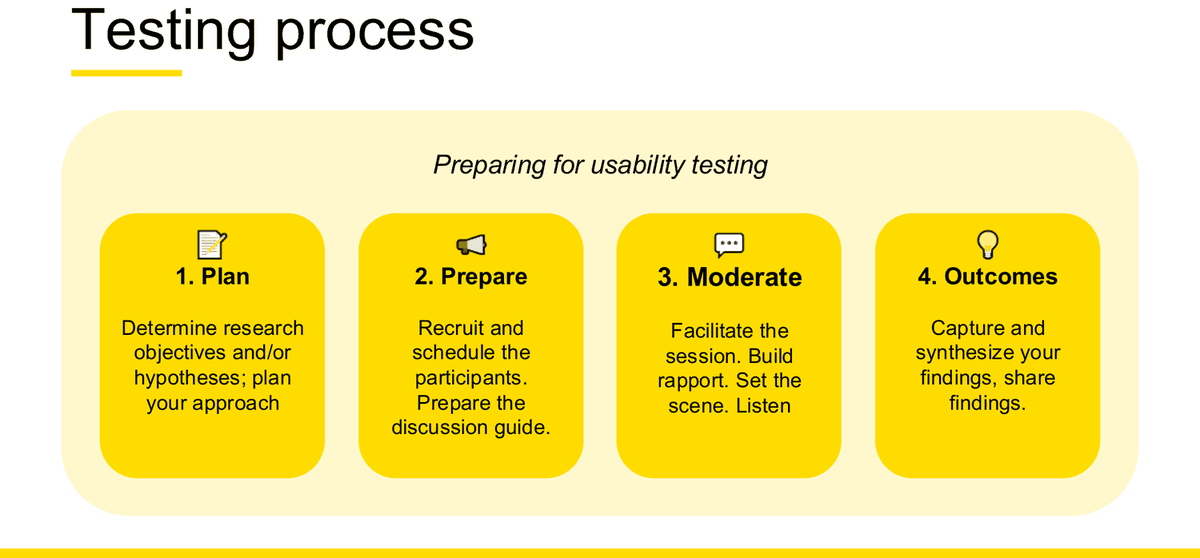
The participant briefing script — five statements, verbatim (W7 s28)
- "we are not testing you, we are testing your designs"
- "be as candid as possible"
- "think out loud as you navigate the site (and please navigate a bit slower than you usually would). Tell us what you're trying to do, what you're looking for, what you expect to happen after you click a link etc. And if you get stuck, please tell me that too."
- "I might not be able to help you or answer some of your questions. But please ask them anyway"
- "this isn't a real website, it's a mock-up so some of the links and buttons may not work. Do you have any questions before we begin?"
Careful: the slide is titled "Creating a test plan", but it is not a document structure — it is the script the moderator reads to the participant. Do not describe it as a test-plan template in an exam answer.
The 8 Rules of moderating (W7 s37)
- Be Curious
- Listen More Than You Talk
- Be Yourself, Be Authentic
- Be Aware Of Your Surroundings
- Base In Actual Behaviour — "Don't ask: 'would you…..?' Ask: 'When is the last time you have…?'"
- Ask Open, Expansive Questions — "Tell me more…?, What was it about this that you like…?"
- Don't Be Afraid Of Silences
- Don't Be Weird
Bias (W7 s39)
Five tips to avoid it: Note down your assumptions beforehand · Choose representative participants · Structure your test plan/guide appropriately · Be open to perspectives from peers, other research · Be an objective sponge
Four named biases: Confirmation bias · Social desirability bias · Hawthorne effect · Culture bias. The slide names them only and gives no definitions — if you define them in an answer, that is your own knowledge, not the course's. named, not defined
Four tips & tricks (W7 s38)
1. Go from broad to specific · 2. Know the limitations of your participants · 3. Highlight your mandatory questions · 4. Organise your data/responses using tables
The reusable UX testing plan template
Fill this in for any case study revision guidance, assembled from course sources
| Section | What to write | Source it comes from |
|---|---|---|
| 1. Objective | One sentence: what are we trying to find out? e.g. "Can customers renew their policy with ease?" | W5 s47; W7 s19 (Assess / Uncover & understand / Observe) |
| 2. Hypothesis | We believe that… / So if we… / We will see… — with a measurable outcome | W7 s22 |
| 3. Method | Concept or usability test; moderated or unmoderated; the tool | W7 s7, s12, s14, s24 |
| 4. Participants | How many and why (5 finds ~85% of problems); the screening criteria; the exclusion; the recruitment channel; consent | W7 s26, s27, s35; W2 s67 |
| 5. Scenario & tasks | A realistic context, a goal, no UI words; prioritised by Critical / Problematic / Typical / Infrequent | W7 s32, s33; W5 s48 |
| 6. Research questions | At least 3: one task-based, one probe, one rating | Individual Assignment p4; tutorial transcript |
| 7. Measures | At least 2 quantitative, plus qualitative for rationale — success/direct-indirect, time, ratings, confidence | Individual Assignment p4; W7 s42; W5 s48; W10 s30 |
| 8. Moderation | The five-statement briefing script; think-aloud; the 8 Rules; bias controls | W7 s28, s37, s39 |
| 9. Capture | Context / Stated / Observed / Inferred; participant snapshots; organise in tables | W7 s43, s45, s38 |
| 10. Decision | Validated → no action required; or iterate → name the specific change and re-test | W10 s30; W5 s49; W7 s7 ("Go / no go / refactor") |
Deciding what to do with the result
The course does not use the words "retain / revise / reject". Its language is:
Validated
"Our design has been validated!" (W5 s49) · "😀 No action required" (W5 s49) · "Our experience has been validated ✅" (W10 s30)
Iterate
"We need to iterate to improve!" (W5 s49) · "💡 Iterate experience and copy to accurately communicate" (W5 s49) · "Iterate — Refine, Test & Learn" (double diamond)
Go / no go / refactor
"Go / no go / refactor decision from test results" — the gate language on the triple-diamond product process (W7 s7). This is the closest the course comes to a formal retain/reject framework. nearest equivalent
Synthesising the findings
Participant snapshot — five fields (W7 s45)
- Sketch or Image of Participant
- "If I had to sum up this interview in a hashtag #"
- Participant ID / Location — "memorable, but de-identified way to identify the participant"
- "3 most interesting things I heard – 1, 2, 3" (New news, different perspectives, Insights / themes)
- "Memorable quotes or comments"
Surfacing what's important (W7 s46)
The same Interesting / Relevant / Actionable filter as Week 3 — see Chapter 6. Its reappearance in the testing deck means the exam can reach it from either direction.
Optional detail: prototypes — what they are and how many kinds there are
Definition (W5 s35): "A prototype is an early model created to test a concept or process. They're created to evaluate the any assumptions made by the designers and help them to refine initial ideas." [sic] — "A functional version of your design · Usually digital but can also be analogue · A key component of usability testing".
Why prototype (W5 s35): To simulate an interactive digital experience · To test with users during all phases of the design cycle · To mitigate risk of releasing bad solutions to the market.
When (W5 s36): "At any stage in the development cycle. They are integral to every project – software and hardware."
Ways to prototype, low effort → high effort (W5 s37): Concept statement · Existing stimulus · Low-fi prototype · Physical models · Hi-fi interactive prototype.
Service staging (W5 s38): "Using Lego is a great way of prototyping a service or physical space." — this is also one of the three UNSW-approved testing methods (W7 s24, "Service staging / role-play"), so it is a legitimate answer for a service-design case where there is no screen to test.
Personal example you can adapt student example
Hypothesis (from the student's individual assignment): "We believe university project team members struggle to recover task ownership and project status when updates are fragmented across tools. So if we provide a shared mobile coordination view showing ownership, outstanding work, deadlines and blockers, we will see at least 4 of 5 participants correctly identify outstanding work, the responsible member and the blocker, and update their own task without facilitator assistance."
Scenario (goal-based, no UI words): "You are in a four-person university group with an assignment due in two weeks… Using the app, get a picture of how the project is going, find the task that most needs attention, check who is responsible for it, mark your own task as done, and let the teammate responsible for the at-risk task know it needs an update — without sending a single chase message yourself."
Validation: this matches the course's recipe exactly — a problem from research findings, a named specific change, and a countable predicted outcome ("at least 4 of 5"), which satisfies "testable" and "specific". The scenario matches the W7 s32 rules — realistic, goal-stated, no UI element named. Limitation: the "4 of 5" threshold is the student's own judgement sized to n=5; the course gives no threshold conventions, so present it as a defensible choice, not a standard.
Common mistakes
- A hypothesis with no measurable outcome. "We will see a better experience" is untestable — the course's own bad-hypothesis list names exactly this.
- Writing a task that names a UI element, or that instructs rather than sets a goal.
- Confusing concept testing with usability testing. Concept = early, refine and remove ideas; usability = late, rigorous, measurable, benchmarkable.
- Presenting the five-statement briefing script as a "test plan structure". It is a script.
- Saying "Nielsen says test 5 users". The course attributes it to Jeff Sauro of MeasuringU.
- Treating a disproved hypothesis as a failure. The assignment brief explicitly says otherwise.
- Reporting numbers with no "due to…" and no "therefore…". See Chapter 9.
Low-fidelity wireframes
"Wireframes" is on the Week 10 possible-topic list, and "drawing out artefacts" is a listed exam format. But "there won't be any mid to high fidelity sketching". So: you may be asked to draw a wireframe, and it must be low fidelity. Structure, flow, annotation and reasoning — not visual polish.
How to read the scope boundary here
- In scope: what a wireframe is and communicates; the fidelity ladder and its definitions; wireflows and user flows; annotation; screen states; the sketch/wireframe/prototype distinction; drawing a low-fidelity structure and justifying it.
- Out of scope: producing mid- or high-fidelity visuals in the exam. You still need to know what mid and high fidelity are, because the definitions are how you justify choosing low fidelity — you just will not be asked to draw one. mid/hi-fi sketching excluded
What a wireframe is
The definitions to quote
W5 s21: "A wireframe is a stripped-down visual map without any graphic treatment."
W5 s19: "Wireframes serve a central function in the development of a web site or app. They are a key tool in communicating the content and layout of each web page for internal and client reviews as well serving as a blueprint for graphic designers to produce designs and for programmers develop functionality."
W5 s8: "Wireframes look to visualise the high-level functionality of digital applications, while flows demonstrate how a user steps through the application."
Why we wireframe — three reasons (W5 s19)
- "Wireframes are the blueprint for your site, app or software."
- "They are medium to high fidelity representations of what users will see." see conflict below
- "They're a primary way to communicate design solutions to engineers and stakeholders."
Source conflict: s19 says wireframes are "medium to high fidelity", but s8 says "Wireframes & protypes can vary from low to medium to high fidelity" and the s26 table gives wireframe fidelity as "Low / Mid / High". Treat s8/s26 as the general rule; s19 describes the wireframe's typical role. Do not state a single fidelity for wireframes as fact.
What a wireframe communicates — six things
1 · Design concept or intent
2 · Hierarchy of elements on a page
3 · Functionality
4 · Relative proportions of elements
5 · Page layout
6 · Interaction options
The fidelity ladder
| Level | Quote on the slide | Characteristics | Best used |
|---|---|---|---|
| 1. Simple block sketch this is what you draw in the exam |
"Communicate concepts, not specifics" | "Contains placeholders for: Images - marked with an 'X'; Text - lines or scribbles" · "Not drawn to scale or following a grid" | "In the Divergent phase - you have several concepts to share" · "While performing information architecture research" |
| 2. Detailed wireframes | "Share more detail" | "More details for specific elements like buttons and text" · "Differing text weights to show hierarchy" · "No image or font style is considered final" | "As Divergent options begin to Converge" · "For more formal reviews with stakeholders" · "With engineers to confirm functionality" |
| 3. High fidelity wireframe not drawn in the exam |
"Prepare for development" | "Often follows a grid" · "Contains images" · "Mostly final text styles and little to no placeholder text" · "Sometimes includes annotations" | "In later parts of the design process" · "When refining a single concept (instead of experimenting)" |
| 4. Mock ups (visual / UI) excluded |
— | "While wireframes focus on page structures and functions, instead mock ups switch the focus to the visual design / UI elements" (W5 s32) | "important definition when working with visual design teams" |
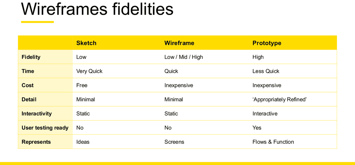
| Sketch | Wireframe | Prototype | |
|---|---|---|---|
| Fidelity | Low | Low / Mid / High | High |
| Time | Very Quick | Quick | Less Quick |
| Cost | Free | Inexpensive | Inexpensive |
| Detail | Minimal | Minimal | 'Appropriately Refined' |
| Interactivity | Static | Static | Interactive |
| User testing ready | No | No | Yes |
| Represents | Ideas | Screens | Flows & Function |
Which artefact answers which question
| Artefact | What it lets you learn |
|---|---|
| Concept drawing | Understanding concepts · Value Proposition · Learning about your users mental models |
| Wireframes | Concept understanding · Categorization scheme & naming · Functionality of UI components |
| Mock ups | Understanding visual elements · Functionality of UI components |
| Clickable prototype | Navigation · Functionality, identify issues in workflow |
| Live site | Benchmarking · Functionality, identify issues in workflow |
Flows: task flow, wireflow, user flow
Week 5 slide 8 gives a four-rung ladder of flow artefacts with a "level" for each. Do not use "wireflow" and "user flow" interchangeably — slide 11 is explicitly about when a wireflow is more useful than a user flow.
| Artefact | Level | What it shows |
|---|---|---|
| 1. User goal | Goal or story level | What the user is trying to achieve |
| 2. Task flow | Action level | The sequence of actions. Course example (s14): "Task: Purchase a hoodie (Buy Now Checkout)" → Product View → Select Size → Click Buy Now → Checkout → Order Confirmation |
| 3. Wireflow | Component level | "A combination of wireframes and flowcharts. They document workflow & screen designs when there are few pages that change dynamically." |
| 4. User Flow | Interaction level | The full flowchart including decision diamonds and conditional branches. Course example (s16): "Is Size attribute specified?" → "Is user Signed In?" → "Registered?" → "Checkout as Guest?" |
Wireflows — the TLDR (W5 s11)
- Show how users move through a process
- Ideal for web and mobile applications
- Outlines basic logic
- Main pathway / happy scenario
When a wireflow beats a user flow (W5 s11)
"Wireflows can be more useful than user flows when we simply need to communicate:"
- The screens required for a user to get from Point A to Point B
- The happy path scenarios that occur with minimal dynamic conditions
- With stakeholders unfamiliar with UX jargon and deliverables
- With people who may have trouble seeing how the app will work with more specific user flows
Four properties of a wireflow (W5 s12)
- Illustrates movement — "a sequence of thumbnail representations of screens or pages that illustrates movement through a system"
- Sequential — "a logical next step after creating task flows"
- Helps plan — "helps designers plan out what screens need to be designed"
- Shows connection — "calls out screen elements that need to connect e.g. showing one button linking to one screen and a second button linking to another"
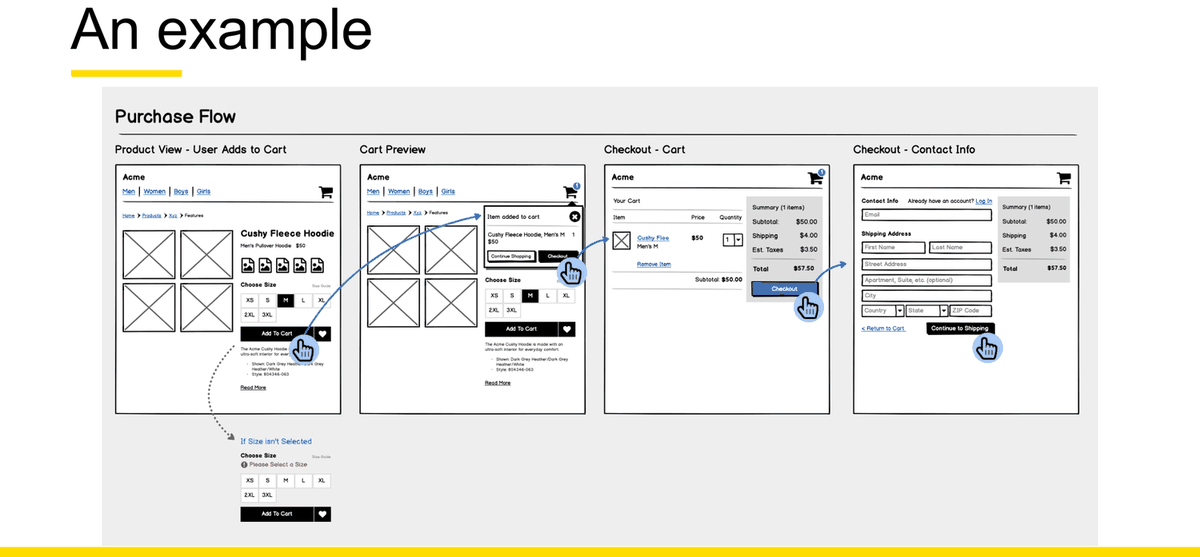
Drawing a low-fidelity wireframe under exam conditions
You have minutes, a pen, and no ruler. This is what a reader can actually read off the page.
Exam drawing checklist — seven moves, in order
- Label the screen. Write its name above the box. If you draw more than one, number them.
- Block out the major regions — header, content, action, navigation. Boxes and lines only. Images as an X, text as lines. Nothing to scale.
- Show the primary action and make it visually dominant. One per screen.
- Show navigation, and mark which item is current.
- Show feedback or system status — progress, counts, a saved state, an error. This is where most drawings are silent, and it is a named heuristic and a named design principle.
- Annotate the important decisions in the margin, numbered, with a leader line — the way W5 s31 does it.
- Link the drawing to evidence or principle. One line per annotation: "this is first because research found X" or "this follows the platform convention so users don't have to learn it".
Compiled from Week 5 slides 15, 20, 28, 29 and 31. revision guidance — the course does not publish an exam drawing rubric.
✗ Common drawing mistakes
- No screen name, so a reader cannot tell what they are looking at.
- Real copy written into the boxes — this is mid-fidelity behaviour and the exam excludes it.
- Shading, colour and icon detail instead of structure.
- No annotation at all, so the reasoning is invisible.
- Three screens drawn with no arrows, so it is not a flow.
- No error or empty state anywhere.
✓ What makes the drawing complete and interpretable
- Every screen labelled; the flow ordered left to right.
- Placeholders used exactly as the course defines them.
- One dominant primary action per screen.
- A visible system-status element.
- Numbered margin annotations that state a decision and its reason.
- At least one non-happy-path state — an error, an empty list, or a blocked item.
Wireframing considerations — the course's four rules
- Design for your audience — "fit the level of detail included in the wireframe to the intended audience"
- Keep fidelity in mind — "stay true to the appropriate level of fidelity based on where you are in the design process"
- Stay consistent — "maintain and abide by a consistent wireframe style among the designers on your team"
- Don't skip sketching!
Annotation
Annotation is listed as a characteristic of high-fidelity wireframes ("Sometimes includes annotations", W5 s31), but the practice is exactly what you need in a low-fidelity exam sketch: it is how you make your reasoning visible.
Course example (W5 s31) — an events app with seven numbered annotations down the right margin, e.g.:
"1 This is what the Events tab will look like when it's selected by the user. It'll have an icon and show the number of events."
"6 To RSVP for an event, users have to click this button. It shows how many days left till an event."
The pattern: [what this element is] + [what it does / what it shows] + [under what condition]. Add one clause the course example does not always have — why — and you have an exam-grade annotation.
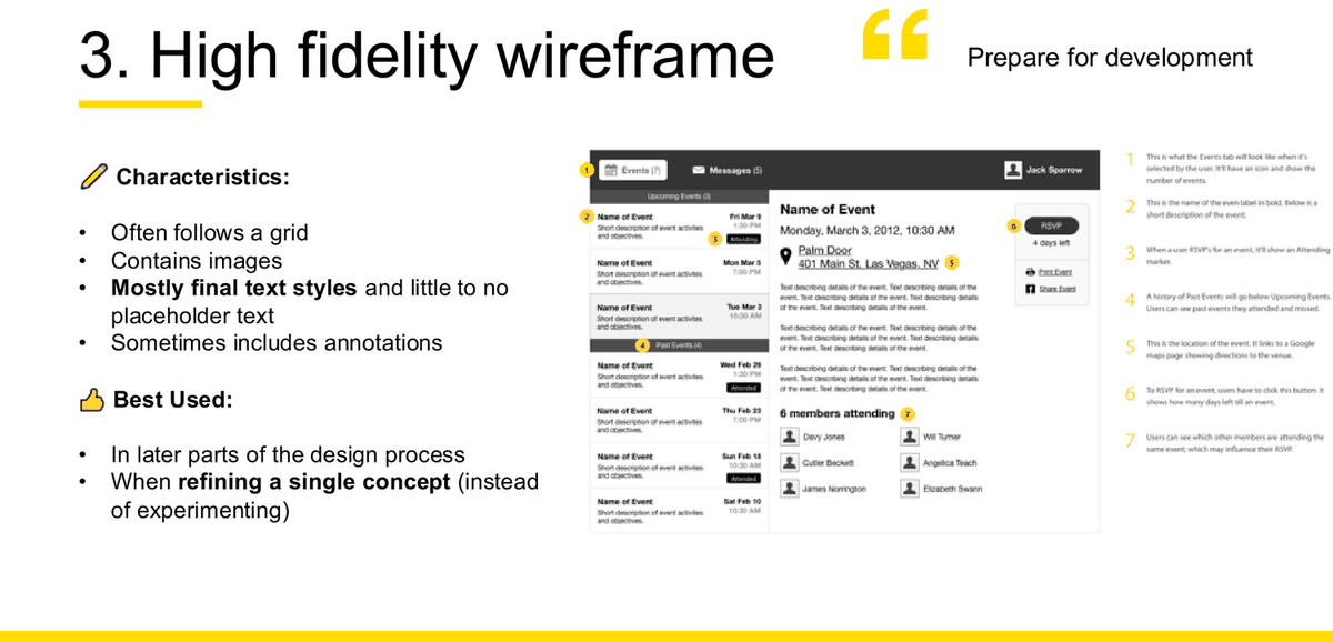
How wireframes support testing
A wireframe is not user-testing ready on its own (W5 s26: "User testing ready: No"). But it is named as a concept-testing artefact (W7 s10: "Wireframes – or mock-ups"), and the Individual Assignment allows a wire-flow as an alternative to a clickable prototype — "non-clickable but functionality and interactions clearly labelled and annotated". That is the exact bridge: annotation is what lets a static artefact carry an interaction into a test session.
Practical low-fidelity method the student used student example
One screen per sheet · placeholders not prose · a whole set drawn in one sitting at 5–10 minutes each · annotations added afterwards in a second colour · photographed flat in daylight · not cleaned up in software. Validated against W5 s26 ("Sketch: Very Quick / Free / Minimal / Static / Represents: Ideas") and s29. The second-colour annotation habit is a genuinely useful exam technique: it separates the drawing from the reasoning so both stay legible.
Common mistakes
- Using "wireframe" and "prototype" as synonyms. Only the prototype is interactive and user-testing ready.
- Using "wireflow" and "user flow" as synonyms. A wireflow shows the happy path with minimal dynamic conditions; a user flow shows the decision branches.
- Producing visual polish when only structure was asked for. Explicitly excluded.
- Claiming wireframes are "medium to high fidelity" as a flat fact — the deck contradicts itself; cite the range.
- Confusing "the wireframe is a blueprint for your site" (W5 s19/s21) with a service blueprint (Chapter 14). Completely different artefacts that share one English word.
Storyboards
Named on the Week 10 possible-topic list under "P&P tasks", and it was Activity 3 of the Week 4 tutorial. The primary source is the Week 4 Lecture, slides 43–50 — an eight-slide block that carries the whole of the course's storyboard teaching. The Week 7 Lecture, slide 10 is the supporting application: it names storyboards as one of the artefacts you concept-test with. The Week 5 deck contains no storyboard material and is not cited anywhere in this chapter.
Sourcing note. The word "storyboard" does not appear anywhere in the 57-page Week 5 deck. Week 5's section 05.5 is "Storytelling in/for design", which is about presenting research to an audience — a different thing entirely. Everything below comes from Week 4. Storyboarding also appears as Commit activity #34 in the 4Cs list, and as a concept-testing artefact at Week 7 slide 10.
What a storyboard is — What / Why / Who / How
| Course wording (verbatim, Week 4 slide 43) | |
|---|---|
| What | "Storyboards are used to convey social or functional messages through entertainment and engagement in a visual format - whether that be physical or digital." |
| Why | "Designers are storytellers. Storyboards are a tool helps bring meaning to our ideas and research, as well as demonstrating our key findings and insights." [sic — the slide's sentence is broken] |
| Who | "Storyboards help share early concepts with clients and stakeholders to help them understand the intention of your design/ideas. They can also be used with designers and customers to identify potential pain points as early as possible." |
| How | "In a linear and sequential fashion, storyboards visually communicate how a customer may interact with your experience or service." |
Why storyboards are important — four reasons (W4 s43)
- Visualize and communicate research & insights
- Illustrate new ideas quickly
- Identify pain-points
- Help communicate ideas to various stakeholders such as investors, CEOs, managers, frontline staff, and customers
Structure: the three acts
The eight storyboard elements
Characters
The actor whose story this is
Speech Bubbles
What they say or think
Devices
The touchpoint they interact with
Signs
Environmental or wayfinding context
Office Furniture
Setting
Backgrounds
Where the scene happens
Transportation Elements
Movement between places
Arrows
Direction, sequence, causation
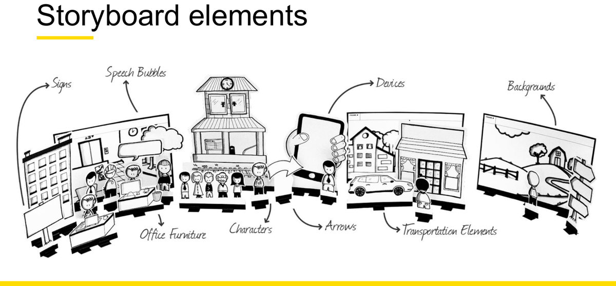
Three principles for a great storyboard
Stay Authentic
"Focus on real humans in real contexts – to strengthen empathy with the viewer"
Keep it Simple
"Edit, edit, edit"
Highlight Emotion
"reinforce the emotion to build empathy further"
The course's worked example
"Heartline" — Problem → Objective/Goal/Action → Outcome (W4 s47, rendered as an 11-panel storyboard on s49)
- Problem. "Tom lives alone and is suffering from depression having just lost his job"
- "Susan notices something is wrong but isn't sure how to reach out"
- Action / intervention. "Susan downloads Heartline and adds Tom"
- "the app periodically reminds Susan to check in"
- Outcome. "Susan checks in with Tom and lets him know how much she cares about him"
The emotion faces move from sad to happy across the panels — Highlight Emotion made literal. The slide-49 version adds the app screens ("add the person you want to check on", "ok. you've got your heartline's set up", "check in with Tom?") and closes on Tom's whole support network. Note the shape: the problem is a human situation, not a missing feature, and the intervention arrives in the middle, not at the start.
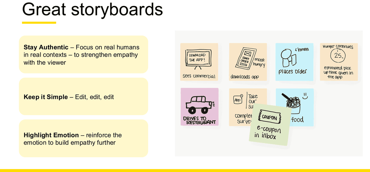
An exam-ready storyboard template
Six frames is plenty under exam conditions. Stick figures are fine — the course's own template is a blank 3×3 grid with a caption line under each frame.
Storyboard vs wireframe vs service blueprint
These three get confused constantly, and all three are examinable. The distinction is what each one is a picture of.
| Storyboard | Wireframe / wireflow | Service blueprint | |
|---|---|---|---|
| Picture of | A person's situation over time | A screen, or a sequence of screens | A whole service, across visible and invisible layers |
| Axis | Narrative time — beginning, middle, end | Screen order along a task path | Journey stages horizontally × five lanes vertically |
| Shows | Actor, context, trigger, emotion, the intervention, the outcome | Layout, hierarchy, functionality, interaction options, states | Physical evidence, customer actions, frontstage, backstage, support processes |
| Does not show | Interface detail. Backstage systems. Layout. | Emotion. Context outside the screen. Anything the organisation does invisibly. | Screen layout. Individual emotion in narrative form. |
| Answers | "Why would anyone want this?" | "What does it look like and how does it work?" | "What has to happen inside the organisation for this to work?" |
| Where taught | Week 4, slides 43–50 | Week 5, slides 7–33 | Week 9 lecture, slides 7–35 |
Where a storyboard sits in the process
Three separate placements in the course, all defensible depending on the question:
Ideate (Week 4)
Taught in section 04.6 alongside Crazy 8s, Parallel worlds and How Might We's — a way to make an idea concrete and communicable.
Commit (4Cs)
"34. Storyboarding" sits in the Commit column — "Prioritize the best ideas". Used to lock down which concept the group is taking forward.
Concept testing (Week 7)
Named at W7 s10 as one of four artefacts you can concept-test with, alongside wireframes, early prototypes and service blueprints.
✗ Weak storyboard
- Six frames of app screens with arrows — that is a wireflow, not a storyboard.
- No named actor, so there is no one to empathise with.
- No trigger, so the need appears from nowhere.
- Flat emotion throughout — the "Highlight Emotion" principle is unused.
- The problem is "the user doesn't have our app yet".
✓ Strong storyboard
- A named person in a real context, drawn as a stick figure.
- A specific trigger moment that creates the need.
- A visible low point in frame 2 — the pain point the research actually found.
- The intervention arrives in the middle and is one clear thing.
- The end shows what changed for the person, not what the product does.
- One-sentence captions in the actor's point of view.
Optional detail: the storyboard planning canvas (Week 4, slide 50)
The deck ends the storyboard section with a named planning canvas. The field names are the examinable content — if a question asks what you would plan before drawing, these are the headings:
Note that the canvas asks for Measuring success — even a storyboard is expected to state how you would know it worked. That connects directly to Chapter 10.
Common mistakes
- Drawing screens instead of situations. The single most common error. A storyboard shows the world around the touchpoint.
- Starting with the solution. The Beginning is the Problem. Heartline starts with Tom losing his job, not with an app.
- No emotion. One of only three principles the course gives is Highlight Emotion; a flat storyboard fails a third of the criteria.
- Too many frames. "Keep it Simple — Edit, edit, edit." Six frames beats twelve.
- No captions. The course's own blank template has a caption line under every frame for a reason.
- Confusing it with Week 5's "storytelling for design", which is about presenting research back to stakeholders.
The Service Design 5Ps
"Service design 5Ps" is named on the Week 10 possible-topic list. All of the content is on Week 8, slides 38–44: one slide introducing the technique, one giving the five names and definitions, and then a dedicated slide per P. Seven slides, and they are the whole topic.
The trap: there are two five-P lists in the same deck
| The 5Ps of Service Design (Week 8, slide 39) | The Project Brief headings (Week 8, slide 35) | |
|---|---|---|
| The list | People · Processes · Places · Products · Performance | Purpose · Performance · People · Place · Problems |
| What it is | A technique for mapping the territory of a service | A one-page project scoping document |
| Where it sits | Inside the Discover stage of the Double Diamond | Before the Double Diamond opens, during scoping |
| Called "the 5Ps"? | Yes — the slide is titled "The 5Ps" | No. The slide never uses the phrase |
Three words overlap (People, Place/Places, Performance) and two differ. Memorising the wrong list would mean answering with the wrong framework entirely. Processes and Products are the two that only appear in the real 5Ps; Purpose and Problems are the two that only appear in the project brief.
What the technique is for
Week 8, slide 38 — verbatim:
"To understand what constitutes a 'lovable' service experience, Service Designers look to define The 5Ps: people, processes, places, products, and performance. This technique is used as a way to map out the territory of the reimagined service, providing clarity on every touchpoint within a service. Each of these touchpoints must come together to meet the end users' needs."
"The 5Ps sits within the Discover stage of the Double Diamond. Implementing this technique helps Service Designers set the trajectory of their research and understand the ecosystem they are working with."
First move on the slide: "Get a sense of the boundaries of the ecosystem."
"Understanding the 5Ps, you can identify and unpack all touchpoints and interaction a business has with its staff, customers, tangible products and intangible spaces and experiences."
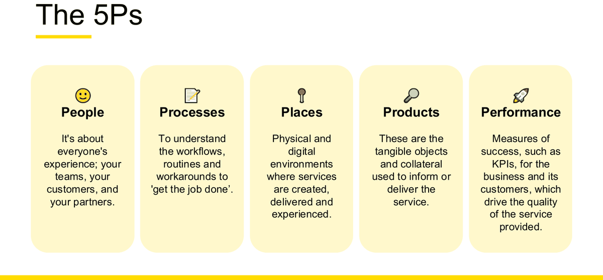
The five Ps
| P | Definition (verbatim, W8 s39) | Components (the dedicated slide) | Course examples |
|---|---|---|---|
| People s40 |
"It's about everyone's experience; your teams, your customers, and your partners." | Customers & users · Employees (split into Front of House and Back of House) · Partners | Front of House = "help desk or reservations staff". Back of House = "baggage handlers". Partners = "an airline may have a limo service. Hotels may have transfer operators who collect the service users from the airport." Service users = "people who purchase the service, who may or may not be the person who is actually using the service". Users = "directly interact with the service to achieve the outcome e.g. booking travel for a partner." |
| Processes s41 |
"To understand the workflows, routines and workarounds to 'get the job done'." | Operations · Systems | Operations = "The current processes, policies and procedures that teams use to enable a service outcome". Systems = "Technical Systems that are either used by the customer, the user, the staff, or the partners are part of the service experience." |
| Places s42 |
"Physical and digital environments where services are created, delivered and experienced." | Touchpoints · Workspaces · In between | Touchpoints = "can be a physical store, a kiosk, a check-in counter". Workspaces = "Workflow and workspaces can affect the quality of service. Observing how people use space to perform their service functions." In between = "Where am I? Where is my thing? An essential part of services these days is understanding that customers are always on the move and expect to stay connected to services." |
| Products s43 |
"These are the tangible objects and collateral used to inform or deliver the service." | Digital · Analog · Spatial | Digital = "These can be touchpoints and products. Used for both functions and for communication." Analog = "printed materials such as brochures, forms, posters, booklets, business cards". Spatial = "Space is anything that supports a customer experience in the absence of direct staff assistance. Think signage, interactive kiosks…" |
| Performance s44 |
"Measures of success, such as KPIs, for the business and its customers, which drive the quality of the service provided." | No sub-components — "It's the least tangible and sits across all of the 5 P's." | "The performance of any given process, person, place or product can be measured in different ways. It doesn't have to be measured in numbers, it can be measured by emotions or how valuable it is to a person." |
The 5Ps as a map
Diagnostic questions for each P
Use these to interrogate a case study. They convert the definitions into something you can actually apply under time pressure.
| P | Ask the case… | What a gap here looks like |
|---|---|---|
| People | Who is the service user, and are they the same person as the customer who paid? Which staff are Front of House and which are Back of House? Are there partners delivering part of this service? Whose experience is being ignored? | A design that only considers the paying customer and forgets the staff who must deliver it — the case study's own Principle #2 argument: "Good EX drives successful CX". |
| Processes | What is the official procedure, and what is the workaround people actually use? Which systems are involved, and who touches each one? Where does a handoff happen? | A polished front end sitting on a manual back-office process that cannot keep up. |
| Places | Where does the service physically and digitally happen? What are the touchpoints? What happens in between them, when the customer is moving and expects to stay connected? | Every touchpoint designed well individually, with nothing joining them — the "in between" left blank. |
| Products | What tangible things carry the service — digital, analog, spatial? What paperwork exists? What signage? What does the customer take away? | A digital-first redesign that leaves outdated printed forms and signage contradicting the new experience. |
| Performance | What does success look like for the business and for the customer? What KPI would move? And what would you measure that is not a number — an emotion, or how valuable this is to a person? | Only business KPIs measured, so a service can look successful while customers hate it. |
Apply the 5Ps to one specific service, never to an industry transcript-derived
Debriefing the class 5P activity, the tutor gave the scoping rule and the reason for it: "for healthy analysis [= healthcare], let me just remind you again that we don't use this analysis for the whole industry or sector because there's no point… the whole thing about but using this framework is to identify the process, um know what's going on and then also identify opportunities for improvement. Usually we use that for specific surveys [= services] that we want to improve." He then showed why: at sector level the answers stop discriminating — "when you talk about a restaurant, uh customers want to talk the same thing."
The exam consequence. If a case names a sector, narrow it yourself in the first sentence — "I will analyse the outpatient booking service at one clinic, not healthcare as a whole" — and then run the five Ps against that. A 5P answer written at industry level produces five paragraphs that would fit any organisation, which is the failure mode this warning describes. Tutor explanation — WEEK10\tut transcript raw.txt, [1:50:41]–[1:51:16]; speaker unlabelled in the file, identified as the tutor from context. "healthy analysis" and "surveys" are transcription errors for healthcare and services; both are recoverable from the surrounding sentences, and neither is course terminology.
A worked application: a local GP clinic
Using the same service the Week 9 tutorial blueprints, so the two chapters connect.
| P | Applied to a local doctor's clinic |
|---|---|
| People | Customers & users: the patient — and note the service user may not be the user, e.g. a parent booking for a child. Front of House: receptionists, practice nurses. Back of House: practice manager, billing staff, the GP writing up notes after you leave. Partners: the pathology lab, the pharmacy, the specialist you get referred to. |
| Processes | Operations: triage rules for urgent symptoms, the recall process for abnormal results, bulk-billing eligibility checks. Systems: the online booking system, the practice management and medical record system, the payment terminal, the e-script service. |
| Places | Touchpoints: the clinic website, the booking page, the reception desk, the waiting room, the consult room. Workspaces: whether reception can see the waiting room; whether the GP's screen shows who has arrived. In between: the patient travelling to the clinic, and the gap between the consultation and the results arriving. |
| Products | Digital: booking confirmation email, SMS reminder, e-script, patient portal. Analog: the new-patient history form, consent paperwork, the printed referral, health pamphlets. Spatial: clinic signage, the wait-time screen, the self check-in tablet. |
| Performance | Business: appointments per day, no-show rate, time from booking to appointment. Customer: waiting time, whether they left understanding what happens next. Non-numeric: whether the patient felt listened to — which the slide explicitly permits as a measure of performance. |
Provenance: the P categories, sub-components and the "not necessarily numbers" permission are the course's. The GP content is worked by this guide from the Week 9 tutorial's own service (Local Doctor is one of the five options on the Week 9 preparation slide) and the physical-evidence checklist the tutor generated in class. worked example, not a course example
How the 5Ps relate to service design as a whole
Week 8 slide 37 is the same greyed Double Diamond as slide 28, with one addition: a yellow arrow pushing SCOPE into the Discover diamond, showing that the 5Ps happen just after scoping, inside Discover. That single detail — where in the process the 5Ps sit — is exactly the kind of thing a short question asks for.
Likely case-study application
A stem gives you a service (a clinic, an airline check-in, a university enrolment) and asks you to "apply the 5Ps" or "identify the touchpoints". Structure your answer as five labelled paragraphs in the lecturer's order, each with its sub-components named and at least one concrete item from the case in each. Then close with one sentence that does the analytical work: "Mapping the 5Ps shows the failure is not at any single touchpoint but in Processes — the back-office recall process does not keep pace with the front-of-house promise — which is why Performance looks acceptable on business KPIs while patients experience the service as unreliable."
Common mistakes
- Reciting the project-brief list (Purpose / Performance / People / Place / Problems) instead of the real 5Ps.
- Using frontstage/backstage in a 5Ps answer. The course says Front of House / Back of House here.
- Dropping the plurals. It is Processes, Places, Products — all plural on the slide.
- Forgetting the sub-components. Naming five Ps is a definition answer; naming their components is an application answer — and the question almost always asks for the second.
- Treating Performance as just numbers. Slide 44 explicitly says it "doesn't have to be measured in numbers".
- Drifting into "service design capabilities." That is a different topic and is explicitly excluded from the exam. excluded
- Listing touchpoints without saying what the map reveals. The technique exists to "set the trajectory of your research" — say what you would go and investigate next.
The service blueprint
Named on the Week 10 possible-topic list, and the Week 9 tutor said it directly: "in the exam, the final exam, this is going to be part of the thing. That can be asked… So you do really have to understand this concepts." This is the topic with the most explicit exam warning attached — and, with the Week 9 lecture deck, the best-sourced chapter in this guide.
Terminology: three sources, three lane namings — and all three are the course's
The lane names differ slightly between the lecture deck, its embedded reference diagrams, and the tutorial preparation slide. None is wrong; they are the same five layers under different labels. Know the set, and be internally consistent in your answer.
| Source | The lanes as printed |
|---|---|
| Week 9 Tutorial Prep, p1 the P&P task | Physical evidence (touchpoints) · Customer actions · Front stage actions · Back stage actions · Support processes — two words |
| Lecture slides 34–35 the lecturer's own example + FigJam template | Physical evidence · Customer actions · Frontstage actions · Backstage actions · Support process — one word |
| Lecture slide 16 NN/g "blueprint elements" | Customer actions · Touchpoints · Frontstage staff · Backstage staff · Support processes |
| Lecture slides 7–8 NN/g "Service Blueprint 101" | Evidence · Customer journey · Frontstage (employee actions, technology) · Backstage actions · Support processes |
Safest choice for the exam: use the tutorial preparation wording — it is what the P&P task asked you to produce, and it maps cleanly onto the lecturer's own template. Note that frontstage / backstage is genuinely Week 9 blueprint vocabulary; Front of House / Back of House is Week 8's 5Ps vocabulary (Chapter 13). Do not swap them.
What a service blueprint is
Definition (Week 9 Lecture, slide 7 — verbatim): "A blueprint is an operational tool that visualizes the components of a service in enough detail to analyze, implement, and maintain it."
"They can be used to describe the existing state of a service experience as well as to support defining and implementing a new or improved 'future' services."
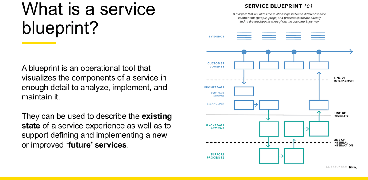
Three characteristics (Week 9 Lecture, slide 8 — verbatim)
- Customer focused, but system driven — "they keep the focus on the customer experience while showing how operations deliver that experience."
- Orchestration — "Blueprints show the orchestration of people, touchpoints, processes, and technology both frontstage (what customers see) and backstage (what is behind the scenes)."
- Highlights dependencies — "the service blueprint highlights dependencies within the organization and provides the foundation for road-mapping and piloting the reinvention or creation of an experience."
Origin (Week 9 Lecture, slide 9)
"Originally proposed by Lynn Shostack (1984) and have been evolving since." The contribution was codified service delivery — "traditionally viewed as intangible or ephemeral — as something that could be documented, measured, controlled, and systematically improved upon." The slide reproduces Shostack's original "Blueprint for a Corner Shoeshine", which already carried a line of visibility and timings per step.
The three lines
Correction to earlier guidance in this guide
An earlier version of this chapter treated line of internal interaction as a term from outside the course, and told you to flag it as your own contribution if you drew it. That was wrong. It was based on the tutorial preparation slide and the tutorial recordings, which between them name two lines. The Week 9 lecture deck names all three — on slides 7, 8 and 23. All three are course terminology; none of them needs a disclaimer. Some templates in the same deck (s34–35) draw only two lines, but that is a presentation variation inside the course's own material, not evidence that the third line is external.
| Line | What it separates | Course wording |
|---|---|---|
| Line of interaction | Customer actions above ← → frontstage actions below | "Sometimes it's helpful to draw a line between what customers can and cannot directly interact with. This line is called the Line of Interaction. When blueprinting complex service exchanges with many touchpoints for customer and employee use, it can become helpful to determine which tools are for whom." (s17) · On the lecturer's own example: "Where the Customer interacts with the Frontstage staff" (s34) |
| Line of visibility | Frontstage above ← → backstage below | "In service design and on a service blueprint, the division between frontstage and backstage is called the Line of Visibility. The elements you choose to show to your customer (and when) can have a profound impact on the experience." (s17) · On the example: "What the customer sees or interact directly with vs what they don't see or interact with" (s34) |
| Line of internal interaction | Backstage actions above ← → support processes below | Labelled on the NN/g reference diagram (s7, s8) and on the "Zoomed in" worked blueprint (s23, where it is printed as "INTERNAL INTERACTION"). The deck does not give it a separate prose definition. named on the diagram, not defined in prose |
Frontstage and backstage — the core concept
Week 9 Lecture, slide 15: "At the core of service design and service blueprints is the concept of frontstage and backstage. In other words, these are the parts of the service that will be visible or invisible to the customer."
Frontstage
"Consider a restaurant, for example. As a customer, there are many frontstage elements of the service that you can see — waiters taking orders, menus, food being delivered, etc. It may be somewhat classy, yet laid back, open and inviting experience."
Backstage
"There are also backstage elements of the service that are hidden from view — chefs cooking, computerized ordering systems, deliveries arriving from food distributors. This backstage activity can create a sense of magic and delight for services."
The lanes, defined
Slide 16 gives a definition for each element. These are the definitions to quote.
| Element | Definition (Week 9 Lecture, slide 16 — verbatim) |
|---|---|
| Customer actions | "Customer actions are the physical or mental actions a customer performs during a service experience. Because services can have multiple customers, we highlight the customer name in each customer action element." |
| Touchpoints = physical evidence | "Touchpoints are the medium of exchange between the customer and the service. Touchpoints can take many forms, ranging from technology to wayfinding to conversations with service staff. We encourage you to try to use only one touchpoint per service moment. This helps teams consider the micro-moments of a service and avoid hiding complexity." |
| Staff actions frontstage and backstage | "Staff actions are captured in both the frontstage and backstage staff swim lanes. Because most services involve multiple staff members, it's especially important to label each element with the actor performing the task (e.g., chef, server, hostess, etc.)." |
| Support processes | "Support processes are the tools and systems necessary to support the staff and the service moment. This can include physical tools like notebooks, software applications, internal processes, staff training, and technical systems. Depending on the context and complexity of your service, it may be helpful to split some of these into their own swim lanes." |
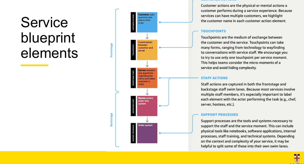
The structure
| Structural element | Course wording (Week 9 Lecture, slide 17 — verbatim) |
|---|---|
| Time | "Service blueprints read from left to right, unfolding over time. If your experience contains different time scales, things that take a week versus a minute, these differences in time should be marked. It's easy to lose a sense of time when looking at a blueprint." |
| Experience stages | "To help give your blueprint structure, stages are used to denote the different experience phases. These stages may connect to your journey map or other organizational knowledge of the end-to-end experience." |
| Swim lanes | "At the core of your service blueprint are your swim lanes. These horizontal rows capture and organize all the elements of your service experience." |
| The line of visibility | See the lines table above. |
| The line of interaction | See the lines table above. |
| Service moments | "The vertical columns, which represent service moments, encapsulate all service activities happening at a given moment in the service experience, both frontstage and backstage. It's important to map the backstage processes at the moment they start, even if they don't move across the Line of Visibility until later in the experience. For example, a server will be preparing your table before you arrive at a restaurant." |
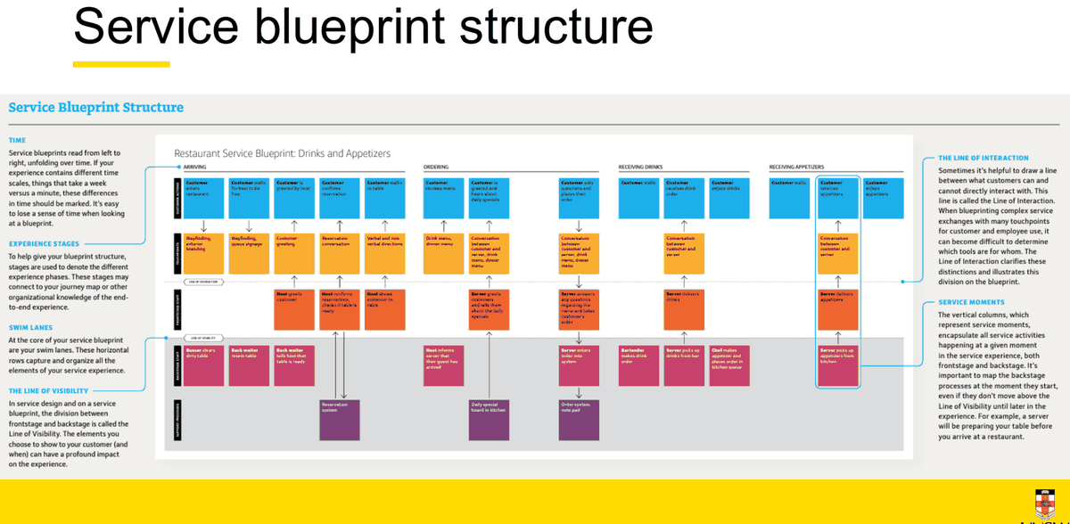
Current state and future state
Current state blueprint (s12)
"At the beginning of a project, a current-state blueprint is used to capture the experience as it's presently delivered. This helps teams:"
- Align on the current service state
- Capture existing organizational and operational knowledge
- Identify existing service opportunities and breakdowns
Benefits: Documentation of existing operational and experience processes · Identification of service breakdowns and pain points · Cross-silo understanding of the existing service
Future state blueprint (s13)
"Toward the end of the design process, blueprints can be used to visualize the future state of a service. This helps teams:"
- communicate change more effectively
- plan the design of touch-points
- capture operational needs
- develop roadmaps
- create planning documents
"Once a new experience is built, blueprints can help future teams maintain the experience, just as an architectural blueprint helps a building engineer maintain a building."
Why blueprint at all
Slide 11: "Digital is complex — with the explosion of digital products and touchpoints, service experiences are becoming more complex and challenging to orchestrate… service blueprints help in three key ways:"
To visualize…
(Previously) intangible experiences · Interconnections and dependencies between service components, technology, and operations · Elements necessary for service delivery · Current-state delivery breakdowns and opportunities · Potential gaps and service breakdowns in the end-to-end experience
To align…
Multiple perspectives by providing a cross-silo view of how a service will be built and delivered · Multiple collaborators by using a communal canvas · Understanding of how elements will connect to each other once built by their respective teams
To prototype…
Common customer flows and interaction points for experience validation · How multiple touchpoints will interconnect and the nature of the connections · Impact and changes to operational processes necessary to realize an experience innovation · Operational viability before investing in development
How to build one — the course's six steps
| Step | Name | Course wording (slide 18 — verbatim) |
|---|---|---|
| 1 | Prepare supplies | "Gather and prepare the supplies you'll need, like felt tip markers, sticky notes, and butcher paper. These may also include operational insights and examples of touchpoints or future touchpoint concepts." |
| 2 | Gather partners | "Identify the people whose expertise you will need to populate your blueprint and get them together in the same room (physically or virtually)." |
| 3 | Take a first pass | "Working from the start of the service experience to the end, fill out the customer action swim lane first. This will form the backbone of the blueprint." |
| 4 | Fill in | "Working from the customer action swim lane, start working down the rows in each moment, then across, filling out all the elements of the blueprint." |
| 5 | Direct attention | "Next add information like time; lines of interaction; flow between people, processes, and technology; and other insights you have into the quality of the service delivery." |
| 6 | Share it | "Once the guts of your blueprint have been filled in, it's time to refine and share it with others involved in the creation of your service." |
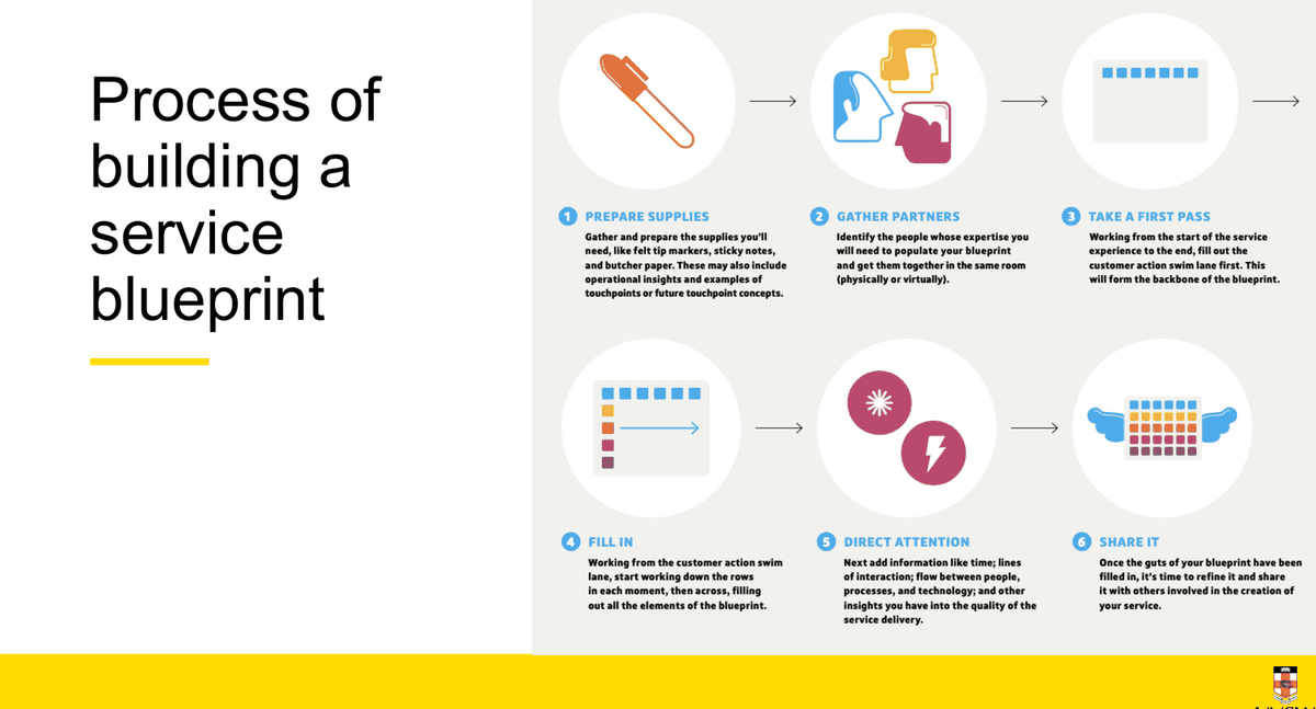
Scope decisions: zoom, fidelity and the happy path
Zoom (s21–22)
"Important consider the scope of the service but the level of detail you wish to capture as well. We call this the level of zoom… if you zoom out too far, your blueprint may become too general to be helpful."
- Not too much detail — "If the zoom in is too close, one can quickly become bogged down in details and overload your audience"
- Be helpful – move things forward — "The proper level of zoom for your blueprint will help move your project or service forward"
- Common path — "Remember to be linear too, following the most common customer path. As you find edge cases that break from the ideal path, make note of them"
Two named views: the helicopter view ("enough information to outline the audience group, episode and steps they need to take to complete actions") and the microscopic view ("at a touchpoint level").
Fidelity (s20)
Stage in the process — "Fidelity is informed by where you are in your design process and your team's communication needs."
Start low — "It's best to start with a lower level of fidelity and work your way up to avoid getting bogged down. Rushing to a high level of polish can make your blueprint too rigid and hard to update, diminishing your ability to use it iteratively."
Three levels: Sticky notes (early stages, collaborative) → Spreadsheets (shareable, remote, asynchronous, fine-tuning language and labels) → Printed posters (a polished artefact near the end of iterations; different colours per row, noting the Line of Visibility, detailing flow, naming stages).
The reality (s25)
- Services are big! — "When blueprinting a multi-phase or multi-encounter service experience, multiple service blueprints are used to explore and document the relevant areas of the service."
- Multiple blueprints — "Various blueprints are required, at varying levels of zoom, to document the different stages of the service in further detail, or for documenting things like edge cases."
- Start with the happy path — "document the ideal path of eating at a restaurant, then go back and create an additional blueprint showing what would happen if there were a mistake with the order."
Plotting the flow
- Direction — "Flow lines indicate directions of interaction and connections between elements within the blueprint — we represent these as arrows. These lines show where a particular interaction originates and what is affected or triggered as a result."
- Gap identification — "As you add flow lines, you will start to see more of the system emerge. Be prepared to spot missing elements and information as gaps are revealed in this process."
- Top Tip — "Flow lines accomplished as a solo task following a blueprinting session. Once you've added the flow lines, share the resulting blueprint with the group for review and alignment."
This confirms the tutor's live correction: use arrows, not plain lines — "so it shows like whom to whom".
Finding the problems — "the bottlenecks"
How to use a completed blueprint (s27)
- Analysing performance — "you can use it to show you how well your existing service is performing, either functionally or experientially."
- Add new 'lenses' — "layering on additional information captured via quantitative or qualitative research. As you add information, remember to constantly assess if these new layers are helping or hindering the communication of your blueprint."
- Create focus — "The most common types of additional information are key moments, unsupported moments, and service breakdowns."
Additional data that can be useful to incorporate
Key moments · Unsupported or missing elements · Service breakdowns · Satisfaction metrics · Opportunity areas · Customer and staff pain points · Moments of customer delight · Duration of moments
This list is the bridge from Chapter 14 to Chapter 6 — a blueprint annotated with pain points and opportunity areas is synthesis, and it feeds straight into a How Might We.
The lecturer's own worked example and template
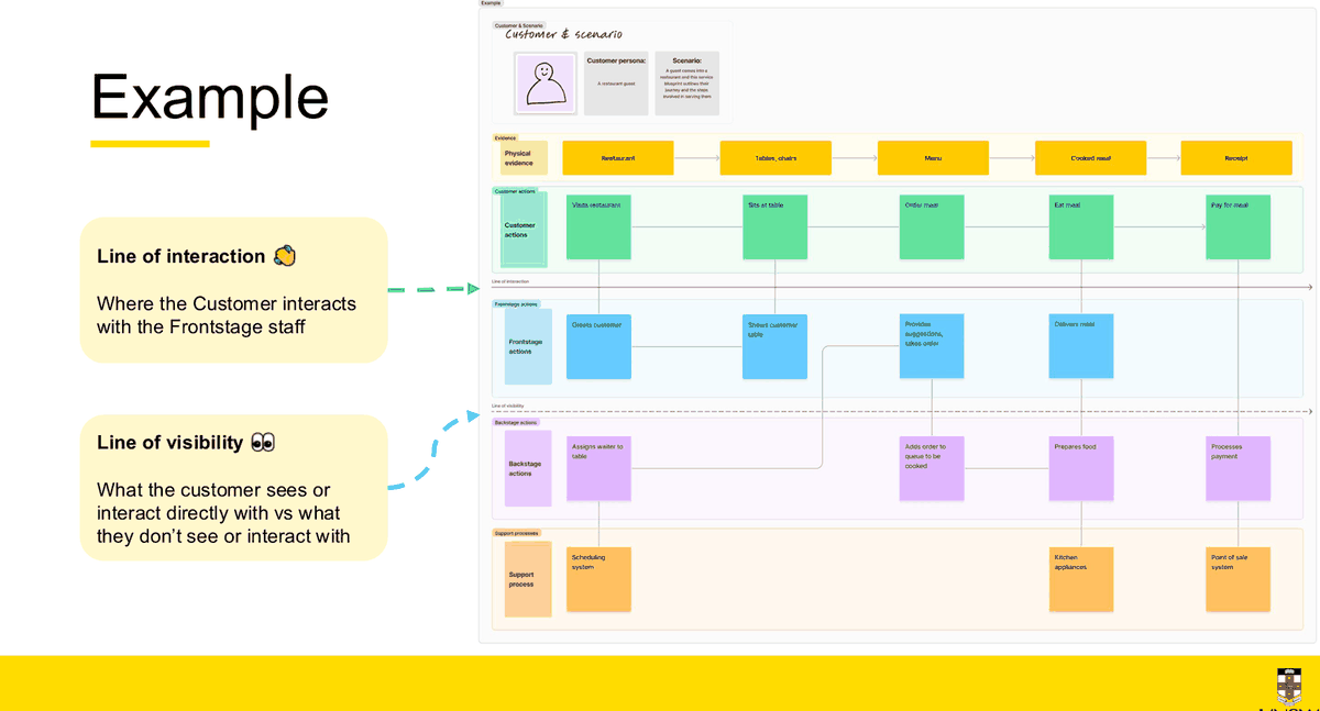
Two details in the lecturer's example worth copying
- It opens with a "Customer & scenario" header block — a customer persona field ("A restaurant guest") and a scenario field ("A guest comes into a restaurant and this service blueprint outlines their journey and the steps involved in serving them"). Put an equivalent one-line scenario at the top of anything you draw.
- Not every lane is filled at every moment. There is no frontstage action at "Eat meal", and no support process at "Sits at table". Empty cells are honest, and they are often where the insight is.
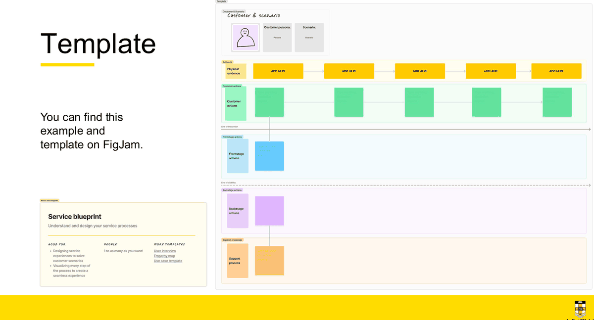
assets/original_diagrams/service_blueprint_blank_template.svg.A second worked example — a GP clinic
The restaurant is the lecturer's. This one uses the service the Week 9 tutorial actually blueprinted, so the two chapters connect.
| Lane | 1 · Appointment booking | 2 · Arrival & waiting | 3 · Receiving treatment | 4 · After treatment |
|---|---|---|---|---|
| Physical evidence (touchpoints) |
Booking page | Reception desk | Consult room | e-script |
| Customer actions | Searches for a GP · picks a time · confirms the booking | Reports at reception · completes the history form · waits | Describes symptoms · is examined · asks questions | Pays · collects the script · waits for results |
| — — — LINE OF INTERACTION — — — | ||||
| Frontstage actions | none — the customer is facing the online system | Receptionist greets and verifies identity | Nurse takes observations · GP consults and explains next steps | Receptionist processes payment and explains how results arrive |
| — — — LINE OF VISIBILITY — — — | ||||
| Backstage actions | Booking system holds the slot · reminder generated | Receptionist flags "arrived" so it appears on the GP's screen | GP retrieves history · writes up notes · raises the pathology request | GP classifies the returned result normal / abnormal / urgent |
| — — — LINE OF INTERNAL INTERACTION — — — | ||||
| Support processes | Practice management and medical record system · online booking platform · privacy and consent policy · staff training including urgent-symptom triage · billing and claiming infrastructure · pathology lab partnership · IT support and downtime procedures | |||
The two moments worth pointing at in any blueprint answer
- A stage with no frontstage action. At booking the customer faces a system, not a person — so the line of interaction is crossed by a self-service touchpoint rather than a staff member. Naming that shows you understand what the line separates. The lecturer's own restaurant example does the same thing at "Eat meal".
- A customer action that triggers an invisible change. Reporting at reception flips a status the customer never sees, which is what tells the GP inside the room they have arrived. That single arrow crosses both lines and is the clearest demonstration of why a blueprint exists.
Using a blueprint once you have one
1 · Prototyping (s29)
"A blueprint is a prototype" — "Once you make a future-state blueprint, you've already made a low-fidelity paper prototype of your service."
Act it out — "Enact sections of the experience or conduct flow walkthroughs (known as service storming) to spot problems early."
Capture or script · Stay Lean!
2 · Supporting a vision (s30)
"Blueprints are powerful tools, but their operational focus means they need support from other artifacts to truly bring an experience to life."
Show the Story · Storyboards or videos · Teams can stay focused on the customer · Blueprint to roadmap
This is the course's own link between the blueprint and Chapter 12.
3 · Making it reusable (s32)
"Blueprints can be used to identify service patterns: common elements within a larger service experience, similar to an interaction pattern, but at a much greater scale."
Pattern libraries · Efficient · Document
The slide references "design patterns concept in Week 4" — an excluded topic, so treat this slide as context only. adjacent to an exclusion
From service vision to implementation planning (s31)
Service artifacts = "tangible things designed to support the desired experience… screen designs, touchpoint flows, and concept sketches". Experience stories = "From the customer's perspective, we tell a story of what the experience will feel like and the value they will receive… an experiential 'north star'". Roadmap = "outlines the plan for the projects and efforts necessary to implement your service vision… from MVP to ideal experience."
Common errors
| Error | What it looks like | The fix |
|---|---|---|
| Steps instead of stages tutor corrected all four groups | Column headings read "clicks book", "arrives", "sits down" | Name the experience stage: Booking · Arrival · Waiting · Receiving treatment · After treatment |
| Not naming the actor | Backstage lane reads "order is entered" | Slide 16: "label each element with the actor performing the task (e.g., chef, server, hostess)". Write "Server enters order into system" |
| Mixing customer actions with staff actions | "Receptionist checks the patient in" in the Customer actions lane | Ask "would the customer say I did this?" If not, move it below the line of interaction |
| Multiple touchpoints in one moment | Four touchpoints stacked in a single column | Slide 16: "try to use only one touchpoint per service moment… avoid hiding complexity". Split the moment |
| Plotting backstage work when the customer notices it | Table preparation shown at the moment the guest sits down | Slide 17: "map the backstage processes at the moment they start, even if they don't move across the Line of Visibility until later" |
| Putting external actors in the wrong lane | The pathology lab placed in Backstage actions | A partner providing standing capability is a support process; a specific act for this customer can be backstage. Decide, and be consistent |
| Omitting backstage or support processes | The blueprint stops at the line of visibility | Every customer action has something happening below the line. An empty lane usually means you have not looked hard enough |
| Failing to connect actions across layers | Five neat rows of boxes and no arrows | Slide 26: flow lines "show where a particular interaction originates and what is affected or triggered as a result" — use arrows |
| Describing departments rather than actions | Backstage lane reads "IT", "Billing", "Admin" | Write verbs with actors: "Reception submits the claim", "GP classifies the result" |
| Wrong level of zoom | Four generic steps that would describe any clinic in the country — or forty micro-steps | Slide 21: zoomed out too far is "too general to be helpful"; too close and you "overload your audience". Aim for the level that moves the project forward |
| Blueprinting every edge case at once | A tangle of conditional branches | Slide 25: start with the happy path, then make a second blueprint for the failure case |
| Unreadable diagram | Dense unlabelled boxes, no lane or line labels | Label every lane and every line. Under exam conditions, legibility is part of the answer |
Optional detail: service design principles (Week 9, section 09.5) — in scope; capabilities are not
Scope note. Week 9's final section is titled "SD principles & capabilities". Week 10 excludes service design capabilities — so the nine capabilities below are out of scope. It does not exclude service design principles, and "design principles" is on the possible-topic list. The six principles are therefore worth knowing, though the P&P task and the Week 10 revision slides both point at the Week 4 five design principles (Chapter 8) as the primary set. not confirmed as a standalone exam topic
The six service design principles (Week 9 Lecture, slide 37 — verbatim):
| Principle | Definition |
|---|---|
| 01. Human Centered | Consider the experience of all people affected by the service |
| 02. Collaborative | Stakeholders (incl. Customers) across various functions should be actively engaged |
| 03. Iterative | Exploratory, adaptive and experimental approach iterating toward implementation |
| 04. Sequenced | The services need to be visualized as a sequence of related actions |
| 05. Real | Needs to be researched and prototyped in reality |
| 06. Holistic | Sustainably address the needs of all stakeholders through the entire service and across the business |
Excluded — do not build an answer on these. The nine service design core capabilities on slide 39 are Empathy · Communication · Facilitation · Systems thinking · Synthesis · Future visioning · Storytelling · Visualisation · Making. Listed here only so you recognise them as the excluded topic and do not spend exam time on them. explicitly excluded
If a question asks about the relationship between the blueprint and the rest of service design
Say this: the 5Ps map the ecosystem and set the trajectory of research (Discover); the current-state blueprint documents the service in enough detail to locate where it breaks down; those breakdowns become pain points and opportunity areas, which become the problem statement and the How Might We; a future-state blueprint then acts as a low-fidelity paper prototype of the redesigned service, which can be service-stormed, supported by a storyboard to carry the emotional picture, and turned into a roadmap for implementation. The blueprint is the artefact that keeps the whole service in view when the temptation is to fix only the screen.
Optional detail: the Week 8/9 tutorial case study — what it is and how to use it
The tutorial case study is "The five principles of omnichannel healthcare service design" by Zichuan Xiong and Brandon Fleisher, published by Thoughtworks on 4 February 2022. It is a set reading, not course-authored. The identical PDF is used in both Week 8 and Week 9.
Do not present the five omnichannel principles as the course's service design principles. They are a consultancy's framework for one industry — and the course now has its own six principles (above). The tutor framed the article as background and asked whether the principles still hold four years on.
The five principles (in-body headings): #1 Design journeys and ecosystems around key patient moments · #2 Good EX drives successful CX · #3 Prioritize ecosystem resilience and adaptability · #4 Envision a platform strategy and design for reusability · #5 Test, learn, and iterate.
Genuinely useful for the exam:
- Omnichannel vs multichannel: "multichannel — where organizations simply operate through and support multiple channels simultaneously. Omnichannel, however, demands that those channels are woven together seamlessly, enabling journeys to flow freely between them." A clean, quotable distinction.
- The four assess-and-reassess criteria (Principle #5): Viability · Usability · Value · Feasibility — "Where are the key points of friction in service user journeys?" · "Who is losing across the omnichannel journeys you're trying to support?" Good evaluation prompts for a service-design case. They are not heuristics and must not be presented as such.
- Using statistics to establish significance: "In January 2019, telehealth engagements accounted for just 0.17% of total healthcare claims. By August 2021, that figure had increased to 4.3% — a 25-fold increase in just over two years."
The article's platform and capability diagrams cover service design capabilities, which is an excluded topic. Use those pages only for their layered structure. excluded topic in the case study
Artefact comparison
"Drawing out artefacts" is a named exam format. Under time pressure the most expensive mistake is producing the wrong artefact well. This table exists to make that decision take five seconds.
Persona and journey-map construction are not in this table, because both are explicitly excluded from the exam (Week 10 slide 13). They are listed at the bottom only so you can recognise and avoid them. excluded
The decision, in one question
Full comparison
| Artefact | Purpose | When used | Core components | What it does not show | Common exam mistakes |
|---|---|---|---|---|---|
| Low-fidelity wireframe W5 s20–29 |
"A stripped-down visual map without any graphic treatment" — communicate the structure of a screen before any visual decisions | Develop · divergent phase, when you have several concepts to share | Major regions; information hierarchy; the primary action; navigation; system-status element; placeholders (images = X, text = lines); annotations | Visual design. Emotion. Anything the organisation does behind the screen. Real content. | Drawing real copy and visual polish; no screen label; no annotations; no error or empty state |
| Wireflow W5 s11–15 |
"A combination of wireframes and flowcharts" — show the screens needed to get from A to B on the happy path | Develop, after task flows; when talking to stakeholders unfamiliar with UX jargon | Sequenced screens; arrows from the specific element clicked; screen states including at least one error branch; labels on each screen | Conditional logic in full — that is a user flow. Backstage systems. Emotion. | Confusing it with a user flow; arrows drawn screen-to-screen instead of element-to-screen; only the happy path with no error state |
| Storyboard W4 s43–50 |
"Bring meaning to our ideas and research"; convey a message visually; identify pain points early | Ideate; 4Cs Commit (#34); as a concept-testing artefact | Three acts — Problem / Objective-Goal-Action / Outcome; actor; context; trigger; user actions; touchpoints; emotion; captions | Interface layout. Backstage processes. Measurement. | Drawing screens instead of situations; starting with the solution; flat emotion; too many frames; no captions |
| Service blueprint W9 prep p1 |
"An operational tool that visualizes the components of a service in enough detail to analyze, implement, and maintain it"; describes the existing state or a future state | Service Design; after the 5Ps have mapped the ecosystem | Experience stages across (time, left to right); five lanes down — physical evidence (touchpoints), customer actions, frontstage actions, backstage actions, support processes; line of interaction; line of visibility; line of internal interaction; service moments as vertical columns; arrows | Screen layout. Narrative emotion. Visual design. | Steps instead of stage names; staff actions in the customer lane; unnamed actors; empty backstage or support lane; no arrows; departments instead of verbs |
| Research plan W2 s62 |
State what you will learn, from whom, how, and why that is the right approach | Plan stage of the UX Research Process, before any recruitment | Problem statement; project objective; proposed research approach + why; research sample + why (including who is excluded); key research questions | Findings. The design. Anything you have not done yet. | Naming a method with no justification; a sample with no exclusion rationale; no research questions |
| Interview guide / discussion guide W2 s65–66, s47 |
Make the session run, and make it repeatable across participants | Prepare stage; before fielding | Timed sections (4 / 10 / 25 / 20 / 1 = 60 min); objectives per section; question types (What / Why / Summing up / silence); protocol items a–g including consent | Answers. Analysis. A script the moderator must read verbatim — it is "a working document". | Leading, hypothetical or design questions; no timings; no consent statement; treating it as a fixed script |
| Workshop plan Group Assignment p4; W2 s55 |
Make a group session produce a specific output within a fixed time | Discover / Frame / Ideate | Timelines and roles; participant criteria; agenda in Beginning / Middle / End; one activity per 4C stage, each with instructions, questions and time allocation; materials and tech | The findings. Individual depth — that is what interviews are for. | Activity names with no instructions, questions or timings; questions listed in a separate section instead of inside each C; more than one activity per C; no participant criteria |
| HMW statement W3 s60–61 |
"Turns challenges into opportunities for design" — reframe an insight as an answerable question | Frame, at the end of synthesis | "How might we" + who + the outcome they want + (optionally) the burden to avoid | The solution. The evidence behind it — that sits in your insight statement. | Embedding the solution ("How might we tell users…"); framing the business's annoyance; too narrow or too broad |
| Hypothesis W7 s22 |
State a testable prediction so the design decision can be checked rather than argued | Prototype, before testing | "We believe that [problem] / So if we [specific change] / We will see [measurable outcome]" | How you will measure it in detail — that is the measures list. Whether it is true. | No measurable outcome; a vague change ("improve the filters"); a problem invented rather than drawn from research |
| Test scenario Individual Assignment p4; W7 s32 |
Put the hypothesis in front of a real person in a realistic situation | Test & Learn | Hypothesis ×1; research questions ×3 minimum (task-based, probe, rating); measures of usability ×2 minimum; realistic context; goal stated without naming UI elements | The result. The design rationale. | Task written as instructions; naming UI elements in the task; fewer than the required counts; measures with no threshold |
| Persona Journey map |
Explicitly excluded from the exam (Week 10 slide 13). Taught in Week 3 and assessed in the Individual Assignment, but you will not be asked to construct either. Recognise them so you do not spend exam time producing one by accident. | Producing one when a case asks you to "understand the user" — use insights, pain points and HMW instead | |||
The artefacts in process order
Three artefacts, one case — how they differ in practice
Take a GP clinic where patients do not know how long they will wait.
- Storyboard: six frames following Amy — arriving, being told "take a seat", checking her phone repeatedly, missing a work call, being called in, leaving unsure when results come. The low point is frame 3. It answers why this matters to a person.
- Wireframe: one screen — a waiting-room display or a patient app view showing position in queue, estimated wait, and a "notify me" action. It answers what the interface looks like.
- Service blueprint: five lanes across four stages, showing that the receptionist flags "arrived" in the practice system, that nothing in that system estimates a wait, and that no support process exists to publish one. It answers why the organisation cannot currently tell her.
Same problem, three artefacts, three different insights. If a question gives you a choice, say in one sentence why you picked the one you did.
Personal example bank
Week 10 says it twice on the same deck: "Always use examples to support your points!!!" and "Use examples from your own experiences". Practice Q1 asks explicitly for "examples from your personal experiences". This chapter turns your own coursework into eight short, checked, reusable examples. Avoid relying on one example throughout the paper — but the same project may support several questions when each use demonstrates a different concept and the analysis is adapted to the specific question.
How to read this chapter
Everything here is student-generated coursework, not course content. Each example has been checked against the lecture slides, and each carries a limitation — the thing you should not claim. Use the shortened version; do not import the original wording wholesale, and never present a student artefact as though it were a course example.
The source project, in one paragraph
Problem Space 2 — Study Group and Group Project Coordination App. The official brief describes the situation: teams "default to using a combination of WhatsApp group chats, Google Drive folders, and shared Notion boards, each serving a different purpose, none providing a unified view of group progress, task ownership, or upcoming deadlines." The group ran a 1-hour online 4Cs workshop with eight participants; the individual assignment took the findings through to a tested wireflow. Both assessments are complete, so the evidence is real. problem space is official course material
The bank
EX-1 · Workshop planning and facilitation student example
| The example | A 60-minute online 4Cs workshop with 8 participants, run on a FigJam board split into zones: Zone 0 welcome and consent, Zone 1 Empathy Map (Collect, #10), Zone 2 Dot Voting (Choose, #11), Zone 3 Idea Storm (Create, #28), Zone 4 Effort/Impact Scale (Commit, #36). Three facilitators split the zones between them; a note-taking template captured time, initials, verbatim quote, activity stage and a significance flag. |
| Supports | Workshop planning · the 4Cs · facilitation roles · one-activity-per-C rule · note-taking · tech preparation |
| Validated against | 4Cs stages and activity numbers match Week 2 slide 10 exactly. The Beginning/Middle/End agenda shape matches Week 2 slide 55. The role split matches Week 10 slide 8 and the Group Assignment p4 role list. 6–8 participants matches the assignment requirement. |
| Shortened for the exam | "In a 60-minute online workshop with 8 participants I used one activity from each of the four Cs — an Empathy Map to collect current-state experience, Dot Voting to choose the dominant pain point, Idea Storm to create solutions individually before discussing, and an Effort/Impact Scale to commit to a shortlist. Roles were split so one person facilitated while another took notes and a third managed the board." |
| Limitation | The activity descriptions in the group's own guide were reconstructed from the Week 2 slide, not read from the Workshop Encyclopedia (the file was too large to open). Cite the activity names and numbers — they come from the lecture slide and are reliable — but do not quote any detailed Encyclopedia description as authoritative. |
EX-2 · Participant criteria — a failure that teaches more than a success student example
| The example | The submitted workshop plan named participants before defining criteria. The tutor's written feedback, twice, asked for a more deliberate sampling plan spanning discipline ("STEM, business, arts, etc., since group work can look different across fields"), year level ("experience with group work") "and other relevant dimensions". The final workshop used a convenience sample arranged the night before, and participant backgrounds were only collected after all four activities had run. |
| Supports | Participant criteria · recruitment logic · sampling limitations · why criteria come before recruitment |
| Validated against | The Who/What/How/Where/When framework at Week 2 slide 67, which requires you to define "Who is your target? Who is not your target?" and to state "the impact of your sample methodology on your outcomes". The tutor's dimensions are staff-authored and therefore authoritative. |
| Shortened for the exam | "In my group project we recruited before we had written criteria, and our tutor's feedback was that we needed a deliberate sampling plan across discipline and year level. The consequence was visible in the session itself: because we had not screened, we ran the introductions at the end and could not weight findings by participant type. Defining criteria first — with an explicit exclusion — would have let us say which findings came from which kind of student." |
| Limitation | This is an example of getting it wrong. That is a strength — the "so what" is concrete — but do not present it as a model recruitment process. Frame it as a lesson. |
EX-3 · Affinity mapping and synthesis student example
| The example | Empathy-map stickies were grouped into four clusters named after experiences, not features: Disorganised Responsibilities (strongest support), Interpersonal Tension, Lack of Understanding of the Assignment, Time Management. The synthesis then built a causal chain rather than a list: unclear requirements → unclear ownership → weak progress visibility → missed or duplicated work → manual chasing and task takeover → stress, unfairness and tension. |
| Supports | Affinity mapping · themes and insights · pain points · evidence-to-insight reasoning · the IRA test |
| Validated against | Week 3 slide 22 step 2 — "organize the insights into categories related to the problem (not by solutions)" — which these cluster names satisfy. Week 3 slide 24 shows the lecturer's own clusters named the same way (Triggers, Barriers/pain points, Entry points). |
| Shortened for the exam | "We grouped workshop stickies into four clusters named after user experiences rather than features — for example 'Disorganised Responsibilities' rather than 'Notifications'. That mattered because naming a cluster after a feature would have decided the solution before we had analysed the problem. From those clusters we built a chain: unclear requirements led to unclear ownership, which made progress hard to read, which meant delays were found late — so the leverage point was ownership, not communication volume." |
| Limitation | The causal chain is the team's inference, not something participants stated. Say so — the discipline of labelling inference as inference is itself worth marks. |
EX-4 · A How Might We statement student example
| The example | "How might we help students clearly understand who is responsible for each task and whether the group is on track, without repeatedly chasing each other for updates?" |
| Supports | HMW framing · insight-to-opportunity · the "without creating what burden" pattern |
| Validated against | Passes all three Week 3 tests: it states the user's desired state, not the business's annoyance; it contains no solution (no dashboard, no notification); and it could be answered several different ways. The "without…" clause echoes the "better" HMW on Week 3 slide 61, which widens the frame beyond the immediate mechanic. |
| Shortened for the exam | Use it verbatim — it is already one sentence. |
| Limitation | A second version the student wrote — "How might we give group members one trusted view of the tasks…" — fails the solution-open test, because "one trusted view" is already a design decision. Worth carrying as the contrasting weak example: the same student, the same project, one good HMW and one that leaks the solution. |
EX-5 · A hypothesis student example
| The example | "We believe university project team members struggle to recover task ownership and project status when updates are fragmented across tools. So if we provide a shared mobile coordination view showing ownership, outstanding work, deadlines and blockers, we will see at least 4 of 5 participants correctly identify outstanding work, the responsible member and the blocker, and update their own task without facilitator assistance." |
| Supports | The hypothesis recipe · testable and specific outcomes · linking a hypothesis to research findings |
| Validated against | Week 7 slide 22: makes a prediction; testable with a measurable impact; simple and clear; specific. The problem in the "We believe" clause traces to the workshop findings, which is the tutor's first rule. |
| Shortened for the exam | Use as is, or compress the middle clause to "a shared view showing ownership and blockers". |
| Limitation | The "4 of 5" threshold is the student's own judgement sized to n=5. The course publishes no threshold conventions. Present it as a defensible choice for a small sample, not as a standard. |
EX-6 · A test scenario and its measures student example
| The example | Scenario: "You are in a four-person university group with an assignment due in two weeks. You have just finished your draft of the data section. Using the app, get a picture of how the project is going, find the task that most needs attention, check who is responsible for it, mark your own task as done, and let the teammate responsible for the at-risk task know it needs an update — without sending a single chase message yourself." Measures: task completion without assistance; time on task; first-click accuracy on the at-risk item; an ease rating. |
| Supports | Test scenario writing · goal-based vs step-based tasks · measures of usability · the three research-question types |
| Validated against | Week 7 slide 32 — realistic (a task a student would actually do), actionable (states goals, not "tell me how you would"), not leading (no screen or button named). Structurally the same as the course's own NRMA scenario at Week 5 slide 48. |
| Shortened for the exam | Quote the first sentence and two of the goals — the full version is too long to reproduce under time pressure. The point you are demonstrating is context + goals + no UI words. |
| Limitation | Two of the measures — the Single Ease Question (7-point, Sauro & Lewis) and first-click accuracy — are industry instruments that do not appear in the course slides. If you use them, say they are external. The course's own vocabulary is direct/indirect success, success rate, time spent before completing, ease-of-use rating out of 5, and confidence rating. |
EX-7 · Low-fidelity design decisions student example
| The example | Three low-fidelity layouts were explored for the main screen and two were rejected on research grounds: a people-first layout because "organising the screen by people makes it read as monitoring people rather than work — one step from a leaderboard, which is exactly the surveillance/fairness risk the group flagged"; and a timeline-first layout because it "organises the screen around time management, the workshop's null result — that pain point attracted no support stamps." |
| Supports | Low-fidelity wireframes · divergent exploration · justifying a design decision from evidence · reading a null result |
| Validated against | Week 5 slide 29 — simple block sketches are "Best Used: in the Divergent phase - you have several concepts to share". Producing three and rejecting two is exactly that. The rejection reasoning uses research evidence rather than taste. |
| Shortened for the exam | "I explored three low-fidelity layouts for the same screen and rejected the people-first version because organising by person made the screen read as monitoring teammates rather than tracking work — which was the exact fairness concern our research had raised. Rejecting an option on evidence rather than preference is what the low-fidelity stage is for." |
| Limitation | The mid-fidelity Figma work that followed covers an excluded exam topic. Stop the example at the low-fidelity decision. mid-fi excluded |
EX-8 · Service blueprint — the local doctor student example
| The example | A complete GP-clinic blueprint written as dot points under the five component headings, with 7 physical evidence items, 7 customer actions, 7 front-stage actions, 8 back-stage actions and 8 support processes. Its clearest contribution is the boundary: back-stage "Test results return to the GP's inbox and are classified as normal, abnormal or urgent" versus support process "IT support, data backups and alternative procedures when digital systems are unavailable." |
| Supports | Service blueprint components · the back-stage vs support-process distinction · physical evidence at volume |
| Validated against | The five component names on the Week 9 preparation slide, and the tutor's physical-evidence checklist generated live in the tutorial. Local Doctor is one of the five health-industry options the slide offers. |
| Shortened for the exam | Use the one-line boundary test rather than the whole blueprint: "Classifying a returned test result is a back-stage action — someone does it, out of sight, for this patient. The record system that stores it is a support process — it exists whether or not this patient ever books." |
| Correction applied | The student's version writes "Front-stage actions" and "Back-stage actions" with hyphens. The course slide prints them without hyphens — "Front stage actions", "Back stage actions". Use the slide's spelling. |
Non-project examples worth having ready
Practice Q1 asks for examples "from your personal experiences" — that does not have to mean coursework. The course's own examples are also fair game, and they are safer because they are definitionally correct.
| Concept | Course-supplied example | Everyday alternative you can reason about |
|---|---|---|
| Heuristic 01 forthcoming | Google Maps warning of congestion ahead (W1 s36) | A banking app warning that a payment will overdraw the account before you confirm |
| Heuristic 02 self-confident | Gmail's send-then-undo (W1 s37) | A photo app that deletes immediately with a 30-day recycle bin instead of a confirm dialog |
| Heuristic 03 visibility of status | "Syncing 5 of 21", "Uploading: 77%" (W1 s38) | Food delivery showing the courier's live position and an ETA |
| Heuristic 04 match to real world | Recycle-bin icon; floppy-disk save (W1 s39) | A transport app saying "Platform 3, 4 min" rather than "Service ID 4471 departs 08:23" |
| Heuristic 05 don't waste my time | Three-tier pricing page, one CTA per tier (W1 s40) | A form that pre-fills your saved address instead of asking again |
| Design principle 3 natural affordances | "Push or Pull?" — Norman's Doors (W4 s11) | Scissors; a kettle handle; a door plate that only affords pushing |
| Design principle 5 constraints | Multi-select dropdown; validation stack; lift keypad (W4 s13) | An AA battery compartment shaped so the cell only fits one way |
| UX vs SD vs CX | The two coffee shops (W1 s17, W8 s14) | Airport check-in: the kiosk UI is UX; the whole check-in-to-boarding flow is SD; whether you fly that airline again is CX |
| Service blueprint / touchpoints | Airline & hotel — help desk staff, baggage handlers, limo partners (W8 s40) | A GP clinic; a pharmacy click-and-collect; a university enrolment |
Allocating examples across the paper
The paper has nine sub-parts. You do not need nine unrelated examples. One substantial project can support several sub-parts — the group workshop alone can evidence participant criteria, workshop planning, facilitation, synthesis and prioritisation, because each of those draws on a different part of it. What has to change each time is the point the example is making. Reusing the same project with the same explanation is what looks thin; reusing it to demonstrate a different concept is normal and efficient. Plan the allocation during reading time:
| If the topic is… | Reach for… |
|---|---|
| UX vs Service Design | The coffee shop (course) or the scheduling-screen vs coordination-flow contrast (EX from the Week 8 forum) |
| Exploratory research / method choice | Survey-for-scale + interviews-for-why, on Problem Space 2 |
| Participant criteria | EX-2 — the criteria-after-recruitment failure and the tutor's dimensions |
| Workshop planning | EX-1 — the four-zone 4Cs workshop |
| Synthesis / HMW | EX-3 and EX-4 — clusters named after experiences, then the HMW |
| Heuristics evaluation | A course example (Google Maps, Gmail) plus one everyday one |
| Design principles | The five everyday objects — measuring cup, volume knob, scissors, kettle, battery compartment |
| Quant vs qual data | The NRMA figures (course) — 86.7% direct, 4.8/5 confidence, 45% misread |
| UX testing / hypothesis | EX-5 and EX-6 |
| Wireframes | EX-7 — three layouts, two rejected on evidence |
| Storyboards | Heartline (course) — Tom, Susan, the check-in reminder |
| 5Ps / service blueprint | EX-8 — the GP clinic, and the airline Front/Back of House split from W8 s40 |
Rules for using a personal example well
- One sentence of context, then the point. Keep the project context brief and focus on applying the concept.
- Name the concept the example is evidencing. "This is an example of grouping by problem rather than by solution" — state the connection explicitly rather than leaving it to be inferred.
- Say what it showed. An example with no "so what" is decoration.
- A failure can be a better example than a success, as long as you state the lesson. EX-2 is the strongest example in this bank for exactly that reason.
- Do not invent detail. If you cannot remember a number, describe the finding qualitatively rather than fabricating a percentage.
- You may return to the same project in more than one sub-part — but only if the point changes. Cite the workshop for participant criteria in one answer and for prioritisation in another, and each answer stands on its own. Retelling the same story for the same reason twice adds nothing to the second answer.
Practice questions and model answers
Twenty-two questions across every Week 10 possible topic, in the formats the exam actually uses. The three Week 10 in-class questions come first because they are the closest thing to a released paper. Model answers are collapsible — attempt the question before opening one.
These are not past papers and there is no official rubric. Week 10 slide 15 states: "This is a Final Exam – a summative assessment – and not an assignment. We will not provide marking criteria." Every model answer and every mark suggestion below is revision guidance written for this guide, built from what the course teaches and what the practice questions ask for. revision guidance, not an official marking scheme
Part A — The three Week 10 in-class questions
Reproduced verbatim from Week 10 Lecture, slide 31. The lecturer gave 10 minutes to draft, 5 minutes for peer critique, then share with the tutor.
Q1. Why is UX and SD design important for products and services? Define both roles and provide examples from your personal experiences. 10 marks
What the question is really asking for — four things: (1) why it matters, (2) a definition of UX, (3) a definition of SD, (4) your own examples. All four must appear; an answer that omits one has left a quarter of the question unanswered.
Model answer
Definitions. UX — user experience — is the process of understanding and solving specific problems, often discrete digital interface solutions; it looks at the digital touchpoints. Service Design is the understanding of how services are created, delivered and experienced by customers, noting specific problems in an experience journey that need to be improved; it looks at the holistic experience of all online and offline interactions. The course draws the relationship as nesting: several UX problems sit inside one service, and the service sits inside the customer's overall perception of the brand, which is CX.
Why they matter. Good UX increases usability, reduces errors because they are considered early and solved for, generates revenue by helping businesses meet their goals, and meets real customer needs. Service design matters because a well-designed screen cannot rescue a service that fails around it — Harris Interactive found 86% would pay more for a better service experience, and the course's coffee-shop example makes the point that when two shops sell identical coffee at an identical price, service design is the reason a customer chooses one.
Examples from my own experience. In my group project on university group-assignment coordination, designing a clear scheduling screen was a UX concern — layout, hierarchy, whether the primary action was obvious. Making sure a confirmed meeting actually flowed through to notifications, task ownership and the way the team then worked together was a Service Design concern. When we tested only the screen, we found people could book a meeting easily and still had no idea who owned the work afterwards — a UX success sitting inside a service failure.
Why this matters commercially. Both are needed because they answer different questions. UX answers "can they do this?"; service design answers "does this whole thing work?" Investing only in the first produces a polished interface on top of a process that still frustrates people, which is the pattern behind the four challenges the course names — lack of differentiation, reliance on old systems and processes, disconnect between customer and business, and inability to innovate.
Q2. What will you consider if you are conducting exploratory research? Give examples of 2 activities and 2 artefacts produced. 10 marks
Watch the counting. "2 activities and 2 artefacts" is an instruction, not a suggestion. Give exactly two of each, clearly labelled.
Model answer
What I would consider. First, where the problem came from — a business investment in an initiative, or complaints heard in day-to-day life. Second, the current state: what the existing experience is like, how it would perform in a heuristics analysis, what the legacy products or services are, and where the gaps are. Third, competitors: what key players are doing, what industry best practice looks like, and what has been working well or not.
Then what sources I can rely on: business stakeholders — product owners, subject matter experts, and front stage and back stage employees; customers and end users, where I need to decide who I am designing for, whether I need a mix of participants, and whether different groups need separate sessions; and existing data analytics such as web traffic, call centre traffic, social media interactions and publicly available statistics.
Practically I would consider preparation — setting up the activity space, doing a practice run and testing the tech, physically (room, printing, whiteboard, markers, post-its) or digitally (Teams, Zoom, FigJam, Miro) — and roles, because everyone has one: meeting organizer, facilitator, note taker, time keeper, tech set up. Finally ethics: consent captured before the research, personally identifiable information stored securely, and being upfront and transparent about how insights will be used.
Two activities. (1) A 1-hour semi-structured user interview, chosen because the problem is not yet clear and I need to understand behaviour and motivation rather than measure it. (2) A co-design workshop with a mix of customers and frontline staff, chosen because it surfaces the current state and builds stakeholder buy-in in the same session.
Two artefacts. (1) A discussion guide — five timed sections over 60 minutes: introduction and warm-up, participant context, current state, exploring the ideal experience, and thank you and close. It exists so the session has a natural flow and is comparable across participants. (2) A participant recruitment brief / screener stating who I need, the behaviours they must already have, quotas across the mix, and an explicit exclusion — because who I exclude shapes what I can conclude.
Q3. What are some examples of quantitative vs qualitative data? How would you go about collecting both types of data? 10 marks
Two-part question. The second half — "how would you go about collecting" — is a method question in its own right. Do not spend the whole answer listing metrics and leave it unanswered.
Model answer
The distinction. Quantitative data is anything that can be represented as a number; qualitative data is anything that can't. Their purposes differ too: quantitative research measures and assesses, confirms, justifies and validates, and closes down the inquiry; qualitative research explores, investigates, understands and expands the focus of the inquiry.
Quantitative examples. Direct success and indirect success rates on a task; overall task success rate; time to complete; the number of clicks needed; an ease-of-use rating out of 5; a confidence rating out of 5; click paths and heat maps showing where attention went.
Qualitative examples. What participants liked, what they did not like, and what they would suggest; overall impressions; and the observed and inferred responses a moderator records — for example *user pauses on screen* as an observation, and *user appears confused* as an inference.
How I would collect the quantitative data. An online survey using closed and Likert questions to measure how common a problem is at scale, scripted so that general questions come first, questions are chunked logically, wording is simple and specific to the audience, and only one thing is asked at a time. For task-level numbers, remote unmoderated testing through a tool such as Maze, which records completion, click paths and time without a moderator present. Existing web analytics where the product is already live.
How I would collect the qualitative data. One-to-one semi-structured interviews, using What, Why and summing-up questions and deliberate silence, and avoiding leading, hypothetical and design questions. Moderated think-aloud usability sessions where I brief the participant that we are testing the designs and not them, and ask them to narrate what they expect to happen. Contextual inquiry where the physical setting matters, observing with as little interference as possible. Consent is collected in every case, as industry standard practice.
Why both. Survey data can show what problems are common, but interviews can explain why those problems happen. Combining sources is triangulation — a form of cross-checking that increases the validity and reliability of the results, because weaknesses in one data source are compensated for by the strengths of another.
Part B — Definition and explanation questions
Q4. Name the five heuristics used in INFS3700 and identify where each comes from. For any two, explain what evidence you would look for when evaluating a product against them. 8 marks
Model answer
The five, with their sources. The course combines three authors' sets. From Alan Cooper ("Software should be polite"): 01 Software should be forthcoming and 02 Software should be self-confident. From Jakob Nielsen's usability heuristics: 03 Visibility of system status and 04 Match between system & real world. From Steve Krug: 05 Don't waste my time! The framing on the slide is that by combining different sets of heuristics we can readily assess any experience.
Evidence for 03, visibility of system status. This heuristic means the system keeps users informed and sets expectations through clear, appropriate and timely feedback. I would look for progress indicators that name the current step ("Syncing 5 of 21"), explicit success and error states, saved-versus-unsaved indicators, and whether the interface changes immediately when an action is submitted. A violation looks like a screen that goes inert after a submit with no spinner and no message, because the user then cannot distinguish processing from failure.
Evidence for 04, match between system and real world. This means the system speaks the users' language, using words, phrases and concepts familiar to them rather than system-oriented terms, and uses icons based on everyday objects. I would look for internal jargon or database terms surfacing in labels, raw error codes shown to end users, and menu structures that mirror the organisation chart rather than the user's task. The remedy the course gives is a card sort with real people — an open sort to see how users group and name things, then a closed round to validate.
Q5. Define the Service Design 5Ps. For each, give one concrete example from a service you know. 10 marks
Model answer
The 5Ps are used to map out the territory of a reimagined service and to get a sense of the boundaries of the ecosystem. They sit within the Discover stage of the Double Diamond and help set the trajectory of research.
People — "it's about everyone's experience; your teams, your customers, and your partners." It splits into customers & users, employees (Front of House and Back of House) and partners. In a GP clinic: the patient is the user, though the service user who books may be a parent; the receptionist is Front of House; the practice manager and billing staff are Back of House; the pathology lab and pharmacy are partners.
Processes — "to understand the workflows, routines and workarounds to 'get the job done'", split into Operations and Systems. In the clinic: triage rules for urgent symptoms and the recall process for abnormal results are operations; the online booking platform and the medical record system are systems.
Places — "physical and digital environments where services are created, delivered and experienced", split into Touchpoints, Workspaces and In between. Touchpoints: the booking page, reception desk, waiting room, consult room. Workspaces: whether reception can actually see the waiting room. In between: the patient travelling to the clinic, and the gap between the consultation and results arriving.
Products — "the tangible objects and collateral used to inform or deliver the service", split into Digital, Analog and Spatial. Digital: the SMS reminder and e-script. Analog: the new-patient history form and printed referral. Spatial: clinic signage and the wait-time screen.
Performance — "measures of success, such as KPIs, for the business and its customers, which drive the quality of the service provided." It is the least tangible and sits across all of the other four. For the clinic: no-show rate and appointments per day for the business, waiting time for the patient — and, importantly, the course notes performance "doesn't have to be measured in numbers, it can be measured by emotions or how valuable it is to a person", so whether the patient felt listened to is also a performance measure.
Q6. What is a service blueprint, what are its components, and what is the line of visibility for? 10 marks
Model answer
A service blueprint is "an operational tool that visualizes the components of a service in enough detail to analyze, implement, and maintain it". It is laid out as components against stages: time runs left to right across experience stages, and the components run down as swim lanes. Each vertical column is a service moment — everything happening at that instant, frontstage and backstage.
The five components are: Physical evidence (touchpoints) — the medium of exchange between the customer and the service, from confirmation emails and SMS to signage, uniforms and paperwork; Customer actions — the physical or mental actions the customer performs; Frontstage actions — staff actions the customer can see; Backstage actions — staff actions taken for this customer out of sight; and Support processes — the tools and systems necessary to support the staff and the service moment.
Three lines cut across the lanes. The line of interaction marks what customers can and cannot directly interact with. The line of visibility is the division between frontstage and backstage — "the elements you choose to show to your customer (and when) can have a profound impact on the experience". The line of internal interaction separates backstage actions from support processes. Note that the lecturer's own template draws only the first two, so a two-line blueprint is equally acceptable.
Why the line of visibility matters. It is the mechanism that makes the blueprint useful. A customer's experience is shaped by work they never see, so plotting that work below the line lets you trace a visible failure back to an invisible cause. For example, a patient reports at reception; the receptionist flags them as arrived; that flag changes a status on the doctor's screen inside the consulting room. The customer sees none of it, but if that step does not happen they wait indefinitely. That single arrow crosses both lines and is exactly what a blueprint exists to expose.
Purpose. A current-state blueprint is used at the beginning of a project to capture the experience as it is presently delivered — it aligns teams on the current state, captures existing operational knowledge, and identifies service breakdowns and pain points. A future-state blueprint is used toward the end of the design process to communicate change, plan touchpoints, capture operational needs and develop roadmaps — and once the experience is built, it helps future teams maintain it, "just as an architectural blueprint helps a building engineer maintain a building".
Part C — Comparison questions
Q7. Compare a sketch, a wireframe and a prototype. When would you use each? 8 marks
Model answer
The three differ across fidelity, cost, interactivity and what they represent. A sketch is low fidelity, very quick, free, minimal in detail, static, not user-testing ready, and represents ideas. A wireframe can be low, mid or high fidelity, is quick and inexpensive, minimal in detail, static, also not user-testing ready, and represents screens. A prototype is high fidelity, less quick, inexpensive, "appropriately refined" in detail, interactive, user-testing ready, and represents flows and function.
When to use each. A simple block sketch — placeholders for images marked with an X, text as lines or scribbles, not drawn to scale — is best used in the divergent phase when you have several concepts to share, and while doing information architecture research. Its purpose is to "communicate concepts, not specifics". A wireframe is used as divergent options begin to converge, for more formal reviews with stakeholders, and with engineers to confirm functionality. A prototype is used to simulate an interactive digital experience, to test with users during any phase of the design cycle, and to mitigate the risk of releasing bad solutions to the market.
The discriminator that matters. Only the prototype is interactive and user-testing ready, so if the research question is about navigation or where a workflow breaks, a wireframe cannot answer it. Conversely, if the question is about concept understanding, categorisation or naming, a wireframe is sufficient and much cheaper. The governing rule the course gives is that "your wireframe should match your level of thinking and what you're trying to communicate."
Q8. Distinguish a storyboard, a wireframe and a service blueprint. What does each show that the others do not? 8 marks
Model answer
All three are visual artefacts, but each is a picture of something different.
A storyboard is a picture of a person's situation over time. It is linear and sequential and visually communicates how a customer may interact with an experience or service. It runs in three acts — Beginning is the Problem, Middle is the Objective / Goal / Action, End is the Outcome — and it uses characters, speech bubbles, devices, signs, arrows and backgrounds to carry context and emotion. It shows why the design matters to someone. It does not show layout, and it shows nothing of what the organisation does invisibly.
A wireframe is a picture of a screen — "a stripped-down visual map without any graphic treatment". It communicates design intent, hierarchy of elements, functionality, relative proportions, page layout and interaction options. Joined into a wireflow it shows the screens needed to get from A to B on the happy path. It shows nothing about emotion, context outside the screen, or backstage systems.
A service blueprint is a picture of the whole service, visible and invisible — "an operational tool that visualizes the components of a service in enough detail to analyze, implement, and maintain it". Experience stages run across as time unfolds, and five lanes run down: physical evidence, customer actions, frontstage actions, backstage actions and support processes, divided by the line of interaction, the line of visibility and the line of internal interaction. It shows what must happen inside the organisation for the customer's experience to work. It shows nothing of screen layout and does not carry an individual's narrative emotion.
Put simply: the storyboard answers "why would anyone want this?"; the wireframe answers "what does it look like and how does it work?"; the blueprint answers "what has to happen behind the scenes for this to be possible?"
Q9. Compare concept testing and usability testing. Give one situation where each is the right choice. 6 marks
Model answer (outline)
Concept testing happens at earlier stages of the design and aims to refine and remove ideas quickly to focus on key ideas only. Its purposes are to evaluate the MVP and value proposition, prevent bad ideas progressing, and refine good ideas. It is structured around hypothesis-driven learning, participant snapshots, and scenarios with task-oriented instructions, and can be run on wireframes, early prototypes, storyboards or service blueprints.
Usability testing is a more rigorous form of evaluative testing that happens closer to the completion of development, before release. It uncovers problems in the design, discovers opportunities to improve it, and teaches you about user behaviour and preferences. Its core elements are the facilitator, the tasks and the participant, and it allows experiences to be measured and compared across industries or over time.
When each. Concept testing is right when you are deciding whether to build something — you have three storyboarded ideas and want to kill two before investing in either. Usability testing is right when you have decided what to build and need to know whether people can actually complete the task, and how long it takes them.
Part D — Application to a case
Q10. A university wants to redesign the process students use to build their timetable each term. Students currently cross-reference course availability manually, assess clashes and balance workload and commutes, and unofficial third-party tools have emerged to fill gaps in the official system. Describe the research you would conduct in the Discover stage, and justify your method choices. 12 marks
Case constructed from Problem Space 1 in the official Assignment Problem Spaces document.
Model answer
Where I would start. Before recruiting anyone I would do a current-state analysis — what is the existing timetabling experience like, how does the official system perform against the five heuristics, what are the legacy tools, and where are the gaps — and a competitor analysis, which here means the unofficial third-party tools students have adopted. The fact that students built and chose workarounds is itself evidence about where the official system fails, and it is free to gather.
How much research is warranted. Using the Risk × Problem Clarity matrix: problem clarity is moderate (we know students struggle, but not why they abandon the official tool) and risk is high (a timetable error costs a student a term). That puts this toward Research Heavy, which justifies primary research rather than shipping and measuring.
Sources. Business stakeholders: the product owner for the student system, subject matter experts in timetabling, and front stage staff such as student-centre advisors who field the complaints. Customers and end users: students. Existing analytics: web traffic on the timetabling pages, and call-centre or help-desk volumes during enrolment week — both of which tell me where the process leaks before I ask anyone anything.
Method 1 — an online survey (quantitative). Chosen to measure the scale of the problem: how many tools students use, how often clashes occur, how long the process takes, and how satisfied they are. Justified because I need to know which pain points are common rather than merely vivid, and a survey is the only method here that reaches enough students to say so. I would keep it short, chunk questions logically, avoid double-barrelled and leading wording, and use a mix of closed and Likert items.
Method 2 — semi-structured 1:1 interviews (qualitative). Chosen to explain why: asking students to walk me through the last timetable they built, what they tried, where they got stuck, and why they moved to an unofficial tool. Justified because the survey cannot recover reasoning or workaround behaviour. I would use What and Why questions and summing-up questions, avoid leading, hypothetical and design questions, and use silence deliberately.
Participant criteria. Who: currently enrolled students who have built a timetable in the last two terms. The mix must span the groups whose constraints differ — first-year undergraduates, postgraduates, students with part-time jobs, and students with long commutes, because each faces a different version of the problem. Exclusion: students who have never built their own timetable, since they cannot speak to the task. I would state that recruitment through university channels is a convenience sample and that findings are directional.
Artefacts I would produce. A research plan stating the problem, the objective, the approach and why, the sample and why, and the key research questions; a discussion guide with timed sections; and a participant recruitment brief with quotas and the exclusion.
How I would know when to stop. When new interviews stop producing new insights — the course's own signal that discovery has come to an end for now — and when I can triangulate the same finding across the survey, the interviews and the analytics.
Q11. Apply the Service Design 5Ps to a suburban pharmacy that wants to reduce the time customers spend waiting for a prescription to be dispensed. What does the mapping reveal? 10 marks
Model answer (outline)
People. Customers & users — the patient, who may not be the person the medicine is for. Front of House — the counter pharmacist and assistants. Back of House — the dispensing pharmacist and stock staff. Partners — the prescribing GP, the e-script service, wholesalers.
Processes. Operations — script verification, checking for interactions, the rules governing which medicines require a pharmacist conversation. Systems — the dispensing system, the e-script token service, the point-of-sale terminal.
Places. Touchpoints — the counter, the waiting area, the collection point, the pharmacy app if one exists. Workspaces — whether the dispensing bench is visible from the queue, which changes how the wait feels. In between — the customer leaving to shop elsewhere and returning, which is currently unsupported.
Products. Digital — the e-script token, an SMS "ready for collection". Analog — the printed script, the dispensing label, the medicine information leaflet. Spatial — queue signage, the collection shelf.
Performance. Business — scripts dispensed per hour, walk-away rate. Customer — minutes waiting, and whether they understood how to take the medicine. Non-numeric — whether the customer felt the conversation was private.
What the mapping reveals. The wait is not caused by the counter interaction; it is caused by Processes — verification and dispensing happen only after the customer is physically present — combined with a gap in Places, because nothing supports the "in between" period when the customer could be elsewhere. That points to an intervention on the process, not the counter: accept the script ahead of arrival and notify when it is ready. Critically, the mapping also shows what must not be automated — the pharmacist conversation required for certain medicines is a Front of House action with a clinical purpose, so a redesign should preserve it while removing the wait around it.
Part E — Critique questions
Q12. Critique the following How Might We statement and rewrite it: "How might we stop students from emailing the faculty office about enrolment?" 5 marks
Model answer
Two faults. First, it frames the business's annoyance rather than the user's need — the emails are a symptom of student uncertainty, and "stopping" them could be achieved by removing the email address, which would make the experience worse. Second, the solution is already embedded in the verb "stop", which forecloses the range of possible answers. A good How Might We suggests a solution is possible without suggesting a particular one.
Rewrite: "How might we make students feel confident they have all the information they need to enrol correctly?"
Why the rewrite is better. It states the user's desired outcome — confidence — rather than the organisation's preferred behaviour. It allows a variety of solutions: clearer guidance at the point of enrolment, a status indicator, a peer channel, a proactive message. And it is neither too broad nor too narrow: it gives a clear place to start brainstorming while leaving room to explore. It follows the pattern the course models on its "good" examples, which are consistently phrased as making users feel confident about something.
Q13. A team submits this workshop plan section: "Activity 3 — Create: SCAMPER. Participants generate ideas. Output: a list of ideas." Identify what is missing and rewrite it. 6 marks
Model answer
What is missing — three things the course requires for each C activity: the instructions a participant could actually follow; the questions the facilitator will ask; and the time allocation. "Participants generate ideas" is a restatement of the activity name, not an instruction, and "a list of ideas" is not a specified output format. There is also no statement of what this activity is meant to produce for the next stage.
Rewrite:
Activity 3 — Create · Idea Storm (#28) · 10 minutes
Instructions: "You have 4 minutes to write as many ideas as you can on separate stickies, working on your own and in silence — one idea per sticky. Do not discuss yet. We will then read them out together."
Questions the facilitator asks: "What would have to be true for that idea to work?" · "Is there an idea here that solves the ownership problem rather than the reminder problem?"
Time: 4 min silent generation, 6 min read-out and clustering.
Expected output: a set of individually authored ideas, clustered, ready for the Commit activity to prioritise on an Effort/Impact scale.
Also worth saying: individual generation before group discussion is deliberate — it reduces anchoring on the first idea spoken, and it addresses the course's own warning about "biases in the group and loud/outspoken members".
Q14. Critique this hypothesis: "We believe the checkout is confusing. So if we redesign it, we will see a better user experience." 5 marks
Model answer
Measured against the course's four criteria for a good hypothesis, this fails three of them and arguably all four.
Not specific. "The checkout is confusing" is not a problem drawn from research; it is an impression. A usable "we believe" clause names what people were observed doing or saying.
The change is vague. "Redesign it" is not a variable that can be changed — it is the whole project. The course's own weak example makes exactly this mistake ("if we change the filters"), and its strong example names a specific intervention ("include a mega-menu in our prototype").
Not testable, and non-directional. "A better user experience" cannot be measured. There is no number, no threshold, and no way to tell afterwards whether the prediction held.
Rewrite: "We believe customers abandon the checkout because the total price changes at the final step when the booking fee is added. So if we display the fee-inclusive total on the results list, we will see fewer abandonments at the payment screen and at least 4 of 5 participants correctly state the total they expect to pay before reaching payment." This makes a prediction, names one specific change, and carries a measurable outcome.
Part F — Recommendation questions
Q15. You run a heuristic evaluation of a university enrolment portal and find: the class list is labelled "Enrolment Entity Extract"; submitting shows no confirmation for about 15 seconds; and errors appear as codes such as "ERR_0x2201". For each finding, name the heuristic, explain the user consequence, and recommend a change. 10 marks
Model answer
Finding 1 — "Enrolment Entity Extract". This violates Match between system & real world, which requires the system to speak the users' language with words, phrases and concepts familiar to them rather than system-oriented terms. "Entity" and "Extract" are database vocabulary. Consequence: students cannot find their class list without asking someone, which converts a self-service task into a support contact and makes the portal feel like it was built for the institution rather than for them. Recommendation: relabel it "My classes", and validate the vocabulary through an open card sort with students followed by a closed round, so the naming is evidenced rather than assumed.
Finding 2 — no confirmation for 15 seconds after submit. This violates Visibility of system status, which requires the system to keep users informed with clear, appropriate and timely feedback. Consequence: the user cannot distinguish processing from failure, so some will submit a second time — creating duplicate enrolments — and others will abandon believing it failed. This is most damaging precisely because it happens at the moment of commitment. Recommendation: disable the button immediately on submit and show a determinate indicator that names the step ("Confirming your enrolment…"), followed by an explicit success or failure state that says what happens next.
Finding 3 — errors as "ERR_0x2201". This violates Match between system & real world again, and it also fails Don't waste my time, which requires giving users the key information they need to complete the task with ease. Consequence: the user is told something went wrong but not what, why, or what to do, so the only available action is to contact support. Recommendation: replace the code with a message that says what happened, why it happened, offers reassurance, gives a way out and helps them fix it — the five-part structure the course models on its "good" error message. Retain the code in a collapsed detail line for support staff, not as the primary message.
Prioritisation. If only one can be fixed this term, fix the missing submit feedback. It is the only one of the three that causes an incorrect outcome — a duplicate enrolment — rather than friction, and it occurs at the highest-value point in the journey.
Q16. A charity's donation form has one long unlabelled column of fields, free-text entry for the donation amount, and no confirmation after submitting. Evaluate it against the five design principles and recommend improvements. 10 marks
Model answer (outline)
Not perceivable and predictable. One undifferentiated column mixes personal details with payment details, and there is no visual hierarchy telling the donor what matters. So what: donors must re-read the whole form to locate themselves, and switching mental contexts mid-form is where abandonment happens. Recommendation: chunk the fields under "Your details" and "Your donation", place labels above their inputs, and give the screen one visually dominant primary action.
Does not provide constraints. A free-text amount field accepts anything, including malformed values. So what: errors are only discovered at submit, after the donor has invested effort. Recommendation: offer preset amount buttons with an "other" option, and validate inline at the field rather than at the end of the form. The course explicitly lists "including validations before submitting a form" as a way design prevents issues occurring.
Does not provide feedback. Nothing confirms the donation was received. So what: the donor does not know whether they have given money, which is the single worst moment to leave someone uncertain, and it will generate support contacts and repeat submissions. Recommendation: confirm at both ends — an immediate state change on submit, and an explicit success screen with a receipt reference and what happens next.
Consistent and conventional and natural affordances should also be checked: does the submit button look pressable and behave like buttons elsewhere on the site, and does the form follow the platform conventions donors already know from other payment flows? Following convention here is not laziness — as the course puts it, users prefer a site to work the same way as the other sites they already know.
Priority. Feedback first, because a donor who does not know whether their money went through is a donor who may not return; then constraints, because they prevent the errors rather than reporting them; then the chunking, which improves completion rate but does not cause failure on its own.
Part G — Artefact drawing
Q17. Draw a low-fidelity wireframe for a screen that lets a student see their group project's progress and identify what needs attention. Annotate your design decisions. 15 marks
How to spend 15 marks' worth of time: roughly 5 minutes drawing, 8 minutes annotating and justifying. The drawing alone is not the answer — the annotations are where the reasoning becomes visible.
What a strong response contains
- The screen labelled at the top with its name and, if you draw more than one, a number.
- Major regions blocked out — header, status summary, primary action, list, navigation. Boxes and lines only; images as an X, text as lines. Not to scale.
- A system-status element — a progress indicator, a count of tasks needing attention, or both. This is the element most drawings omit and it maps to a named heuristic and a named design principle.
- One visually dominant primary action.
- Navigation shown, with the current item marked.
- One non-happy-path element — a flagged or blocked item, or an empty state.
- Numbered margin annotations with leader lines, each stating a decision and its reason. For example: "3 — the at-risk task is placed first because research found blockers were discovered too late; ordering by urgency rather than by date makes the problem visible without the user searching for it."
- A closing sentence on fidelity: "This is deliberately low fidelity — placeholders rather than content — because at this stage I am testing whether the information hierarchy communicates status, not what it looks like."
The annotated example in Chapter 11 shows exactly this layout with six worked annotations.
Q18. Draw a service blueprint for a walk-in vaccination clinic. Label the components and the lines. 15 marks
What a strong response contains
Structure first — draw the grid before filling anything in. A scenario line at the top; four or five named experience stages across (Arrival → Registration → Waiting → Vaccination → Observation & departure); five lanes down; the line of interaction under customer actions and the line of visibility under frontstage actions, both labelled. Add the line of internal interaction above support processes if you want the full three-line model.
Then fill in the course's own order: customer actions first — "this will form the backbone of the blueprint" — then work down the rows in each moment, then across. Name the actor in every staff action, and use one touchpoint per service moment.
A complete response should include:
- Physical evidence at volume: street signage, queue barriers, consent form, information leaflet, the vaccine vial and tray, the observation-area chairs and timer, staff uniforms and lanyards, the SMS certificate.
- Back stage actions that are genuinely actions: "checks the patient's immunisation history in the register", "draws up the dose", "records the batch number against the patient".
- Support processes that are genuinely standing capabilities: the immunisation register, cold-chain storage and monitoring, clinical governance and adverse-event protocol, staff training and accreditation, stock ordering.
- At least two arrows crossing a line — e.g. the consent form handed over (crossing the line of interaction), and registration writing to the immunisation register (crossing the line of visibility).
- One or two circled failure points with a sentence each: "the 15-minute observation period has no visible timer, so patients ask staff repeatedly when they can leave — a visibility-of-status gap with a staffing cost."
State whether it is current or future state. One line at the top. It takes only one line, and it is the thing tutors corrected most.
Q19. Draw a storyboard showing how a new feature would change a user's experience. 10 marks
What a strong response contains
Six frames in three acts. Beginning = Problem: frame 1 establishes a named actor in a real context; frame 2 delivers the trigger and the pain point. Middle = Objective / Goal / Action: frame 3 shows what they currently try; frame 4 introduces the intervention and the touchpoint. End = Outcome: frame 5 shows the immediate result; frame 6 shows what it enables next.
Stick figures are fine. Each frame gets a one-sentence caption in the actor's point of view. Emotion must visibly change across the frames — the low point in frame 2, resolution by frame 5 — because "Highlight Emotion" is one of only three principles the course gives for a great storyboard, alongside "Stay Authentic — focus on real humans in real contexts" and "Keep it Simple — edit, edit, edit".
The trap to avoid: drawing six app screens. That is a wireflow. A storyboard shows the world around the touchpoint — where the person is, what else is going on, and how they feel — which is precisely what a wireframe cannot carry.
Part H — Interpreting research results
Q20. A remote unmoderated test of a renewal flow with 60 participants returns: 72% direct success · 19% indirect success · 9% failure · confidence rating 3.1/5. Open feedback includes "I wasn't sure it had actually saved" and "I found it in the end but not where I looked first". Interpret these results and state what you would do next. 10 marks
Model answer
What the numbers say. Combined direct and indirect success is 91%, so the task is achievable — this is not a blocking effectiveness failure. But the split matters more than the total: 19% indirect success means nearly one in five participants completed the task by a route we did not design. That is not a success; it means the intended path is not the discoverable one, and the flow is working partly by accident. The 9% failure rate is a genuine blocking problem for a minority.
The confidence rating is the real finding. At 3.1 out of 5 against a 91% success rate, there is a clear gap between what users did and what they believed they had done. Users are completing the task without trusting the outcome. That is characteristically a feedback and system-status problem rather than a navigation one, and the first open comment — "I wasn't sure it had actually saved" — corroborates it directly.
The qualitative data localises both problems. "I found it in the end but not where I looked first" explains the indirect success: the entry point is not where users expect it, which is a match-to-the-real-world or hierarchy issue. "I wasn't sure it had actually saved" explains the low confidence: no clear success state after the action.
Conclusion. Using the course's framing, this experience should be iterated, not validated. Low confidence rating due to the absence of an explicit confirmation after saving; substantial indirect success due to the primary entry point being mislocated relative to where users look; therefore two specific changes are needed.
What I would do next. (1) Add an explicit, persistent success state after the action, naming what was saved — addressing the confidence gap directly. (2) Use the click-path and heat-map data to identify where the 19% actually clicked first, and either move the primary entry point there or raise its salience through contrast and position. (3) Re-test the same scenario with the same measures so the two rounds are comparable, and treat the confidence rating as the primary success criterion this time, since it is the measure that exposed the problem.
One caution. A 9% failure rate deserves qualitative follow-up before redesigning — unmoderated testing tells you that people failed but not why, so I would run a small number of moderated think-aloud sessions on the same task to recover the reason rather than guessing at it.
Part I — Integrated multi-part case study
Q21. Case: A city council runs a public library service. Members borrow physical books, reserve items online, use study rooms and attend events. The council has heard complaints that reservations "never seem to arrive", that staff spend a lot of time answering the same questions at the desk, and that study-room bookings are frequently double-booked. It wants to improve the service. 55 marks total
Structured to match the Week 10 mark split for Question 3: 10 + 5 + 10 + 15 + 15.
| Part | Marks | Question |
|---|---|---|
| (a) | 10 | Describe the exploratory research you would conduct, naming two activities and two artefacts, and justify your participant criteria. |
| (b) | 5 | Write two How Might We statements based on the complaints described, and explain why each is well framed. |
| (c) | 10 | Apply the Service Design 5Ps to the library service and state what the mapping reveals about the double-booking problem. |
| (d) | 15 | Draw a service blueprint for the study-room booking journey. Label the components and lines, and identify two failure points. |
| (e) | 15 | Propose a design response to one failure point. Write a hypothesis, a test scenario with three research questions, and two measures of usability. Explain how you would decide whether to iterate. |
Model answer — parts (a) and (b)
(a) Exploratory research. I would begin with a current-state analysis — how the reservation and room-booking systems perform against the five heuristics, what legacy systems exist, and where the gaps are — and with existing analytics, because the council already holds two rich secondary sources: desk enquiry volumes (which tell me what staff are repeatedly asked) and booking-system data (which tells me how often double-bookings actually occur, rather than how often they are complained about). That is free evidence and it targets everything that follows.
Activity 1 — semi-structured 1:1 interviews with members, chosen because the complaint "reservations never seem to arrive" is a statement about expectation, not about logistics, and only an interview can recover what members expected to happen and when. Activity 2 — a co-design workshop with front-desk staff, chosen because staff are the front stage employees who see every failure and have already built workarounds; the workshop surfaces the current state and builds buy-in for whatever changes follow.
Artefact 1 — a research plan stating the problem, the objective, the proposed approach and why it suits this context, the sample and the rationale for who is included and excluded, and the key research questions. Artefact 2 — a discussion guide with five timed sections across an hour, weighted toward the current state.
Participant criteria and justification. Who: library members who have reserved an item or booked a study room in the last three months — a behavioural qualifier, not a demographic one, because the task must be recent enough to recall. The mix should span the distinct user groups whose needs differ: students using study rooms, casual borrowers reserving books, and event attendees. I would also run a separate session with front-desk staff, because mixing staff and members in one session suppresses honest criticism of staff. Exclusion: members who only browse in person, since they have not used the systems in question. Limitation: recruiting through the library's own channels reaches engaged members and under-represents people who gave up, so I would state that the sample skews toward continuing users.
(b) Two How Might We statements.
HMW 1: "How might we help members know where their reservation is and when it will be ready, without having to ask at the desk?"
Well framed because it states the member's desired outcome — knowing — rather than the council's desired behaviour of fewer enquiries; it contains no solution, so it could be answered by a notification, a status page, a shelf-location system or a change to how staff communicate; and the "without…" clause names the burden to avoid without prescribing how.
HMW 2: "How might we make members confident that a study room they have booked will actually be available when they arrive?"
Well framed because it targets confidence, which is the real damage caused by double-booking — the loss of trust rather than the single wasted trip; it does not specify a locking mechanism, a check-in system or a policy change, all of which remain open; and it is narrow enough to start brainstorming from while broad enough to allow a non-technical answer.
Model answer — part (e), the design response
Failure point chosen: a room can be booked online but there is no mechanism confirming the booking is still live at the time of arrival, so a room released by a no-show is not reallocated and a double-booked room is only discovered in person.
Hypothesis. "We believe members lose trust in study-room bookings because a booking is not confirmed close to the time and no-shows are never released. So if we send a confirmation prompt 30 minutes before the booking that the member must acknowledge, and automatically release unacknowledged rooms after 10 minutes, we will see fewer arrivals at an occupied room and at least 4 of 5 participants correctly state whether their room is confirmed before travelling to the library."
Test scenario. "You have booked study room 2 for 2pm this afternoon to work on an assignment. It is 1:30pm and you are about to leave home. Using the app, find out whether your room is confirmed, and make sure it is still held for you when you arrive." The scenario states goals, sets a realistic context, and names no screen or button.
Three research questions. (1) Task-based: "Show me how you would check whether your room is confirmed." (2) Probe: "What did you expect to happen after you tapped that? Why?" (3) Rating: "On a scale of 1 to 5, how confident are you that the room will be available when you arrive?"
Two measures of usability. (1) Quantitative — task success: the proportion of participants who confirm the booking without assistance, and whether they do so by the intended route or an indirect one. (2) Quantitative — confidence rating: the average out of 5 from question 3, chosen because confidence is the outcome the hypothesis actually predicts; success alone would not tell me whether trust had been restored. Qualitative open feedback would supply the rationale behind both.
How I would decide whether to iterate. If success is high and confidence is high, the design is validated and no action is required. If success is high but confidence is low — the pattern seen in the earlier renewal study — the mechanism works but does not communicate, so I would iterate the feedback and copy rather than the flow itself. If success is low or indirect success is substantial, the entry point is not discoverable and I would iterate the information hierarchy and re-test the same scenario with the same measures so the rounds are comparable. A disproved hypothesis is not a failure; it means taking another approach based on user insights.
Part J — Rapid recall
Q22. Fifteen one-line checks. Cover the answers and work down the list. warm-up
| Prompt | Answer |
|---|---|
| The four Double Diamond phases | Discover · Define · Develop · Deliver |
| The seven activities | Define · Empathise · Frame · Ideate · Prototype · Test & Learn · Iterate |
| The three sensemaking steps | Analyse · Synthesize · Frame & Focus |
| What makes an observation an insight | IRA — Interesting, Relevant, Actionable |
| The three affinity-mapping moves | Capture · Group · Label |
| Affinity cluster size rules | <3 too small · >10 too big · at least 2 users per grouping |
| The five INFS3700 heuristics | forthcoming · self-confident · visibility of system status · match between system & real world · don't waste my time |
| Who wrote which heuristic | Cooper 01–02 · Nielsen 03–04 · Krug 05 |
| The five design principles | perceivable and predictable · consistent and conventional · use natural affordances · provide feedback · provide constraints |
| The hypothesis recipe | We believe that… / So if we… / We will see… |
| Three criteria for a good test task | Realistic · Actionable · Not leading |
| The four-step testing process | Plan · Prepare · Moderate · Outcomes |
| Sketch / wireframe / prototype — which is user-testing ready | Only the prototype |
| The Service Design 5Ps | People · Processes · Places · Products · Performance |
| The five blueprint components | Physical evidence (touchpoints) · Customer actions · Front stage actions · Back stage actions · Support processes |
Exam answer frameworks
Nine sub-parts, 120 minutes, no notes. What decides whether an answer lands is not how much you know but whether you answer the command verb that was actually used. This chapter gives one compact structure per verb, and a length guide by mark value.
Everything in this chapter is revision guidance. The course does not release marking criteria for the final exam ("We will not provide marking criteria and there will be NO qualitative feedback" — Week 10 slide 15). These structures are built from what the practice questions ask for and from how the course itself writes answers — chiefly the "We found that… / …so what?" format that appears on six separate slides. revision guidance, not an official marking scheme
The universal spine
Almost every answer in this course is a variation on one sequence. Learn the spine, then adapt it to the verb.
One structure per command verb
| Verb | What it is asking | Structure | The trap |
|---|---|---|---|
| Define | Reproduce the course's meaning of a term precisely | Course definition in the lecturer's wording → the term's key distinguishing feature → one short example. Two to three sentences. | Paraphrasing into generic UX language. If the course has exact wording, use it — "a stripped-down visual map without any graphic treatment", not "a rough plan of a page". |
| Explain | Show how or why something works, not just what it is | Definition → the mechanism (how it produces its effect) → what it enables or prevents → an example. The word "because" should appear. | Writing a longer definition and calling it an explanation. If your answer contains no causal word, you have not explained anything. |
| Compare / Distinguish | Set two or more things against each other on named dimensions | Name the dimensions first (purpose, stage, what it shows, what it does not) → go dimension by dimension, both items in the same sentence → close with the single sharpest discriminator. | Describing A fully, then B fully, and leaving the comparison to the reader. Compare within each sentence. |
| Identify / List / Name | Produce specific items, usually a fixed number | Exactly the number asked for, each in the course's own words, each with a clause of substance. Numbered. | Giving three when two were asked (wastes time) or two when three were asked (leaves a third of the instruction unmet). Count the instruction. |
| Analyse | Break something into parts and show how they relate | Name the framework you are using → apply it part by part to the case → say what the parts reveal together that no single part shows. | Stopping after the parts. Analysis is the last step: "mapping the 5Ps shows the failure is in Processes, not at any touchpoint." |
| Evaluate / Critique | Judge something against stated criteria | State the criteria you are judging against (heuristics, design principles, the good-hypothesis tests) → find evidence for each → judge → say which fault matters most and why. | Listing faults without criteria, or without prioritising. A judgement with no ranking is a list. |
| Recommend | Say what should change, specifically | The finding → the user consequence → the specific change (an action, not a wish) → how you would know it worked. | "Improve the UX", "make it clearer", "add better feedback". If the recommendation could apply to any product, it is not a recommendation. |
| Justify | Defend a choice you have made | The choice → the alternative you rejected → why the case makes your choice better (evidence, stage, risk, constraints) → the limitation you accept. | Justifying in the abstract. Justification is always against an alternative and relative to this case. Naming the limitation strengthens the answer, not weakens it. |
| Design / Propose | Produce a plan or an artefact | State the goal → produce the thing with its required components → justify two or three decisions from evidence → say how you would test it. | Producing the artefact and stopping. The annotations and the reasoning are part of the answer, not decoration on top of it. |
| Draw / Sketch | Produce a labelled low-fidelity artefact | Title it → draw the structure → label every region, lane or frame → annotate two or three decisions with a reason each → one closing sentence on why this fidelity. | An unlabelled drawing. Labels and annotations are the answer; the boxes are just scaffolding. Never draw mid- or high-fidelity — it is excluded. |
Adapting to the mark value
The paper uses 5, 8, 10, 12 and 15-mark sub-parts. The structure does not change; the depth does. These are proportions, not word counts — the course publishes none.
| Marks | Shape | What to include | What to cut |
|---|---|---|---|
| 5 | One tight paragraph, or a short labelled list | Direct answer + definition + one example or one applied point. If it is a critique, name the fault and the fix. | Background. Alternatives you rejected. A second example. |
| 8 | Two or three short paragraphs | Definition + application to the case + example + one "so what". If it is a comparison, cover three dimensions and close with the discriminator. | Extended justification; a full method rationale. |
| 10 | Three or four paragraphs, or a labelled structure | The full spine. If a count is specified ("2 activities and 2 artefacts"), give exactly that many and label each. Add one limitation or caveat. | Nothing structural — this is the standard full answer. |
| 12 | Four or five paragraphs | The full spine, plus justification against an alternative and a stated limitation. Usually a "describe and justify" question. | — |
| 15 | An artefact plus prose, or five to six paragraphs | If it says draw: the labelled artefact plus annotations plus two or three justified decisions plus how you would test it. If it is prose: the full spine, an alternative considered, a limitation, and a prioritised recommendation. | — |
The four sentences that carry disproportionate weight
1 · The "so what?" sentence
Every finding needs one. The template is on the course's own slides: "We found that [X] … so what? [the consequence for the user or the business]." An answer full of findings and empty of consequences reads as description.
2 · The justification sentence
"I chose [method] because the problem clarity here is low and the risk is high, which puts this toward Research Heavy." One sentence converts a listed method into a defended choice.
3 · The limitation sentence
"This is a convenience sample, so findings are directional rather than generalisable." Stating a limitation demonstrates you understand the method, and the course's own research-plan canvas prompts for exactly this.
4 · The prioritisation sentence
"If only one can be fixed this term, fix [X], because it is the only one that produces an incorrect outcome rather than friction." Ranking your own recommendations is what turns a list into a judgement.
Weak versus improved — the same content, restructured
✗ Weak — everything is true, and it still does not answer the question
"Affinity mapping is a technique for grouping research data. You write insights on post-it notes and group them into categories, then label each category. It is based on the KJ Method. It is useful because it helps you find themes and communicate research to the team. There are best practices such as working in silence and timeboxing the exercise. Groups should not be too small or too big."
Diagnosis: accurate, well-recalled, and entirely definitional. No case, no example, no consequence, no judgement. It answers "what is affinity mapping?" when the question said "explain how you would use…".
✓ Improved — same facts, spine applied
I would use affinity mapping to turn the workshop output into themes before framing any problem. The method is Capture, Group, Label: one insight per note, organised into categories related to the problem and not by solutions, then each category titled by the theme it represents.
Applied to this case, the raw notes about missed deadlines, duplicated work and repeated chasing would group into a cluster I would title "I can't tell who owns what" — a statement of the user's stance, not a feature name. Naming it "Notifications" would have decided the solution before the analysis was finished, which is precisely what step 2 warns against.
I would enforce the course's own quality rules: initial grouping in silence so the loudest voice does not set the categories, any grouping the whole team cannot abide by gets reorganised, and clusters below three notes get folded in while clusters above ten get split. Critically, a cluster must contain data from at least two users — otherwise it is one person's opinion presented as a theme.
So what: the cluster becomes an insight only if it passes IRA — interesting, relevant and actionable — and only an actionable insight can become a How Might We. That is the step that converts a wall of sticky notes into a design direction.
Managing the paper
- Reading time: read Q3 first — it is 55 marks across five sub-parts and takes the longest to plan. During reading time, identify the mark value, command verb and relevant case evidence for each sub-part. Record or annotate anything only where the examination interface or invigilator explicitly permits it.
- Answer the highest-mark question you feel strongest on first, not necessarily Q1. Confidence early buys clarity later.
- Plan for one minute before each sub-part. Three bullets: the definition, the application, the "so what". Then write.
- If a sub-part asks for a count, make the items countable — "Activity 1:", "Artefact 2:" as headings — so a reader can see at a glance that you delivered the number asked for.
- Draw before you run out of time. A sub-part that asks you to draw cannot be answered with prose alone, and an artefact left undrawn is the one thing you cannot partially deliver.
- Leave five minutes. Check every sub-part has at least one example and at least one "so what" — the two things Week 10 asks for most explicitly. Adding a missing example or consequence completes an answer; rewriting a sentence does not.
Guide inference — not stated by the lecturer. The order of this list is this guide's suggestion. The Week 10 slides publish the mark split (slide 23) and the reading-time allowance (slides 14–15), and state that no marking criteria will be provided (slide 15). Whether you may annotate during reading time depends on the venue's instructions, the invigilator and the Inspera interface — check on the day.
If you go blank
Fall back on the process. Nearly every topic in this course sits somewhere on the Double Diamond, and you can reconstruct most of an answer by asking: which stage is this? what question does that stage answer? what method would I use? what artefact comes out? what would I do with the result? That skeleton is not a complete answer on its own, but it will never produce a blank page.
Common mistakes
Every warning here is traceable either to something the course explicitly says, to something a tutor actually corrected, or to a documented conflict in the source materials. Read this the night before.
A · Mistakes of structure — where answers stop short of what was asked
| Mistake | Why the answer is incomplete | The fix |
|---|---|---|
| Describing a method without explaining why it is suitable | The course's own research-plan canvas puts a "WHY?" prompt on both the approach and the sample, and the Week 2 P&P task said "justify why this is appropriate". Naming a method answers half the question at most. | One sentence per method: what stage it belongs to, what the case's problem-clarity and risk level are, and what insight it produces that the alternative cannot. |
| Listing findings without the "so what?" | Six separate Week 10 and Week 5 slides use a two-column layout: "We found that…" beside "…so what?". The right column is the half most answers leave out. | Never write a finding without the consequence for the user, and where relevant for the business. |
| Generic examples unrelated to the case | Week 10 says "Always use examples to support your points!!!" and "Use examples from your own experiences". A generic example proves recall but not application. | Use Chapter 16. Decide during reading time which example each sub-part will use, and what point that use is making. The same project may serve several sub-parts as long as the point changes. |
| A recommendation with no link to evidence | "Improve the UX" could be written without reading the case at all. The course's five-part good-error-message structure — say what happened, say why, provide reassurance, give a way out, help them fix it — shows the level of specificity expected. | Finding → user consequence → the specific change → how you would know it worked. |
| Repeating definitions instead of applying them | Every Week 10 practice question asks for definition and example. An answer that stops at the definition has answered only the first half. | Definition, then immediately "In this case that means…". |
| Answering the wrong command verb | An "explain" answer to a "compare" question can be entirely correct and still miss the question. | Identify the verb during reading time and answer in its shape. See Chapter 18. |
| Ignoring a specified count | "Give examples of 2 activities and 2 artefacts" is an instruction. So is "Research questions × 3 minimum". | Label them as headings so they are countable at a glance. |
| Drawing an artefact without labels | A tutor corrected all four Week 9 groups on labelling. An unlabelled diagram cannot be marked. | Label every screen, lane, line and frame. Then annotate two or three decisions with reasons. |
B · Mistakes of terminology — where this course differs from general UX
Each row below is a substitution that would make an otherwise competent answer factually inconsistent with the slides. The right-hand column names the slide, so you can check every one.
| Do not write… | Because the course says… | Source |
|---|---|---|
| "Nielsen's five heuristics" | The five are titled "Combining 5 heuristics for INFS3700" and come from three authors — Cooper (01, 02), Nielsen (03, 04), Krug (05). | W1 s35 |
| "Nielsen says test 5 users" | The Magic of 5 users is attributed to Jeff Sauro of MeasuringU, via binomial probability / the Poisson Distribution. | W7 s35 |
| "Frontstage / backstage employees" in a 5Ps answer | The Week 8 People slide says Front of House and Back of House. Frontstage/backstage is Week 9 blueprint vocabulary — the Week 9 lecture deck uses it throughout. The two vocabularies really are week-specific. | W8 s40 vs W9L s15–17 |
| "The Z-pattern" as course terminology | The slide is titled "Two Viewing Patterns" and labels neither overlay. The Week 4 lecture recording does name the F pattern and describe its scan path, so that one is safe; the second pattern's name is lost in the transcription ("one is that, uh, pattern") and no source in this folder confirms it as "Z". transcript-derived | W4 s26; lecture transcript\wk4.txt |
| "Signifier" | The word appears nowhere in Week 4. The course teaches affordance: "a property or feature of an object which presents a prompt on what can be done with the object". | W4 s11 |
| "Hick's Law" / "Fitts's Law" | The slide prints Hicks Law and Fitts Law without apostrophes, and Jakob's Law of the Internet User Experience in full. | W4 s32 |
| "Task completion rate" / "time to complete" as Week 7 terms | Week 7 says Success rate and Time spent before completing. "Direct success / indirect success / confidence rating" come from Week 5 and Week 10, not Week 7. | W7 s42 vs W5 s48, W10 s30 |
| "Norman's seven stages: goal, plan, specify…" | The course presents them as seven questions ("What do I want to accomplish?" …), not as canonical named stages. | W1 s32 |
| Card sorting as a qualitative method | This course teaches it under quantitative methods: "Provides quantitative evidence (closed)", "Simple, Quick, Quantifiable". | W2 s26–27 |
| "Clarifying / Creating / Collaborating / Confirming" | The 4Cs are Collect · Choose · Create · Commit. The other set was a documented error in a student draft. | W2 s10 |
| The Thoughtworks "five principles" as course principles | They belong to a consultancy article set as tutorial pre-reading, not to INFS3700. So do its Viability / Usability / Value / Feasibility checklist — which is not a heuristic set. | W8/W9 tutorial case study |
C · Mistakes of confusion — pairs that get swapped
| Frequently confused | How to keep them apart |
|---|---|
| Heuristics vs design principles | Heuristics start "Software is…" and are criteria you evaluate against (Week 1). Design principles start "Design is…" and are rules you design by (Week 4). |
| The 5Ps of Service Design vs the project brief's five P-words | 5Ps = People, Processes, Places, Products, Performance. Project brief = Purpose, Performance, People, Place, Problems. Only the first is ever called "the 5Ps". |
| Wireframe vs prototype | Only the prototype is Interactive and User testing ready: Yes. A wireframe represents Screens; a prototype represents Flows & Function. |
| Wireflow vs user flow | A wireflow shows the happy path with minimal dynamic conditions; a user flow includes the decision diamonds and conditional branches. |
| A wireframe "blueprint" vs a service blueprint | Week 5 calls a wireframe "the blueprint for your site". That is a metaphor. A service blueprint is a five-lane map of a whole service. |
| Storyboard vs Week 5's "storytelling for design" | Storyboards are Week 4, slides 43–50. Week 5's section 05.5 is about presenting research back to stakeholders and contains no storyboard content at all. |
| Interview question types vs survey question types | Interviews: avoid Leading / Hypothetical / Design; use What / Why / Summing up / silence. Surveys: Open ended / Close ended / Likert. Two separate taxonomies. |
| Workshop Beginning-Middle-End vs interview Beginning-Middle-End | Workshop (W2 s55): welcome, icebreaker, project context, intro to process → activities → reflections, feedback. Interview (W2 s69): ground rules, start broad → deep dive, exercises → wind down, thank & close. |
| Impact × Importance vs Impact × Effort | W3 s64: Impact = customer benefit, Importance = business benefit, scored 1–5. W3 s65: Impact vs Effort, quadrants Start Here / Do Next / Proceed Carefully / Avoid. Getting Impact and Importance the wrong way round is the easy error. |
| Back stage actions vs support processes | Would it still exist if this customer never turned up? Yes → support process. No → back stage action. |
| Five-step UX Research Process vs four-step Testing Process | Plan / Prepare / Field / Analyse / Report is for discovery (W2 s59). Plan / Prepare / Moderate / Outcomes is for a usability test (W7 s17). |
| Concept testing vs usability testing | Concept = early, refine and remove ideas. Usability = late, rigorous, measurable, benchmarkable. |
| Learning (capability) workshop vs service design capabilities | Unrelated. The first is a workshop type (W2 s57); the second is an excluded exam topic. |
D · Mistakes of scope — spending exam time on excluded material
✗ Do not build an answer on
- Personas — constructing one, or making one the centre of an answer
- Journey maps — drawing stages, emotion curves or opportunity rows as an artefact
- Design patterns / design systems — the Week 4 deck contains no slides on either
- Service design capabilities — a distinct topic from the 5Ps and the blueprint
- Mid- or high-fidelity visuals — no polished UI sketching
- Calculations — no arithmetic is required anywhere
- Referencing — no citation format is expected in the exam
✓ But these remain fully in scope
- Pain points, joys, needs, opportunities — named under synthesis & analysis, and Week 10 slide 27 works them through to design responses itself
- How Might We statements — the course's own reframing technique
- Insight-to-opportunity reasoning — the whole evidence chain
- Low-fidelity wireframes and wireflows — structure, flow, annotation, reasoning
- Knowing what mid and high fidelity are — you need the definitions to justify choosing low fidelity, you just will not draw one
- Interpreting numbers — reading a success rate or a confidence rating is interpretation, not calculation
E · Mistakes of content — specific facts people get wrong
| Wrong | Right |
|---|---|
| Affinity clusters can be any size | <3 too small, >10 too big, and every grouping needs data from at least 2 users |
| A cluster is named after the feature it implies | Named after the theme or user experience — step 2 says "not by solutions" |
| A hypothesis predicts "a better experience" | It predicts a measurable outcome. "in less than 10 seconds" is the course's own model |
| A test task tells the participant which button to press | Realistic, actionable, and not using the same words as the UI |
| The blueprint columns are the steps the customer takes | They are named experience stages — the tutor corrected all four groups on this |
| A blueprint is five rows of boxes | Arrows matter: flow lines "show where a particular interaction originates and what is affected or triggered as a result" (W9L s26) |
| Fill the blueprint in whatever order | Customer actions first — "This will form the backbone of the blueprint" — then down each moment, then across (W9L s18) |
| Backstage work is plotted where the customer notices it | Plot it at the moment it starts, even if it does not cross the line of visibility until later (W9L s17) |
| Staff actions can be written impersonally | "Label each element with the actor performing the task (e.g., chef, server, hostess)" (W9L s16) |
| Physical evidence means physical objects | It includes digital evidence — confirmation emails, SMS, digital forms — as well as signage, uniforms and paperwork |
| A disproved hypothesis means the project failed | "incorrect isn't necessarily a bad thing it just means taking another approach based on user insights!" |
| High success rate means the design is fine | High success with low confidence is a real pattern and a finding in its own right |
| Indirect success is a kind of success | It means users got there by a route you did not design — the intended path is not discoverable |
| Research only happens in Discover | Week 2 slide 20 puts qualitative research into Discover and Develop and quantitative into Define and Deliver |
| Performance in the 5Ps means KPIs only | "It doesn't have to be measured in numbers, it can be measured by emotions or how valuable it is to a person" |
| Prioritisation is a matter of judgement | "Prioritization activities need criteria" — state them before you prioritise |
| You keep researching until you have enough | Stop when there are no new insights — "the surest sign discovery has come to an end for now" |
F · Source conflicts you should know about
If two decks disagree, an answer that quietly picks one is fine; an answer that notes the conflict is better. These are the four real ones in the materials.
| Conflict | The disagreement | What to do |
|---|---|---|
| Develop vs Design | Week 5 slide 5 labels the third phase Develop; Week 5 slide 36 labels it Design. | Use Develop — it is the version in six decks including Week 10. |
| Wireframe fidelity | W5 s19 says wireframes are "medium to high fidelity"; W5 s8 and s26 say low / mid / high. | State the range, and note s19 describes the wireframe's typical role rather than a fixed fidelity. |
| Metric vocabulary | Week 7 says "Success rate"; Week 5 and Week 10 say "direct success / indirect success / confidence rating". | Use the Week 10 vocabulary — it is the revision deck — and note the Week 7 equivalent. |
| Term labels on files | Weeks 5, 7 and 8 lecture decks are labelled T1, not T2; the Week 7 tutorial prep is labelled T1 2025. Weeks 1–4, 9 and 10 are T2 2026. | Not examinable, but it explains why the assignment dates inside those decks do not match this term. Ignore dates in T1 files. |
| Blueprint lane names | The Week 9 tutorial prep writes Front stage / Back stage (two words); the lecture deck writes Frontstage / Backstage (one word); the embedded NN/g diagrams use Evidence / Customer journey and Touchpoints / Frontstage staff / Backstage staff. | All are the course's. Use the tutorial-prep wording — it is what the P&P task asked for — and stay internally consistent. See Chapter 14. |
| How many lines a blueprint has | The Week 9 lecture deck names three (interaction, visibility, internal interaction). The lecturer's own template and worked example draw two. The tutorial prep names none. | Both are defensible. Three is fully supported by the slides; two matches the template you were given. Label whichever you draw. |
04_ACCURACY_AND_SCOPE_AUDIT.md.The five-minute final check
- Does every sub-part have at least one example?
- Does every finding have a "so what?"?
- Did I answer the command verb, and give the number asked for?
- Is every drawing labelled and annotated?
- Have I used any excluded topic as the substance of an answer?
- Where I returned to the same example, does each answer make a different point with it?
Source appendix
Every substantial claim in this guide is traceable to a file and a page. This appendix lists the sources used, the citation convention, and the rules that governed what was included.
Citation convention
"Week N Lecture, slide M" means page M of the PDF, 1-indexed. None of the lecture decks print slide numbers on the slides, so the PDF page number is the only citable reference and it corresponds 1:1 to slide order. The one exception is the Week 10 deck, which prints "23" on its Exam Questions slide — and that printed number matches PDF page 23.
Abbreviations used inside tables: W1–W10 = the lecture deck for that week; s = slide/page. So "W3 s61" = Week 3 Lecture, PDF page 61.
Sources used
| File | Pages | Tier | Used for |
|---|---|---|---|
| 10 UX & SD in Industry — Lecture Slides T2 2026 WEEK10\ | 33 | Authoritative | Exam format, mark split, inclusions, exclusions, practice questions, the Double Diamond, the heuristics and design-principle "so what" tables, the research-data structure, exploratory research (slides 6–9) |
| 01 UX Intro — Lecture Slides T2 2026 WEEK1\ | 48 | Lecture | The five INFS3700 heuristics and their sources; UX / SD / CX; why UX matters; Nielsen 10, Krug 8, Norman's 7 questions; natural mapping and perceived affordances |
| 02 UX Research — Lecture Slides T2 2026 WEEK2\ | 70 | Lecture | Primary/secondary research; qual vs quant; the Risk × Problem Clarity matrix; method inventories; survey craft; interview question types; the interview protocol; discussion guides; workshops and the four types; the 4Cs; recruiting rules and the screener; the research plan canvas; ethics |
| 03 UX Analysis — Lecture Slides T2 2026 WEEK3\ | 68 | Lecture | Sensemaking; the IRA insight test; affinity mapping; triangulation; problem framing and the six traps; How Might We; prioritisation; participant criteria |
| 04 Design Principles & Ideation — Lecture Slides T2 2026 WEEK4\ | 51 | Lecture | The five design principles; affordances; consistency types; chunking, anchoring, visual hierarchy, error handling, CTA; the three named laws; information architecture and navigation; ideation techniques; storyboards |
| 05 Wireframing & Prototyping — Lecture Slides T1 2026 WEEK5\ | 57 | Lecture T1 | Wireframes and what they communicate; the fidelity ladder; sketch/wireframe/prototype; wireflows and user flows; annotation; prototyping; direct/indirect success and confidence rating; the heuristics and design-principle tables |
| 07 UX Testing — Lecture Slides T1 2026 WEEK7\ | 53 | Lecture T1 | Concept vs usability testing; moderated vs unmoderated; the testing process; the hypothesis recipe; task wording and prioritisation; the Magic of 5 users; the 8 Rules; bias; quant vs qual metrics; capturing feedback; participant snapshots |
| 08 SD Intro — Lecture Slides T1 2026 WEEK8\ | 45 | Lecture T1 | What a service is; UX / SD / CX; what service design is not; benefits and challenges; DVF; scoping and the project brief; the 5Ps |
| 09 Service Blueprinting — Lecture Slides T2 2026 WEEK9\ | 40 | Lecture | The blueprint definition and three characteristics; Shostack's origin; current vs future state; frontstage vs backstage; the lane definitions; the structure (time, experience stages, swim lanes, service moments); all three lines; the six-step build process; zoom and fidelity; plotting the flow; the bottlenecks; using a blueprint; the worked restaurant example and blank template; the six service design principles |
| 09 Service Blueprinting — Tutorial Preparation T1 2026 WEEK9\ | 2 | Tutorial | The five blueprint components as the P&P task names them; the five health-industry options; the task wording |
| Week 1–8 Tutorial Preparation files WEEK1–WEEK8\ | 2–4 ea. | Tutorial | P&P task wording for each week — the heuristic analysis task, the research-method selection task, the design-principles everyday-objects task, the wireflow task, the SD-vs-UX task, the hypothesis task |
| Week 9 tutorial recording transcripts WEEK9\新录音 91.txt, 92.txt | — | Tutor statement | Blueprint structure, swim lanes, the two lines, journey stages, the physical-evidence checklist, current vs future state, the exam warning, common errors corrected in class |
| Week 8 tutorial recording transcript WEEK8\tut transcript wk8.txt | — | Tutor statement | The hypothesis recipe rules; the three usability indicators; the three research-question types. Note: despite the filename, this session delivered Week 7 content as make-up. |
| INFS3700 T2 2026 Group Assignment assessments\ | 7 | Assessment | Workshop plan components; participant requirements and the recruitment brief; workshop constraints; synthesis requirements; the criteria and weightings |
| INFS3700 T2 2026 Individual Assignment May assessments\ | 6 | Assessment | The test scenario structure (hypothesis ×1, research questions ×3 min, measures ×2 min); prototype vs wire-flow; the "incorrect isn't necessarily a bad thing" instruction |
| INFS3700 T2 2026 Assignment Problem Spaces_May assessments\ | 6 | Assessment | The six problem spaces and the shared scaffold (Analyse the current state / Consider the user goals / Propose a digital solution) — used to build case-study practice questions |
| 08 SD Intro — Tutorial case study (= 09 - Tutorial case study, byte-identical) WEEK8\, WEEK9\ | 7 | Set reading not course-authored | Omnichannel vs multichannel; the Viability/Usability/Value/Feasibility checklist; the telehealth statistics. Its five principles are Thoughtworks', not INFS3700's. |
| Tutor feedback on the Group 5 workshop plan group workshop\tutor给 plan的反馈.docx | — | Tutor written feedback | Participant-criteria dimensions; the three things to specify per C activity; the 4Cs sequencing rule |
| Student coursework — Group 5 workshop deck, plan v2, workshop transcript; individual portfolio, testing plan, HMW and low-fi files; Week 2/4/5/8/9 P&P submissions | — | student | Chapter 16 only, each validated against the lecture slides and each carrying a stated limitation |
Files deliberately not used
| File | Why excluded |
|---|---|
| The Workshopper Playbook Ebook.pdf The Ultimate Workshop Exercise Encyclopedia_AJS.pdf | Third-party commercial ebooks. The course references them, but they are not course-authored, and quoting their framings risks substituting external terminology for the lecturer's. The 4Cs stage names and 40 activity names are taken from Week 2 slide 10 instead, which is the course's own reproduction. |
| Course_Weeks_1-8_Complete_Guide_CN.html | A pre-existing AI-generated Chinese study guide. Not trusted as a source; audited for contradictions only. It predates the Week 10 scope announcement and therefore covers excluded topics. |
| INFS3703_Week10_PathB_Exam_Revision_EN.html | A different course. Used only as a layout and usability reference for this pack's interface. No INFS3703 content was carried over. |
| group workshop\other groups\G1–G4\ (48 photographs) | Other groups' whiteboards. Peer-generated, unvalidated, and not the student's own work. |
| INFS3700_Individual_Assignment_Workspace\04_Personas\ and 05_Customer_Journey\ | Cover topics explicitly excluded from the exam. Read to confirm their scope, not used for teaching content. |
| Audio (.m4a) and video (.mp4) files — 218 MB audio, 1.3 GB video | Existing text transcripts in the same folders were used instead; no re-transcription was performed. |
| 3700assignment backup files\3700\ | A byte-identical mirror of the primary week folders. The primary copy is cited throughout. Full duplicate list in 00_FILE_INVENTORY.md. |
Rules this guide followed
- Week 10 overrides everything on scope and format. Where any other source implies a different exam shape, Week 10 wins.
- The lecturer's terminology is preserved exactly, including where it differs from standard UX vocabulary and including its typos, which are marked [sic] rather than silently corrected.
- Nothing is cited to a source that does not support it. Every page reference was checked by a second pass over the same slide.
- Gaps are labelled, not filled. Where an explanation goes beyond the course files it is marked "supplementary explanation, not explicitly stated in the course files".
- Student work is labelled student example wherever it appears, validated against the slides, and carries a stated limitation.
- Uncertainty is stated in the course's own gradations — explicitly included, explicitly excluded, identified by Week 10 as a possible topic, supported by tutorial activities, not confirmed as a standalone exam topic.
- No source file was modified, renamed, moved or deleted. All access was read-only; slide images were rendered to new files inside this pack.
Visual sources
Course-slide screenshots — 36 images in assets/course_screenshots/, rendered directly from the source PDFs at 170 dpi, cropped to the relevant content, and captioned with the file and page number. Filenames encode their origin: wk4_p44_storyboard_three_act.png is Week 4, PDF page 44.
Original diagrams — inline SVG throughout, so they scale, print sharply and keep their text selectable. Each is captioned with the slides its content comes from and flags any element that is this guide's own layout choice rather than the lecturer's. A standalone printable copy of the blank service blueprint template is at assets/original_diagrams/service_blueprint_blank_template.svg.
External visuals — none. No image in this guide comes from outside the course materials, so assets/external_visuals/ is empty by design. Nothing loads from the internet; the guide works fully offline.